The Problem of the Compact Loft
At World Archi Design, we've been tracking a recurring challenge in adaptive reuse: how do you honor a building's industrial bones while meeting the spatial demands of contemporary domestic life? The question becomes especially acute when the floor plate is modest and the program is ambitious. A recent intervention in Manhattan's West Village offers one compelling answer, not through demolition or expansion, but through careful calibration of what gets embedded and what gets revealed.
The project occupies 1,500 square feet within a 1920s structure on Barrow Street, originally a herring canning facility built during the neighborhood's industrial heyday. The building's conversion into residential co-ops in the late 1980s introduced a layer of period-specific finishes that obscured much of the original fabric. Studio Vural, led by architect Selim Vural, was tasked with creating an open entertaining space, three flexible bedrooms, and a private primary suite within this constrained footprint. The solution hinges on what the studio describes as insertions within a larger shell, a strategy that treats the apartment less as a series of discrete rooms and more as a field of nested enclosures.
Insertions and Excavations
The design approach is fundamentally subtractive and additive in equal measure. Stripping away mirrored walls, laminate surfaces, and a small koi pond revealed the building's original concrete columns and beams, as well as parquet flooring from the 1980s renovation. These elements now form a layered timeline, with each era legible in the final composition.
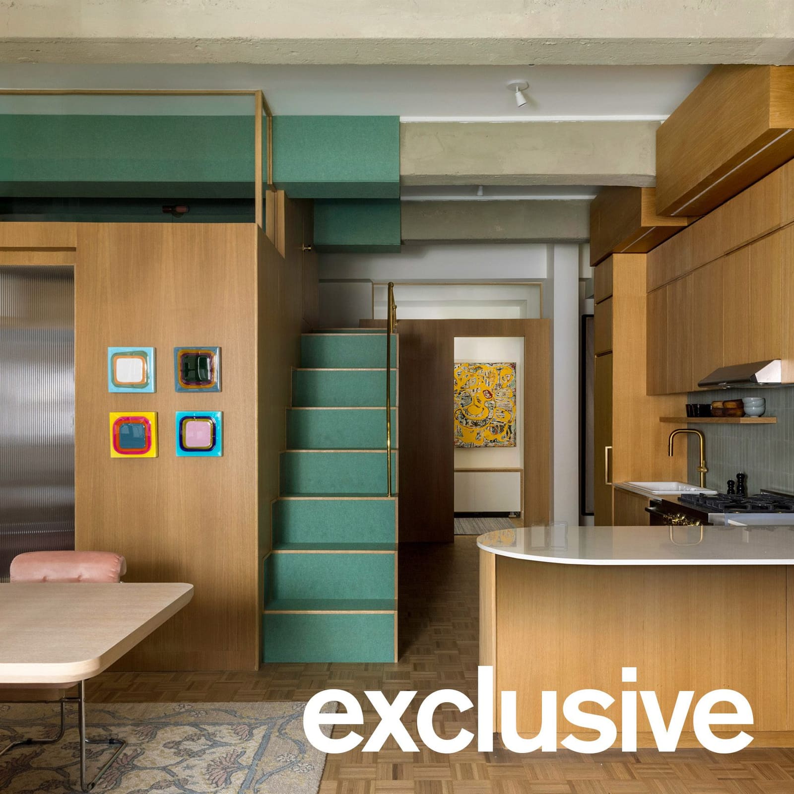
Into this cleared field, the studio introduced three primary insertions: a home office that doubles as a flexible bedroom, a lofted reading area, and a sleeping nook. Each is clad in oak millwork and lit through a combination of spandrel windows and large glass blocks. The oak wrapping serves a dual purpose: it provides abundant storage while visually unifying the insertions as a family of objects within the larger volume. This strategy recalls the work of firms like Tsuruta Architects, who use freestanding joinery to organize domestic space without relying on full-height partitions.
The lofted reading area is accessed via a flight of stairs clad entirely in felt, covering both treads and risers. Felt panels also wrap the concrete beams above, serving an acoustic function while softening the industrial materiality of the existing structure. The use of felt as both finish and acoustic dampener is a detail worth noting; it's a material choice that addresses performance without resorting to the ubiquitous acoustic tile, and it reinforces the tonal palette that runs throughout the apartment.
Tonal Green as Organizing Element
Color in residential interiors often functions as decoration, but here it operates more strategically. A large wall painted in a muted green tone divides the living area from the primary suite, establishing a visual boundary without full enclosure. The same green reappears in the kitchen cabinetry, in bathroom tiles, and in the felt stair covering. This repetition creates a cohesive spatial language, tying together disparate elements and reinforcing the sense of the insertions as related objects.
The green is not arbitrary. It contrasts with the warm oak millwork while remaining within a subdued, earthy register. In the bathrooms, tiles in various verdant tones clad the walls inside the shower and around the vanities, creating a gradient effect that adds depth without introducing additional hues. The interplay between green and oak, between cool and warm, gives the apartment a measured richness that avoids the visual flatness common in small-scale renovations.
The Dining Zone as Social Hinge
The dining area occupies a critical position in the plan, nestled against a custom built-in bench and positioned to accommodate eight people. This is not incidental. In a compact apartment where the program demands both openness for entertaining and enclosure for privacy, the dining zone functions as a hinge, mediating between the kitchen and the living area while remaining visually connected to both.
The built-in seating maximizes efficiency, eliminating the need for freestanding chairs on one side of the table and freeing up circulation space. This kind of detail, where furniture and architecture merge, is emblematic of the project's broader logic: every element must perform multiple roles. The bench provides seating, defines the edge of the dining zone, and conceals storage. The oak millwork that wraps the insertions also houses closets, shelving, and mechanical systems. The lofted reading area creates a vertical dimension in a low-ceilinged space, expanding the perceived volume without altering the building envelope.
Precedent and Context
The strategy of insertions within a shell is not new. Renzo Piano's Diogene cabin and the interior work of Studio Oink both explore the idea of furniture-as-architecture, where freestanding elements organize space without traditional walls. What distinguishes this project is the degree to which the insertions are integrated with the existing structure. The concrete columns are not hidden but incorporated, sometimes tucked within the oak millwork, sometimes left exposed as punctuation marks in the open areas.
This negotiation between old and new is particularly legible in the living area, where original columns stand alongside the green-painted dividing wall and a tiled fireplace. The juxtaposition is deliberate, creating a layered reading of the space that acknowledges its industrial origins, its 1980s transformation, and its current iteration. It's a design approach that resists the urge to sanitize history in favor of a single aesthetic gesture.
Material Continuity and Spatial Flow
The use of oak millwork throughout the apartment establishes a material continuity that counteracts the potential fragmentation of the plan. In small spaces, too many materials can create visual clutter, making the space feel even more constrained. By limiting the primary materials to oak, concrete, felt, and glass block, the design maintains a coherent vocabulary while allowing for variation in texture and tone.
Glass blocks, often associated with mid-century modern or postmodern aesthetics, are deployed here to admit light into the insertions without sacrificing privacy. They create a diffused glow that softens the boundaries between the pods and the larger volume, reinforcing the sense of the insertions as permeable rather than fully enclosed. This permeability is crucial to the success of the layout; the apartment feels larger than its square footage because sightlines extend across multiple zones, even when individual areas are partially enclosed.
Adaptive Reuse as Layered Practice
The project resists the temptation to erase the building's past in favor of a unified vision. Instead, it treats adaptive reuse as a practice of layering, where each intervention adds to the palimpsest rather than replacing it. The preserved parquet floors, the exposed concrete structure, and the new oak insertions coexist without hierarchical dominance. This approach aligns with contemporary thinking in preservation, which increasingly values legibility of change over frozen historicism.
The West Village context adds another dimension. As a neighborhood that has undergone repeated waves of transformation, from industrial port to bohemian enclave to high-value residential district, the building itself is a microcosm of broader urban shifts. The design acknowledges this by making the layers of change visible, allowing the apartment to function as both a functional dwelling and a readable artifact of its own history.
Flexibility Without Openness
One of the more subtle achievements of the project is the way it provides flexibility without defaulting to the open-plan model. The three flexible bedrooms are not simply partitioned rooms but nested volumes that can be opened or closed depending on need. The home office can function as a guest room, the lofted reading area as a workspace or retreat, the sleeping nook as a child's room or storage zone. This flexibility is built into the architecture rather than left to furniture arrangement, giving the inhabitants multiple configurations without sacrificing spatial definition.
This stands in contrast to the prevailing logic of many contemporary loft renovations, which prioritize openness above all else. Here, openness and enclosure are held in balance, with the insertions providing just enough separation to allow for privacy and acoustic isolation while maintaining visual and spatial connection to the larger volume. It's a more nuanced approach, one that acknowledges the limitations of both fully open and fully compartmentalized plans.
The project suggests that in constrained urban sites, the most effective strategy may not be to maximize openness or to carve out discrete rooms, but to create a gradient of enclosure, where spaces are defined by degree rather than by kind. The loft as a type has always been about negotiating between the raw and the refined, between the industrial and the domestic. This intervention continues that negotiation, adding another layer to an already complex architectural history.
Save this story. A free account keeps your reading list and the 07:00 email in one place.
CREATE FREE ACCOUNT →SIGN IN