In the crowded world of specialty cafés and global coffee brands, % Arabica has carved out a distinctive place through design rigor as much as coffee quality. From Cairo to Riyadh, Bangkok to Hangzhou, the brand’s retail spaces display a remarkable consistency: a refined use of white space, architectural precision, and clarity of experience that transcends local contexts while accommodating them. These design choices are central to how % Arabica presents not just coffee, but a global coffee culture.
Design Philosophy: Precision & White Space as Brand Language
At the core of % Arabica’s retail design is a minimalist aesthetic rooted in Japanese design principles - a commitment to space, proportion, light, and material integrity. Unlike café interiors that trade heavily on nostalgia or thematic storytelling, % Arabica uses white space as an active design element: it clarifies sightlines, foregrounds product and process, and creates a visual pause amidst the bustle of urban shopping centers and city streets. This disciplined spatial language becomes instantly recognizable, forming a global retail system that communicates the brand identity without decoration.
Global Expressions of a Singular Design Ethos
% Arabica Hangzhou MixC (China)
The new Hangzhou MixC store exemplifies how precision and white space can be sculptural and experiential. Designed by Nguyen Khai Architects & Associates, this flagship features a striking white façade composed of hundreds of rotatable Chemex plates. The careful arrangement of these elements catches sunlight to animate the exterior with light and shadow, revealing that even a minimalist palette can be dynamic. Inside, a tunnel-like rhythm created by gate structures and aligned benches guides visitors toward the coffee counter, making the spatial journey a central part of the café experience.


A sculptural façade transforms everyday coffee rituals into an immersive spatial approach, using repetition and light to animate a restrained palette
% Arabica Bangkok Iconsiam (Thailand)
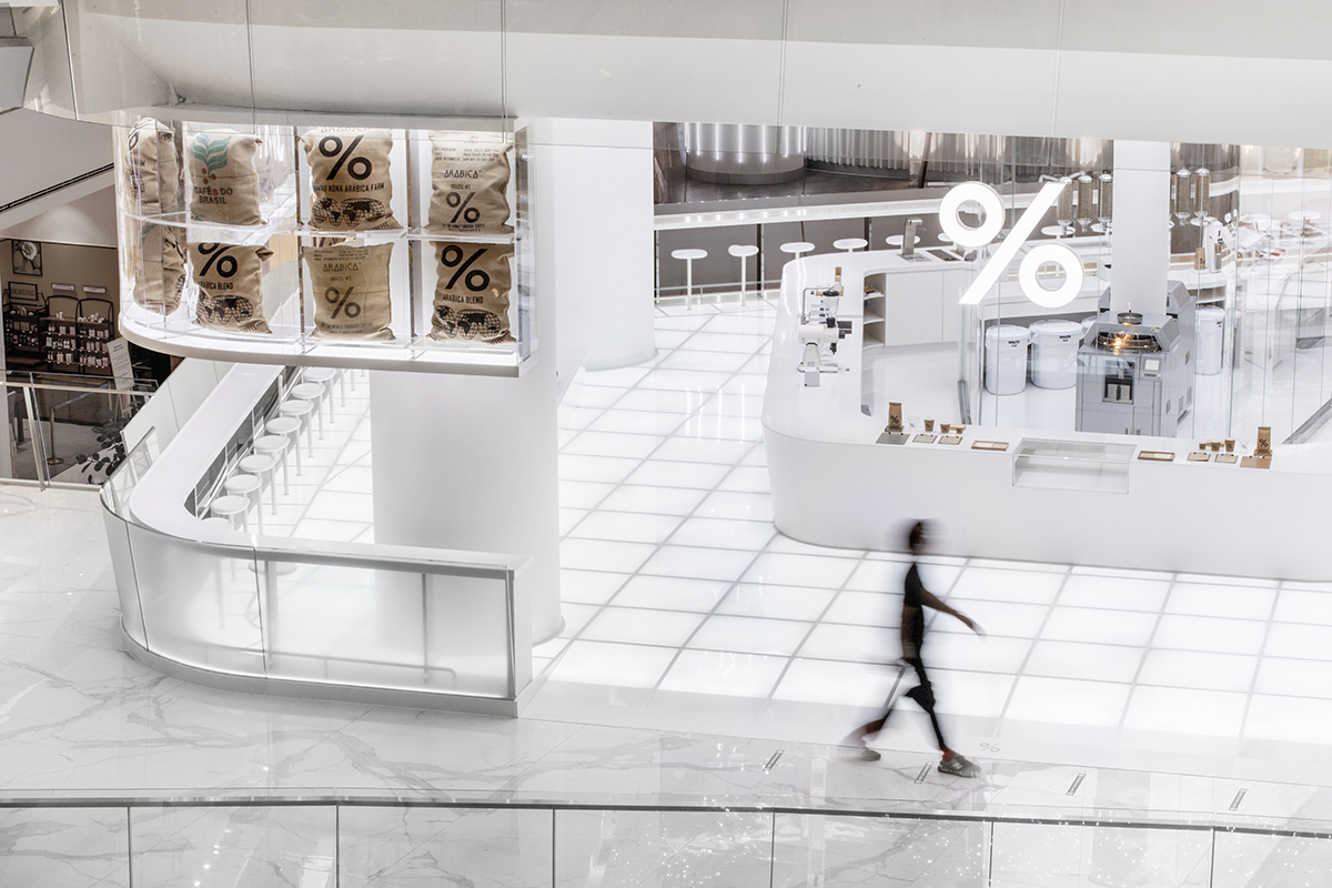
Located within one of Bangkok’s most prominent luxury retail destinations, this flagship store amplifies the brand’s minimalist language at an urban scale. Crisp white surfaces, finely detailed counters, and seemingly floating seating elements create a light, weightless interior that contrasts with the mall’s visual density. Large openings and strategic sightlines frame views toward the riverfront and city beyond, allowing natural light and movement to animate the space. The result is a calm, precise coffee environment embedded within a vibrant metropolitan setting.


Minimal architectural gestures carve out moments of calm within a high-energy retail environment, allowing light, movement, and views to shape the experience
% Arabica Jakarta PIK Drive Thru (Indonesia)
Set within Jakarta’s fast-growing Pantai Indah Kapuk district, this drive-thru store translates % Arabica’s precision-driven design language into an infrastructure-led typology. A clean white architectural envelope and streamlined canopy emphasize efficiency and clarity, while expansive glazing maintains visual openness despite the automotive format. The coffee counter remains visually central, reinforcing craft and process. By pairing white space with circulation logic, the store demonstrates how % Arabica adapts minimalist retail design to contemporary urban mobility without sacrificing brand identity.

Even in a drive-thru format, the architecture keeps coffee-making visually present through openness and disciplined framing

% Arabica Riyadh Roastery (Saudi Arabia)
At the Riyadh Roastery, the brand scales up its design language to accommodate a large roastery - café hybrid. Standard white surfaces define the major spatial volumes, while sheer curtains segment areas without adding visual clutter. Large communal seating zones, organized along the roastery’s axis, make coffee craftsmanship part of the architectural narrative itself - visible and unadorned.


Large-scale white space organizes production, seating, and movement into a single, legible architectural framework
% Arabica New Cairo (Egypt)
This café in Cairo uses stacked limestone slabs as a foundational design gesture, creating variable seating levels and sightlines that organically shape circulation and social zones. Unlike many minimalist cafés, this space subtly references Egyptian heritage (pyramids) while maintaining a contemporary minimal palette. The design plays with materials and spatial flow rather than decorative elements.


Solid massing and stepped geometry reinterpret local material traditions through a contemporary spatial order
Design Takeaways: What Retail Designers Can Learn from % Arabica
% Arabica demonstrates that a global retail identity does not depend on repetition, nostalgia, or visual spectacle. Instead, it is built through precision, restraint, and spatial consistency. White space is treated as an active architectural tool rather than an absence, sharpening focus on coffee-making processes, material junctions, and human movement. By prioritizing proportion, circulation, and clarity over decorative storytelling, the brand creates adaptable design systems rather than fixed aesthetics, proving that spatial discipline can travel across cultures, climates, and retail formats without losing meaning or relevance.
Globalizing Coffee Through Space, Not Story
In an era when cafés often compete through themed interiors and visual excess, % Arabica chooses a quieter path. Its stores operate as calm, disciplined frameworks where coffee culture is communicated through proportion, light, and process. Across continents, the brand speaks the same spatial language - one that values focus over decoration and experience over narrative. In doing so, % Arabica doesn’t just globalize coffee as a product, but as a shared architectural experience, understood instinctively wherever it appears.
PHOTO CREDIT: % Arabica
Save this story. A free account keeps your reading list and the 07:00 email in one place.
CREATE FREE ACCOUNT →SIGN IN