The Architecture of Seeing
There's a particular spatial grammar to buildings that once served industrial functions. High ceilings necessitated by machinery or workflow, expanses of glass engineered for natural light rather than view, structural systems stripped of ornament because beauty was never the brief. When Venetia Scott acquired her North Kensington property in 2004, these qualities were already in place, courtesy of a previous life as a postal sorting office and a subsequent transformation by Orefelt Associates for painter Felicia Larsson.
The existing intervention, tall finlike piers supporting an upper living floor with bedrooms tucked beneath, established a vertical hierarchy unusual in residential typology. Scott's decision to inhabit this ready-made spatial condition rather than reconfigure it speaks to an understanding of adaptive reuse that architects often advocate but clients rarely embrace: work with what the building wants to be.
What the building wanted, in this case, was to remain legible as a volume. The Victorian-era envelope, its greenhouse-like steel beam and glass panel roof system intact, reads as a single vertical gesture from entry threshold to apex. Scott's interior palette reinforces this. Dark green walls, applied throughout in a hue from Paint & Papers, recede visually, allowing the proportions and light quality to dominate. It's a move borrowed more from gallery design than residential convention, and it succeeds precisely because the space operates as both.
Studio Practice as Spatial Program
At World Archi Design, we've covered numerous live-work conversions, and the recurring challenge is always adjacency. How do you separate professional function from domestic life when both occupy the same envelope? Scott's solution is zoning by character rather than partition. The studio occupies the front zone immediately off the entry, a conference table surrounded by red crackled leather Charles Pollock swivel chairs for Knoll sourced via eBay. The Mad Men-era aesthetic is deliberate, a visual anchor for work that often references midcentury fashion photography.
But the real infrastructure of her practice is less visible: eight-by-four-foot magnetic boards for research pinups, a dedicated wall for set-building materials, shelving systems by Dan Birch Interiors that accommodate the physical archive of a career spanning decades. Scott's methodology, location-driven and color-coordinated before garment selection, requires spatial support for material samples, reference imagery, casting portfolios. The studio isn't simply an office; it's a three-dimensional mood board.
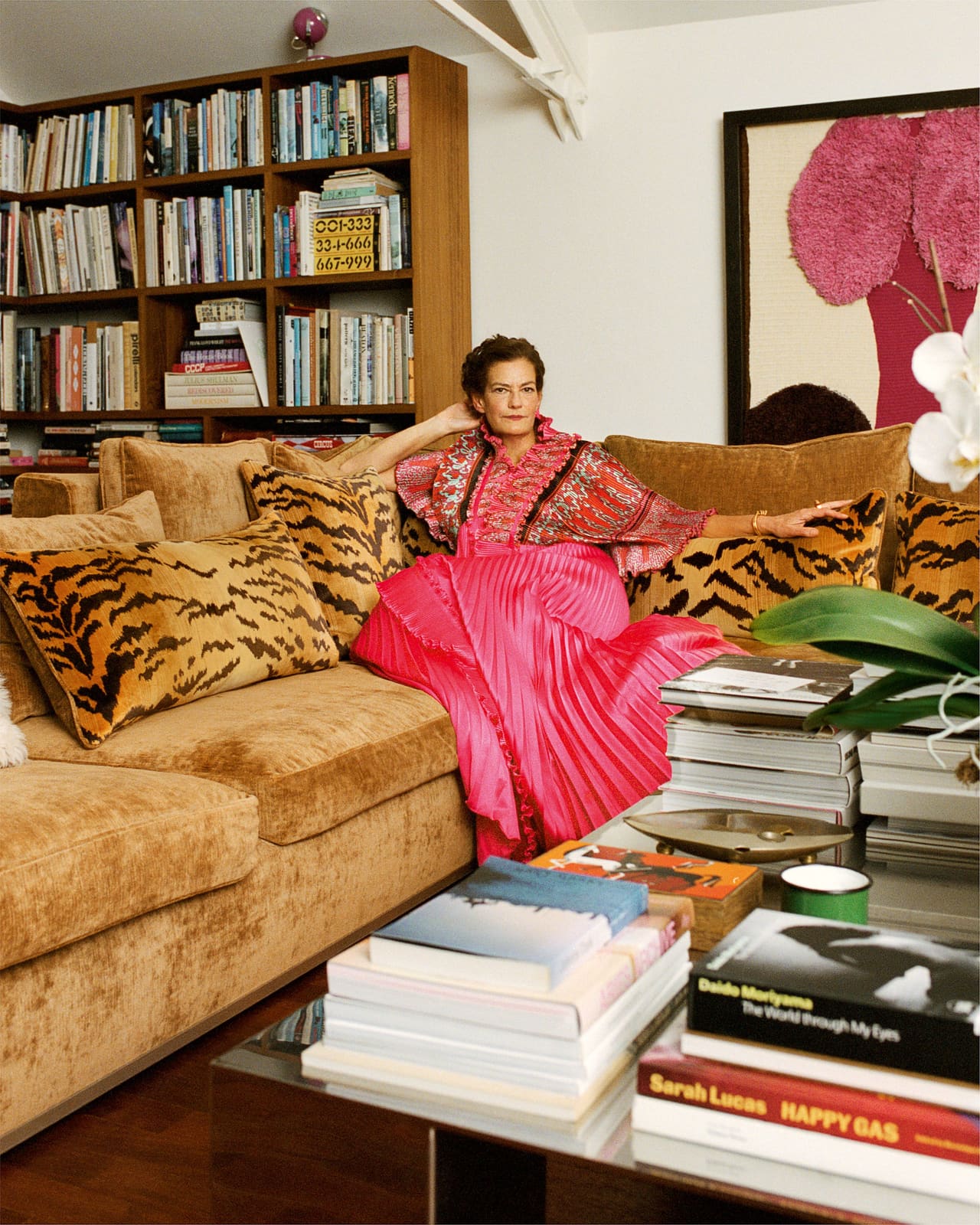
The transition to domestic program happens without corridors or doors. A B&B Italia sofa, reupholstered in sandy-gold fabric with tiger-stripe cushions, marks the shift. Beyond it, the custom Arclinea kitchen in a slightly different green than the walls, trimmed in gold and fitted with Wolf appliances. A Saarinen dining table by Knoll, surrounded by S33 Cognac chairs from the Mart Stam and Marcel Breuer collaboration, establishes a social zone. Overhead, a collection of vintage Murano glass pendants by Carlo Nason and a 1970s Pamela pendant by Ettore Arcelli for Tronconi provide task lighting that doubles as sculptural punctuation.
This arrangement, open-plan in the literal sense but articulated through furniture placement and lighting strategy, recalls the loft living experiments of 1970s SoHo more than contemporary open-concept residential trends. The difference is density. Every object carries visual weight; there's no minimalist restraint here. Instead, a curated accumulation that suggests decades of acquisition rather than a single design moment.
The Midcentury Throughline
Scott's interiors are often read as 1970s-inflected, and the material evidence supports this. A wall hanging by Ewald Kröner, an articulated wood floor lamp by David Pigeon, a 1950s sideboard by Arne Vodder, Barcelona pendant lamps by Bent Karlby. The dining area features Julio Le Parc's "La Longue Marche" screen prints and Niels O. Møller seating around an A.J. Iversen table. These aren't reproductions or homages; they're period pieces, many acquired during an initial furnishing phase at Alfie's Antique Market and Themes & Variations.
But to categorize the project as retro styling misses the tectonic logic at work. Midcentury Scandinavian and Italian design emphasized material honesty, structural clarity, and craft-based production methods that align closely with the Victorian industrial aesthetic of the building itself. A Mies van der Rohe Barcelona bench in hide, positioned in the entry beneath photographs by Roni Horn, doesn't contrast with the finlike piers; it echoes their reductive geometry.
The chromatic choices reinforce this. Grass cloth wall coverings by Phillip Jeffries in the bedrooms, Zinc Textile corduroy curtains in the primary suite, aqua tile in the guest bath. These are saturated, unapologetic color applications that recall both 1970s interiors and the Brutalist palette Scott often uses as backdrop in her photography. There's a feedback loop here between her spatial environment and her image-making practice, each informing the other's visual language.
Domestic Inversion: The Subterranean Retreat
While the upper level privileges light and volume, the lower floor embraces enclosure. Scott's primary bedroom, carpeted in leopard print and furnished with a sleigh bed from Simon Horn, operates as a deliberate inversion of the studio's openness. Heavy corduroy curtains acknowledge rather than apologize for the lack of natural light. Above the bed, an Alfred Wallis painting of a trawler; on the nightstand, gold-leaf geometric work by Piers Jackson that, despite dim conditions, appears to emit its own luminosity.
This willingness to differentiate spatial experiences within a single project, to let some areas be dark and compressed, demonstrates a more sophisticated approach to residential design than the ubiquitous mandate for light-filled rooms. Not every space needs to perform the same way. A bedroom as den, as retreat from the hyper-visual labor happening two floors above, makes programmatic sense.
The functional apotheosis of the lower level, though, is pure fashion pragmatism: a 16-foot hanging wardrobe behind a transparent sliding door. This wasn't Scott's addition but an existing feature from the Larsson era, evidence that artists and photographers share certain spatial needs. The transparency is key; it transforms storage into display, garments into a chromatic spectrum visible from the studio beyond. It's infrastructure as installation.
Adaptive Reuse as Collaborative Authorship
What makes this project compelling from an architectural perspective isn't Scott's intervention alone but her recognition of what was already there. Orefelt Associates created the mezzanine strategy; Larsson established the artist-residence precedent; Scott layered in the midcentury collection and color palette. This is adaptive reuse as palimpsest, each occupant adding to rather than erasing what came before.
The recent renovation, undertaken during the pandemic pause in commercial work, focused on spatial opening rather than addition. Removing a divider extended sightlines to the rear, increasing the sense of volume without altering the building's footprint or structural system. The Arclinea kitchen installation brought contemporary performance standards to food preparation without stylistic rupture. These are moves of refinement, not transformation.
In a city where residential conversions of industrial buildings often gut interiors to impose developer-standard layouts, Scott's approach offers a counter-model. Inhabit the existing spatial logic. Let program emerge from what the architecture suggests rather than imposing a predetermined domestic script. Furnish with objects that share the building's material and temporal DNA. The result isn't a designed interior in the conventional sense but an environment that accumulated intelligently over two decades.
The Image-Maker's Paradox
For someone whose career is built on constructing visual narratives, Scott's own space operates with surprising understatement. Yes, there's the saturated color, the vintage furniture, the carefully composed vignettes. But there's also a functional pragmatism, an acceptance of the building's constraints, a willingness to let the architecture dictate terms. The studio wall covered in portraits, subjects staring directly at camera, becomes a kind of manifesto: this is a space about looking and being looked at, about the apparatus of image-making made visible.
The transparent wardrobe door, the magnetic research boards, the set-building materials stacked against walls all reveal process rather than conceal it. In an era when residential interiors are increasingly styled for social media consumption, optimized for the single perfect shot, Scott's home operates as a working archive. It's photogenic, certainly, her self-portrait on the B&B Italia sofa in a vintage Zandra Rhodes dress could run in any shelter magazine. But it's also genuinely inhabited, layered with the material evidence of a sustained creative practice.
That tension between image and function, between the composed shot and the daily reality of making those shots, gives the project its conceptual depth. It's not just a beautiful space. It's a space about how beautiful spaces get made.
Save this story. A free account keeps your reading list and the 07:00 email in one place.
CREATE FREE ACCOUNT →SIGN IN