The Problem with Boxes
Restaurant design has long been a game of dividing square footage into rigid zones: dining room here, kitchen there, storage tucked away, circulation squeezed between. The model works, functionally, but it rarely questions whether the boundary between guest and service needs to be a hard line. In a 66-square-meter floor of a Tokyo commercial building, IGArchitects chose to dissolve that binary altogether.
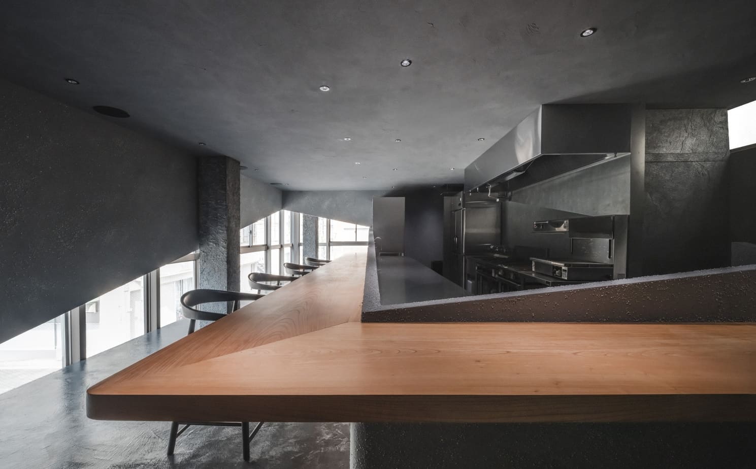
Completed in 2025, the project led by Masato Igarashi and Yuuki Yazaki replaces the typical front-of-house/back-of-house partition with a single, sinuous wall that wraps through the entire footprint. The result is a spatial system that organizes without isolating, that guides movement without blocking sightlines, and that performs multiple programmatic roles with one continuous element.
Continuous Form, Multiple Functions
The wall is not a divider in the traditional sense. It curves, folds, and inflects to create pockets for cooking, serving, seating, and circulation, but it never fully encloses any zone. Kitchen equipment nestles into one concave section; diners occupy another. The boundary between preparation and consumption becomes porous, legible but not hermetic.
This approach recalls the spatial experiments of SANAA's early interiors, where walls became loose membranes rather than rigid enclosures. But where SANAA often pursued transparency through glass or open spans, IGArchitects achieves porosity through curvature and continuity. The wall is opaque, yet its serpentine path invites glimpses and cross-views that a straight partition would block.
The material expression remains modest. The wall reads as a single surface, unadorned, allowing its geometry to do the work. In a compact commercial tenant space, where every square meter counts, this strategy avoids the inefficiency of double-loaded corridors or redundant circulation. Movement flows along the wall's edge; program fills the voids it creates.
Rethinking the Restaurant Typology
Most restaurant renovations in Tokyo's dense tenant buildings default to a predictable layout: a galley kitchen against one wall, a dining zone filling the remainder, a service counter mediating between them. The IGArchitects scheme inverts that logic. Here, the wall itself becomes the mediator, a three-dimensional organizational device that distributes program rather than simply separating it.
The design also challenges the assumption that diners need to be shielded from operational realities. By weaving kitchen and dining into a single spatial field, the project makes preparation part of the experience without resorting to the spectacle of an open kitchen. The wall modulates visibility rather than eliminating it, offering partial views and auditory cues that signal activity without exposing every detail.
This calibration of openness and enclosure is particularly relevant in Japan, where restaurant culture often values both intimacy and a subtle awareness of craft. The wall's curves create alcoves that feel semi-private without requiring doors or partitions, and the open ceiling height (typical of tenant floors) allows sound and light to circulate freely above the enclosing element.
Spatial Efficiency in a Compact Footprint
At 66 square meters, the project operates within severe spatial constraints. A conventional layout would likely carve the floor into discrete rooms, each requiring its own access and egress, each consuming valuable area in transitions. The continuous wall eliminates redundant thresholds. Instead of multiple doorways and corridors, the design offers a single path that winds through the space, with program unfolding along its length.
This efficiency extends to construction. The wall's continuity means fewer junctions, fewer material transitions, and a simpler structural logic. The construction team, including Kentaro Okata, Tomoyuki Hirabayashi, Ken Ishii, and Chiba GALAS Inc., executed the form as a unified element, which likely streamlined detailing and reduced the potential for misalignment or visual breaks.
The photography by Ooki Jingu captures this fluidity, emphasizing the wall's uninterrupted sweep and the way it carves the floor into interconnected zones. The images reveal a space that feels larger than its footprint suggests, a perceptual trick enabled by the absence of hard corners and the gentle curve of the enclosing form.
Precedents and Departures
The idea of a single, multipurpose wall has precedents in both residential and commercial design. Shigeru Ban's furniture houses used freestanding storage walls to organize domestic space without fixed rooms. More recently, studios like Schemata Architects have explored linear service cores in small retail interiors, consolidating infrastructure into one spine.
IGArchitects pushes this concept further by making the wall not just a service element but a spatial generator. It does not simply house equipment or storage; it shapes the entire restaurant experience. The wall's path determines where diners sit, where staff move, and how the two groups interact. In this sense, it functions more like a tectonic parti, a single formal decision that cascades through every aspect of the design.
The project also departs from the current trend toward maximalist material palettes in Tokyo hospitality interiors. Instead of layering textures, colors, and finishes, the design relies on geometric clarity. The wall's form is the primary expression; everything else recedes. This restraint aligns with a longer Japanese architectural tradition, one that values the articulation of structure and space over applied ornament.
A Model for Tenant-Floor Renovation
Commercial tenant buildings, ubiquitous in Tokyo and other dense Asian cities, present a recurring design challenge: how to create spatial identity within a generic shell. Most renovations address this through surface treatments, lighting, or furniture. IGArchitects demonstrates that a more fundamental rethinking of layout can yield richer results.
The continuous wall strategy is not universally applicable. It works here because the program is relatively simple and the required adjacencies are flexible. A restaurant with more complex back-of-house needs, or one requiring strict health code separations, might not afford the same spatial openness. But for small-scale hospitality interiors, the approach offers a compelling alternative to the default compartmentalized plan.
As urban real estate costs continue to rise and tenant spaces shrink, architects will need to extract more spatial value from less area. Projects like this one suggest that efficiency need not mean sterility. By collapsing multiple functions into a single architectural element, the design achieves both programmatic performance and experiential richness within severe constraints. The wall, in this case, is not a barrier but a generator, a device that organizes, connects, and defines an entire restaurant with one continuous gesture.
Save this story. A free account keeps your reading list and the 07:00 email in one place.
CREATE FREE ACCOUNT →SIGN IN