The Shift from Safe Harbor to Personal Expression
For years, interior color forecasts have functioned as gentle suggestions, nudging homeowners toward palettes that prioritize harmony and resale value. But something fundamental has shifted in how people approach their living environments. The newest offering from Sherwin-Williams, Colormix 2027, reads less like a prescriptive guide and more like permission to experiment. Emily Kantz, interior designer and color strategist at the company, frames the collection of 48 shades as a response to an observable trend: people are tired of performing neutrality.
Where previous forecasts leaned into themes of comfort and balance, this iteration embraces tension and personality. The palette includes shades that demand attention, like Humorous Green, which hovers near fluorescent territory, and Forward Fuchsia, a pink that refuses to apologize. Alongside these are quieter moments: Honorable Blue, Secret Garden, and a suite of neutrals that serve as anchors rather than defaults. Ten continuity colors round out the system, offering pathways between extremes. The result is a toolkit for spaces that reflect lived experience rather than editorial aspiration.
Richer Tones and the Architecture of Depth
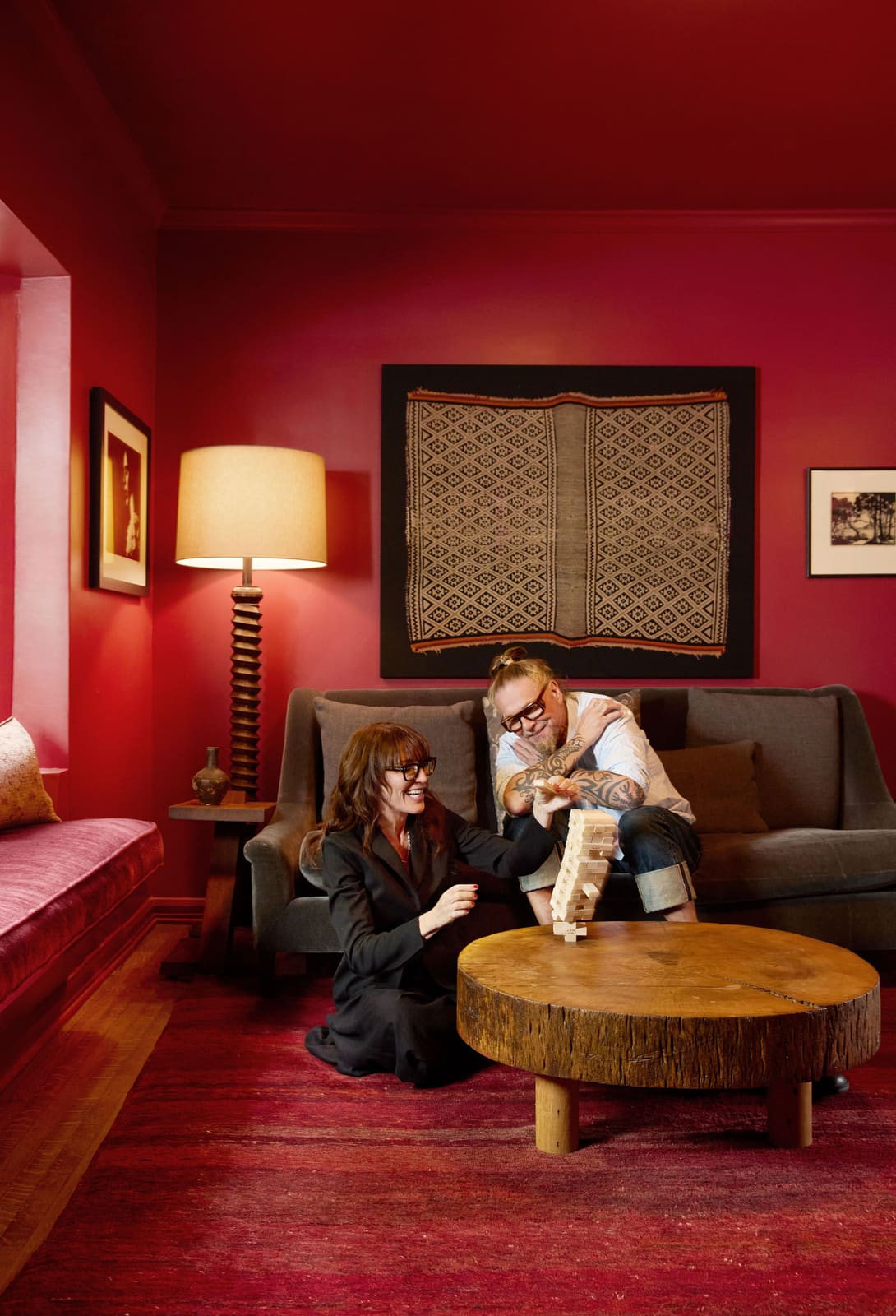
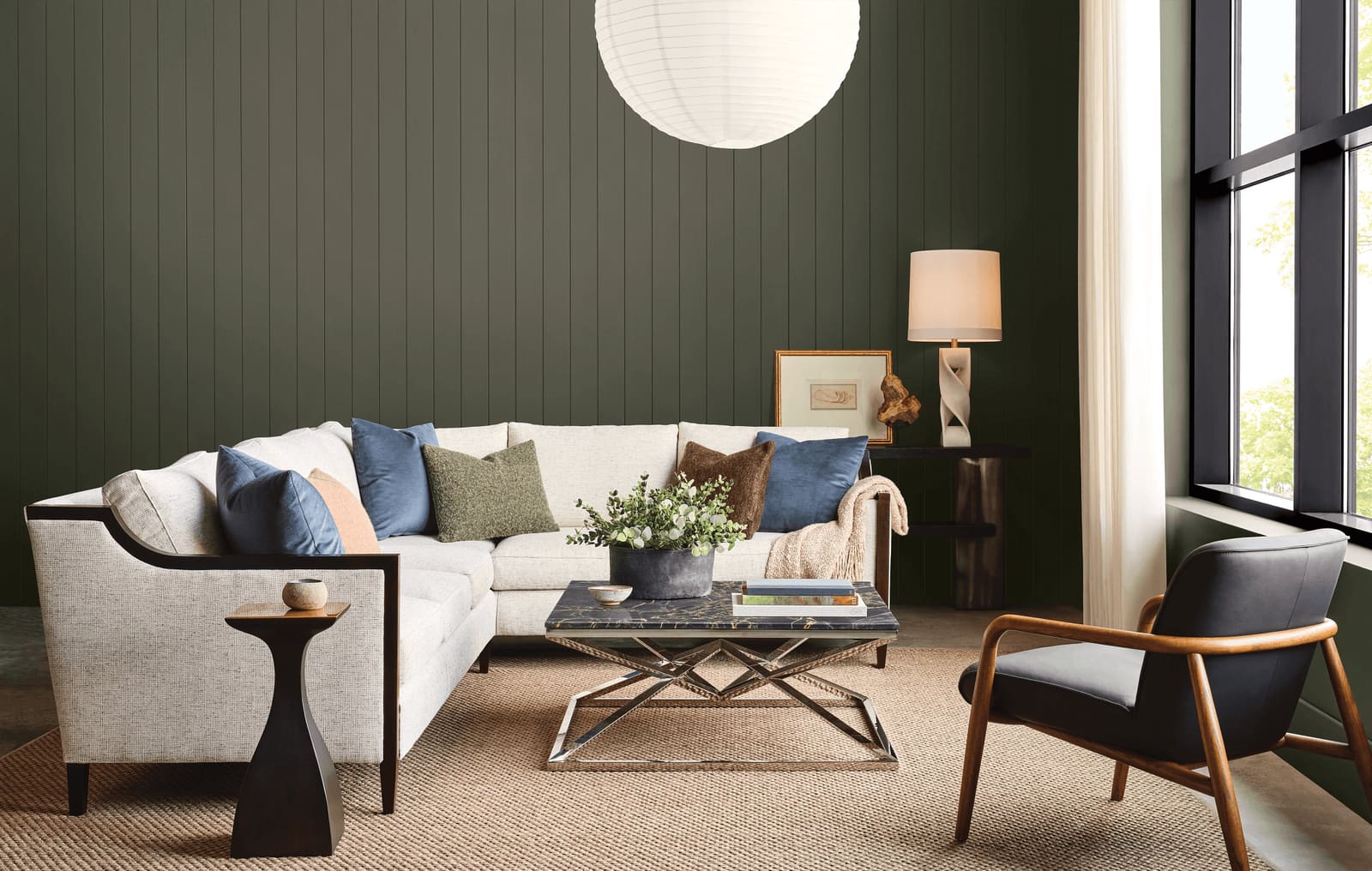
Traditional interiors have long relied on depth to convey permanence. Think of the drawing rooms of Georgian townhouses, where walls in deep reds and greens provided a backdrop for gilded frames and mahogany furniture. Colormix 2027 revisits that instinct with shades like Midnight, a plum with enough complexity to shift throughout the day, and Salty Dog, a navy that reads as grounded rather than nautical.
Kantz suggests introducing these tones incrementally, treating them as accents that complement existing neutrals. A kitchen island painted in Roycroft Bronze Green, for instance, can anchor a space without overwhelming it. Built-in shelving in a rich hue becomes a focal point, drawing the eye and creating layered visual interest. Over time, as confidence builds, the approach can expand. A dining room enveloped in Roycroft Bronze Green, for example, transforms the act of gathering into something ceremonial.
This strategy mirrors a broader movement in residential design: the rejection of the open-plan, light-flooded aesthetic that dominated the 2010s. As people spend more time at home, they are rediscovering the value of enclosure and intimacy. Color becomes a tool for delineating zones and shaping mood, much like the spatial strategies employed by architects such as Carlo Scarpa, who used material transitions to guide movement and perception.
Contrast as Compositional Strategy
One of the more intriguing aspects of the forecast is its embrace of juxtaposition. Kantz highlights pairings that might have been dismissed as discordant a decade ago: Lotus Petal, a soft pink, set against Jadite, a mint green with vintage undertones. Or Jadite itself placed against High Sierra, a warm, earthy tone. These combinations work not because they harmonize in the traditional sense, but because they create visual friction.
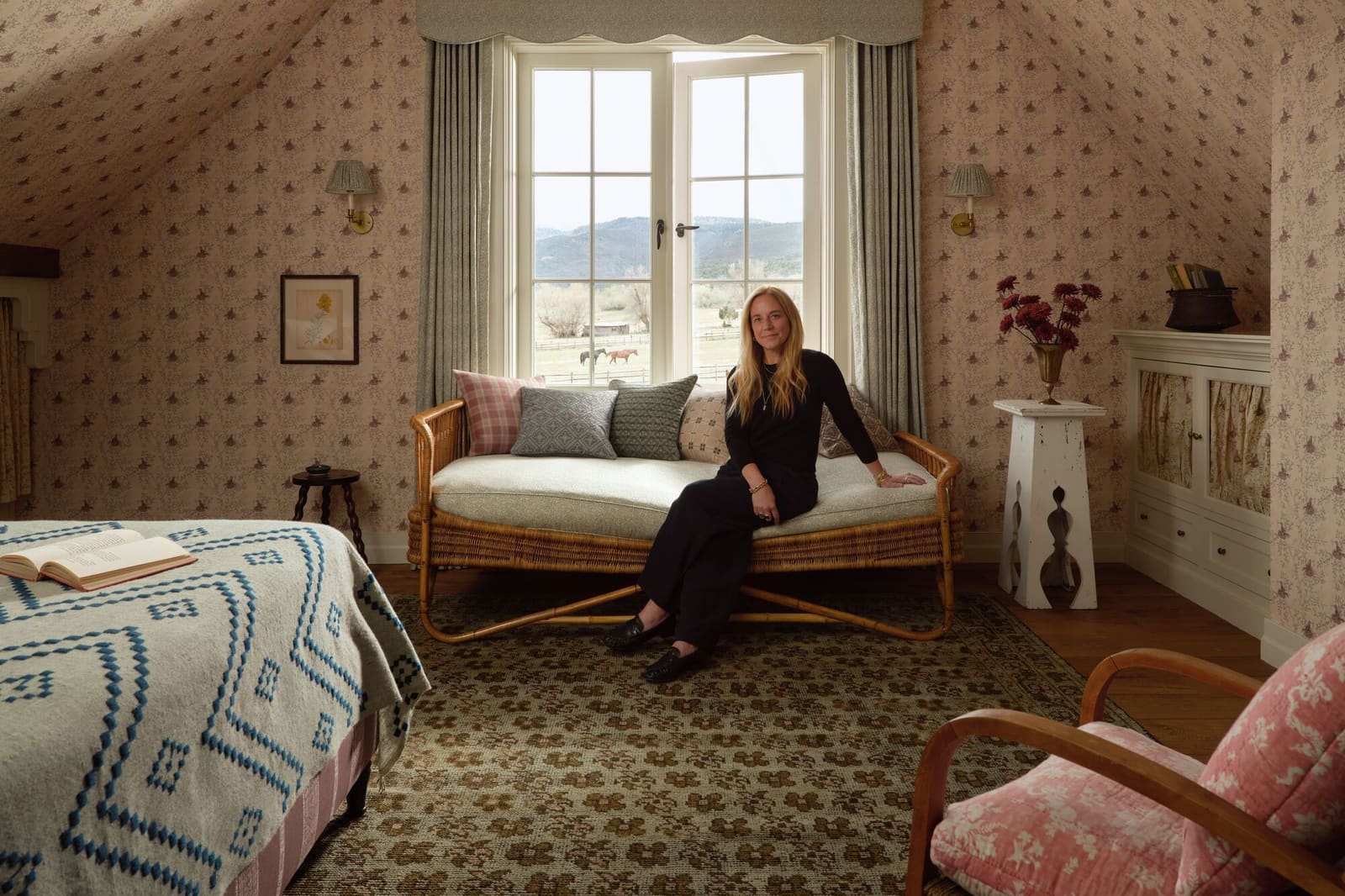
This approach reflects how interiors are increasingly assembled rather than coordinated. People are layering colors, materials, and finishes in ways that prioritize personality over polish. The aesthetic is less about achieving a magazine-ready tableau and more about constructing an environment that feels lived-in and specific. It is the difference between a room that photographs well and a room that accommodates the complexities of daily life.
Precedent for this kind of chromatic tension can be found in the work of designers like Dorothy Draper, who famously combined bold patterns and saturated colors in ways that defied mid-century restraint. More recently, studios such as India Mahdavi have demonstrated how unexpected color pairings can activate space, using contrast to create rhythm and surprise. The Colormix 2027 palette provides a similar framework, but one accessible to a broader audience.
Nostalgia and the Return of Joy
Neutrals have long been positioned as the safe choice, a way to ensure that a space remains adaptable and resale-friendly. But Kantz and her team have observed a shift in priorities. People are seeking environments that inspire positive emotion, even if that means sacrificing a degree of flexibility. The forecast responds with shades that feel both familiar and energizing: Real Red, a classic primary; Trinket, a mustard yellow with mid-century warmth; Dutch Tile Blue, which evokes the glazed ceramics of European vernacular architecture.
These colors tap into collective memory without feeling retrograde. They recall eras when color was a given rather than a risk, when kitchens were painted in cheerful yellows and front doors in bold reds. But they are calibrated for contemporary sensibilities, avoiding the overwrought nostalgia that can make a space feel like a period piece.
The emphasis on joy is not merely aesthetic; it reflects a broader reconsideration of what homes are meant to provide. As remote work has blurred the boundaries between public and private life, the home has taken on new responsibilities. It is no longer just a retreat but a workspace, a social hub, and a stage for self-presentation via video calls. In this context, color becomes a form of self-expression, a way to assert individuality in an environment that must serve multiple functions.
Material Implications and Practical Application
While the forecast is framed around paint, its implications extend to material selection and spatial planning. The tension between grounded and vibrant tones suggests opportunities for contrast in finishes: matte surfaces against gloss, rough textures against smooth. A wall in Humorous Green might be paired with natural oak cabinetry, the warmth of the wood tempering the intensity of the green. Forward Fuchsia could be used sparingly, perhaps on a single architectural element like a stair riser or door reveal, where it functions as punctuation rather than statement.
Kantz emphasizes that paint remains one of the most accessible tools for transformation. Unlike tile, upholstery, or millwork, it can be changed relatively easily, making it a low-stakes entry point for experimentation. But the forecast also encourages a more holistic approach, one that considers how color interacts with light, form, and materiality. A deep plum like Midnight will read differently in a north-facing room than in a south-facing one. Dutch Tile Blue will shift depending on whether it is paired with brass hardware or matte black fixtures.
The Broader Context of Color Forecasting
Color forecasting has always been part science, part speculation. Companies like Sherwin-Williams analyze consumer behavior, monitor design fairs, and track shifts in cultural mood to predict what will resonate. But the process is also inherently subjective, shaped by the tastes and biases of the forecasters themselves. Colormix 2027 is notable not for its predictive accuracy but for what it reveals about the current moment.
The move away from safety and toward personality aligns with broader trends in design and culture. There is a growing fatigue with the homogenizing effects of globalization, a desire for specificity and locality. In architecture, this has manifested as a renewed interest in vernacular forms and regional materials. In interiors, it shows up as a willingness to embrace color that feels personal rather than universal.
At the same time, the forecast acknowledges that not everyone is ready to commit fully. The inclusion of neutrals and continuity colors provides an off-ramp for those who want to dip a toe into bolder territory without diving in. This flexibility is crucial; it recognizes that taste is individual and that the goal is not to impose a single aesthetic but to offer a framework for exploration.
Looking Forward
As we move further into the decade, it seems likely that the appetite for color will continue to grow. The pandemic disrupted many assumptions about how we live, and the interiors that emerge in its wake are reflecting that disruption. People are less interested in creating spaces that appeal to an imagined future buyer and more focused on crafting environments that serve their immediate needs and desires.
Colormix 2027 is a snapshot of this shift, a collection that encourages experimentation while providing structure. It is a reminder that color is not just decorative but deeply functional, shaping how we experience and inhabit space. Whether that means painting a laundry room in Humorous Green or enveloping a bedroom in Midnight, the message is the same: the spaces we create should reflect who we are, not who we think we should be.
Save this story. A free account keeps your reading list and the 07:00 email in one place.
CREATE FREE ACCOUNT →SIGN IN