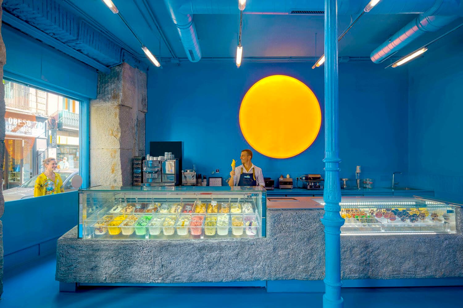
A Retail Typology Built on Joy
There is something instructive in the way ice cream shops resist regional variation. Whether anchored to a sidewalk in Seoul or carved into a Barcelona market hall, these small commercial spaces converge on a shared design language: saturated color fields, approachable materials, and spatial arrangements that invite lingering without demanding formality. At World Archi Design, we have tracked this phenomenon across dozens of projects, and what emerges is less a trend than a fundamental truth about retail environments designed around pleasure. The ice cream shop operates as pure branding exercise, a compressed architectural statement meant to pull bodies off the pavement and into a moment of indulgence.
The consistency is worth examining. Unlike cafés, which fracture into countless aesthetic camps, or bakeries, which often lean heavily on vernacular cues, ice cream retail appears to occupy a narrower band of formal strategies. Designers working in this typology return repeatedly to a toolkit grounded in playfulness, legibility, and material warmth. This is not laziness. It is recognition that the program itself, centered on a product universally associated with childhood and reward, demands a specific emotional register. The architecture must signal permission to slow down, to choose frivolously, to spend five minutes debating flavors in a world that rarely encourages such deliberation.
Four Contexts, One Logic
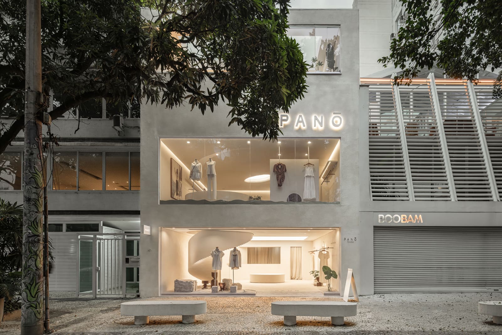
The constraints shift depending on where the shop lands. Urban storefronts negotiate the cadence of an existing streetscape, inserting themselves into a rhythm of facades, awnings, and pedestrian movement. Here, the design challenge hinges on presence: how to assert identity within a block of competing signals without overwhelming the sidewalk. Fenestration becomes critical. Large glazed openings invite visual access, collapsing the boundary between interior and exterior so that passersby glimpse the ritual of scooping, the stacked tubs of gelato, the choreography of choice. The storefront must perform even when closed, relying on color blocking, illuminated signage, or bold material gestures to register after hours.
Interior locations, typically nested within shopping malls or food halls, face a different problem. Without a street facade to anchor the intervention, designers must generate identity through contrast. Lighting does much of the work here: pendant fixtures, backlit panels, or neon elements that differentiate the shop from the ambient wash of the larger commercial space. Material palettes skew toward the tactile and the unexpected. Terrazzo, colored resin, fluted metal, ceramic tile laid in unconventional patterns. These choices create a boundary, a perceptual threshold that signals arrival even in the absence of walls. The counter itself often becomes the primary architectural element, a sculptural object that organizes circulation and frames the transaction.
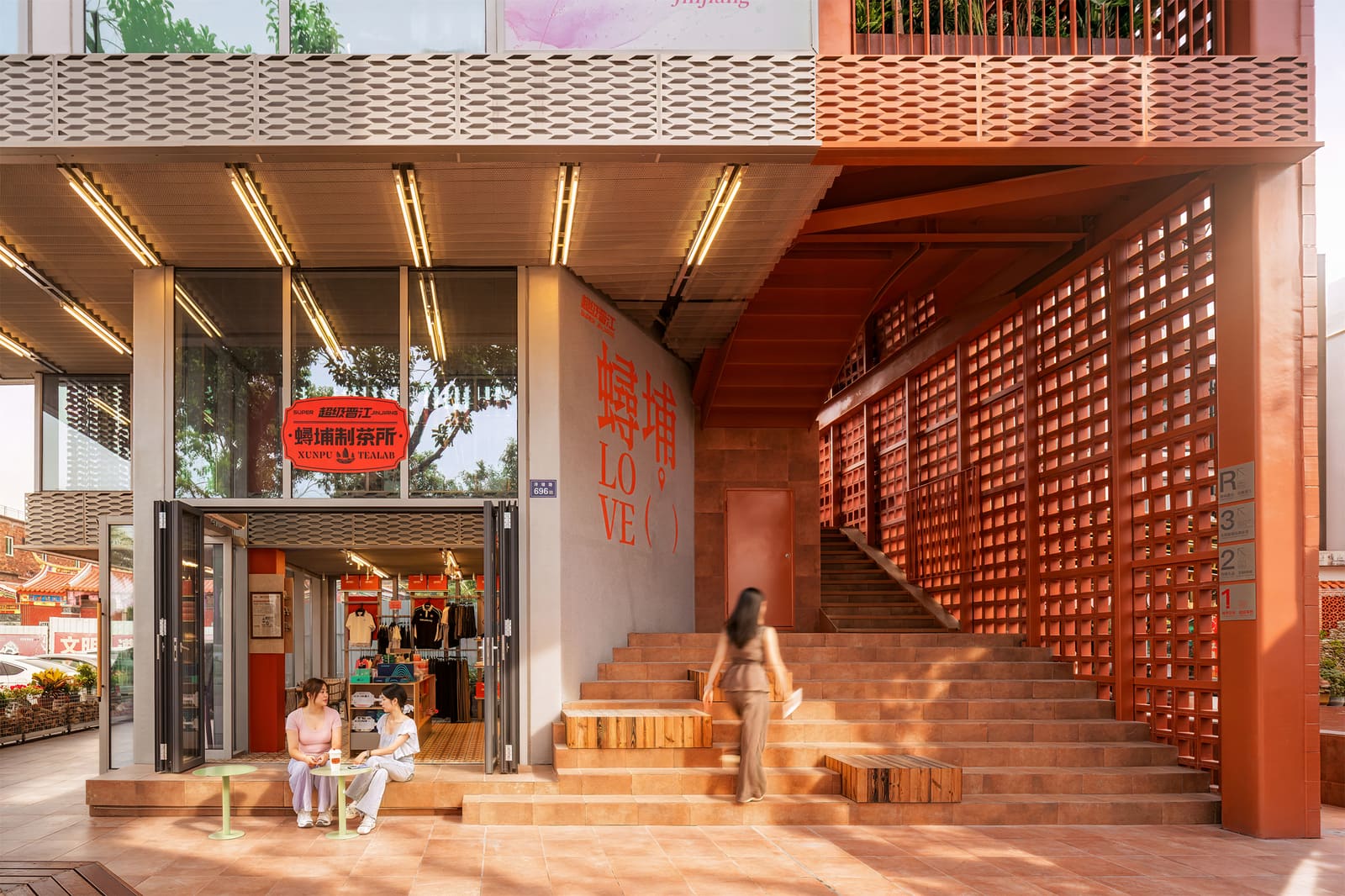
Outdoor terraces and seasonal patios introduce variables that interior projects can ignore. Climate and seasonality dictate not just comfort but the entire spatial proposition. Shade structures, whether tensile fabric, slatted timber, or perforated metal canopies, become the dominant formal gesture. Seating arrangements must accommodate groups without feeling institutional, balancing intimacy with throughput. Material choices shift toward durability and weather resistance, but the palette remains playful. Powder-coated steel in saturated hues, marine-grade plywood, composite decking in unexpected colors. The patio format also permits a looser relationship to branding: signage can be larger, more graphic, more willing to court kitsch because the open-air context absorbs exuberance more generously than a dense urban block.
Pop-up installations compress all of these concerns into temporary structures that must communicate instantly. Here, geometry and color carry the entire argument. A bright yellow kiosk in a public plaza. A pink shipping container retrofitted with service windows. These interventions lean into boldness because they lack the luxury of time. The design must be legible from across a park, memorable enough to generate social media traction, and simple enough to be fabricated quickly and disassembled cleanly. The pop-up format also permits experimentation that permanent retail cannot afford. Designers test materials, color combinations, and spatial configurations that would feel risky in a lease-bound storefront. Some of these experiments migrate back into more conventional projects, enriching the broader vocabulary of the typology.
Materiality as Memory
The palette of an ice cream shop is rarely neutral. Pastel tiles recall mid-century American diners and Italian gelaterias. Terrazzo evokes postwar optimism and the material culture of public institutions built to last. Stainless steel and white subway tile borrow the hygiene and efficiency of professional kitchens, reframing commercial utility as aesthetic choice. These are not arbitrary selections. Each material carries cultural memory, a set of associations that designers activate to position the shop within a larger narrative about craft, nostalgia, or modernity.
Color functions similarly. Soft pinks and mint greens signal approachability and whimsy, a deliberate retreat from the severity of high design. Bright primaries, red and yellow and blue, lean into childlike directness, an unapologetic embrace of joy. Monochrome schemes, when they appear, tend toward warmth: cream, beige, pale wood tones that suggest naturalness and purity. The choice of palette is never incidental. It shapes the emotional tenor of the space, cueing visitors to relax, to indulge, to momentarily abandon the calculus of adult decision-making.
Lighting completes the material story. Warm-toned LEDs soften the space, making faces and food more appealing. Pendant fixtures, often oversized or geometrically bold, anchor the counter and define the service zone. Backlighting transforms display cases into glowing vitrines, elevating rows of gelato into something approaching art. In outdoor contexts, string lights or integrated LED strips extend the operational day, turning the patio into a lantern as dusk falls. The lighting strategy must balance visibility with atmosphere, ensuring that the product remains legible without flattening the space into clinical brightness.
Precedent and Variation
The ice cream shop as architectural typology owes much to Italian gelateria design, which established the service counter as stage and the display case as framing device. Studios working today refine rather than reinvent this model. Brando Ice Cream Shop by SOLAR, for instance, employs a restrained material palette and careful spatial sequencing to elevate the ritual of ordering. The project demonstrates how subtle shifts in proportion, the height of a counter or the depth of a canopy, can recalibrate the entire experience without resorting to novelty.
Other projects embrace more overt theatricality. Shops that incorporate mirrored surfaces or curved walls amplify the sense of volume, making small footprints feel expansive. Those that integrate greenery or biophilic elements soften the commercial transaction, introducing a layer of domesticity. The range of formal strategies is wide, but the underlying intention remains consistent: to create an environment where the act of choosing and consuming ice cream feels special, a momentary escape from the transactional logic that governs most retail.
Why It Persists
The persistence of this design language across geographies and decades suggests something deeper than fashion. Ice cream, as a product, resists premiumization in the way that coffee or wine does not. It remains fundamentally democratic, accessible, tied to childhood and summer and uncomplicated pleasure. The architecture that houses it must honor that spirit. It cannot be too serious, too minimal, too austere. It must invite, it must delight, it must feel like a small gift.
This is the paradox of the typology. It appears simple, even formulaic, but achieving that ease requires precision. The proportions must be right, the palette must cohere, the materials must feel both fresh and familiar. Get it wrong, and the space reads as generic, a missed opportunity. Get it right, and the shop becomes a neighborhood anchor, a place people return to not just for the product but for the experience of being there. That is the art of it: designing a space so attuned to its program that the architecture dissolves into pure atmosphere, leaving only the memory of color, taste, and a few unhurried minutes in the sun.
Save this story. A free account keeps your reading list and the 07:00 email in one place.
CREATE FREE ACCOUNT →SIGN IN