When Architecture Meets Narrative
There is a particular kind of spatial storytelling that happens when designers truly understand their client's world. At Neon Rated's recently completed Santa Monica headquarters, the Los Angeles firm Studio Muka has crafted an environment that functions less as corporate real estate and more as a three-dimensional essay on cinema history. The 10,000-square-foot workspace occupies a 1940s structure at Santa Monica Airport, and from the moment you enter, the design vocabulary shifts from the language of tech-inflected minimalism that dominates much of LA's media landscape into something more tactile, more referential, and considerably more atmospheric.
Studio Muka principals Zabie Mustafa and Neda Kakhsaz approached the project as an adaptive reuse challenge with a narrative overlay. They ground the existing concrete floors down to expose aggregate, creating an effect reminiscent of terrazzo without the cost or weight. Original ceiling beams and columns remain exposed, a deliberate gesture that acknowledges the building's mid-century origins while providing textural contrast to the custom millwork that defines the interior. The result is a refined industrial aesthetic that feels neither precious nor overly raw.
Material Choices as Cinematic Reference
Oak plywood appears throughout the space, forming desks, partition walls, and storage elements. The choice is both pragmatic and symbolic. Kakhsaz has noted the material's connection to Frank Gehry's early experiments with humble construction materials elevated through thoughtful application. In a neighborhood where Gehry's presence looms large, the decision to use an economical wood species in sophisticated ways reads as both homage and practical constraint.
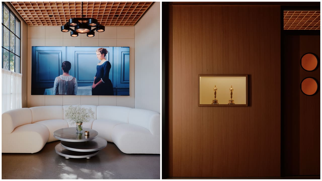
But the real design intelligence lies in how Studio Muka embedded cinematic references into architectural details. A series of circular apertures cut into oak doors and walls directly reference the twin lenses of Rolleiflex cameras, the medium-format workhorses that defined mid-century photojournalism and street photography. The gesture is subtle enough to avoid kitsch, yet specific enough to register with anyone versed in photographic equipment. Similarly, a custom pendant fixture in the reception area incorporates vintage Fresnel lenses, the optical instruments that shaped theatrical and film lighting for decades.
The furnishings carry equal narrative weight. A pair of low-slung Djinn chairs, originally designed by Olivier Mourgue in the 1960s, anchor the reception area. Their inclusion is no accident: the same chair model appeared in Stanley Kubrick's 2001: A Space Odyssey, and its presence here functions as a quiet nod to artificial intelligence themes that feel increasingly urgent. Nearby, a Metafora table lamp by Umberto Riva and a vintage Delta wall sconce by Sergio Mazza provide ambient lighting that skews warm rather than clinical.
The Screening Room as Spatial Core
At the center of the office sits a purpose-built screening room finished in a deep, enveloping blue. Studio Muka designed the seating themselves, drawing inspiration from Dieter Rams' reductive industrial aesthetic. The chairs are generously proportioned and fully reclining, automated for ease but detailed with a restraint that avoids the plush excess of commercial cinema seating. Wall sconces, formed from single sheets of folded metal and layered with subway grating, provide controlled illumination that does not compete with on-screen content.
The room represents a different kind of luxury than what typically defines high-end office design. Rather than prioritizing flexibility or multi-use functionality, it commits fully to a single purpose: the evaluation and appreciation of film. In an era when most corporate screening spaces double as conference rooms or presentation theaters, this singular focus is itself a statement about priorities.
Spatial Interventions and the Airport Metaphor
Studio Muka introduced an interior courtyard to open up circulation and bring natural light deeper into the floorplate. The move creates a sense of pause within the workspace, a moment of decompression that functions much like the narrative beats in a well-edited film. The courtyard also reinforces the airport adjacency, a location that founder Tom Quinn has likened to Rick's Café in Casablanca: a crossroads, a place of transience and possibility, a threshold between departure and arrival.
Custom rugs in jewel tones, saturated blues and deep greens, anchor individual work zones and provide acoustic softening in the open floor plan. The palette throughout leans warm and layered, a deliberate counterpoint to the bright whites and cool grays that dominate much contemporary office design. Bullnose edges on custom desks reduce impact on forearms during extended computer work, a small ergonomic gesture that signals attention to daily use rather than photographic appeal alone.
Furniture as Filmic Artifact
A breakout area features upholstered banquettes and tables arranged more like a European café than a corporate pantry. The space is designed for lingering, for the kind of extended conversation that benefits from soft seating and flattering light. Elsewhere, a pair of lounge chairs designed by Studio Muka and upholstered in Raf Simons bouclé fabric reference automotive design, a direct nod to Michael Mann's Ferrari, which Neon released in 2023. The chairs are chunky and postmodern in proportion, their forms borrowed from the sculptural language of car interiors rather than traditional furniture typologies.
In the main conference room, a vintage D120 sofa by Valeria Borsani and Alfredo Bonetti sits alongside Groovy chairs by Pierre Paulin, pieces that carry their own design-historical weight. A light box displaying a still from Portrait of a Lady on Fire functions as both artwork and illumination, collapsing the boundary between decoration and narrative content. Another light box in a separate conference area features imagery from Parasite, the film that brought Neon its first Academy Award for Best Picture.
Adaptive Reuse and Historical Continuity
The decision to retain and expose the building's structural framework rather than conceal it behind drywall reflects a broader ethos within adaptive reuse practice. By leaving the bones visible, Studio Muka allows the building's history to remain legible, a gesture that parallels Neon's own approach to film distribution: championing work that retains its cultural specificity rather than sanding down edges for broader appeal.
The studio's intervention is careful to distinguish between what is original and what is added. New millwork reads as clearly contemporary, even as its material palette, oak plywood and charred wood, nods to vernacular construction methods. The reception desk, fabricated in steel, charred wood, and subway grating, combines industrial materials in a composition that feels both utilitarian and sculptural. It is a piece that could function equally well in a gallery context, yet here it serves the prosaic purpose of greeting visitors and sorting mail.
Design as Collaborative Interpretation
Tom Quinn's decision to hire Studio Muka stemmed from an earlier residential project. He has described the duo's working method as possessing "the calmness of well-trained astronauts," a phrase that captures both their unflappable demeanor and their systematic approach to problem-solving. For a company that operates at the intersection of commerce and art, releasing films that often challenge conventional narrative structures or subject matter, the choice of designers who prioritize curiosity over formula makes strategic sense.
Mustafa and Kakhsaz have spoken about defaulting to cinematic reference points throughout the design process. Rather than viewing this as a limitation, they treated it as a generative constraint, a way to ensure that every material, fixture, and spatial gesture connected back to the act of storytelling. The result is an office that functions as a kind of built argument: that workplaces need not be generic, that cultural organizations benefit from environments that reflect their values, and that design intelligence can be deployed in the service of narrative rather than novelty alone.
The Office as Gesamtkunstwerk
What distinguishes this project from other branded environments is its refusal to traffic in obvious iconography. There are no oversized film posters, no neon signage spelling out the company name, no trophy cases displaying awards. Instead, the space operates through allusion and material specificity. The Djinn chairs, the Fresnel lenses, the Rolleiflex apertures: these are elements that reward close looking, that function on multiple registers depending on the viewer's frame of reference.
In this sense, Studio Muka has created a total work that mirrors the immersive quality of cinema itself. Just as a well-crafted film constructs a coherent world through the accumulation of visual, sonic, and narrative details, this office builds its identity through the layering of design decisions that all point in the same direction. The space does not announce its themes; it embodies them. And in doing so, it offers a model for how workplace design might move beyond the utilitarian or the merely aesthetic toward something more integrated, more intentional, and ultimately more memorable.
Credit: William Jess Laird
Save this story. A free account keeps your reading list and the 07:00 email in one place.
CREATE FREE ACCOUNT →SIGN IN