A Question of Cultural Translation
There's a recurring challenge in hospitality design: how do you signal cultural specificity without falling into the trap of pastiche? It's a question we've seen play out across dozens of projects, from pan-Asian fusion concepts draped in lanterns to taco bars clad in terracotta tile and fake adobe. The Kimchi, a quick-service Korean restaurant occupying a former bakery near Prague's Masaryk Railway Station, offers a different answer. Designed by local practice SOA architekti for a Korean husband-and-wife team, the project eschews the usual visual shorthand - no hanok timber screens, no calligraphy murals - in favor of a more distilled approach rooted in color theory, graphic composition, and operational transparency.
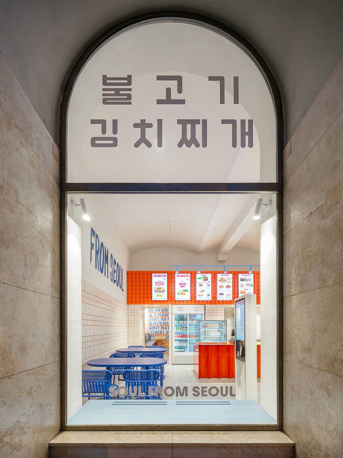
The design begins with a deliberate act of restraint. Rather than gut the existing footprint, SOA architekti preserved much of the original layout, dividing the narrow space into two interconnected zones: a back-of-house prep area and a front-facing service counter where final assembly happens in full view. This arrangement does double duty, streamlining workflow while making the cooking process legible to customers - a move that aligns with broader trends in fast-casual design, where transparency has become shorthand for quality and authenticity.
Palette as Parti
What immediately distinguishes the interior is its commitment to a triadic color scheme: red, white, and cobalt blue, drawn directly from the flag of South Korea. But rather than apply these hues as mere accent colors or superficial nods, SOA architekti uses them structurally, as organizing elements that define spatial zones and guide circulation. The scalloped service counter, rendered in glossy red, anchors the middle of the dining area and borrows its undulating profile from the taeguk - the central yin-yang emblem on the Korean flag, whose curves also inspired the wave motif that recurs in the exterior signage.
This kind of symbolic abstraction is far more effective than literal translation. The wave form becomes a flexible design language, one that can be scaled, rotated, and applied across surfaces without ever feeling forced. It's a tactic we've seen work well in projects like Studio Tack's interiors for The Dewberry in Charleston, where regional identity is evoked through material and proportion rather than overt iconography.
The menu board offers another example of this layered thinking. Clad in coral-toned basketweave tile with red grout, it reads as both functional object and graphic installation - a vertical plane that punctuates the otherwise horizontal flow of the space. Paired with cobalt seating from French manufacturer Petit Friture, the composition achieves a kind of chromatic tension that feels urban and energetic, evoking the saturated streetscapes of Seoul's Gangnam or Hongdae districts without resorting to neon signage or K-pop posters.
Zoning Through Materiality
As you move deeper into the restaurant, the palette softens and the spatial character shifts. A communal concrete table - sculptural, monolithic - sits flanked by black stools, creating a casual perch for solo diners or small groups. The concrete reads as industrial, but its massing and finish lend it a tectonic weight that anchors the back half of the room. Further along, a powder blue tiled banquette defines a quieter alcove, paired with simple wooden tables and chairs. Here, the shift from bold primary hues to pastel tones signals a change in tempo, offering a more intimate dining experience within the same compact footprint.
This kind of micro-zoning is a smart strategy for small-format hospitality projects, particularly in urban settings where square footage is at a premium. By varying material, color, and furniture typology, SOA architekti manages to create distinct atmospheres without relying on walls or partitions - an approach that maintains visual continuity while accommodating different modes of use.
Precedents and Parallels
The Kimchi's approach calls to mind a handful of recent projects that similarly navigate the tension between cultural specificity and contemporary design language. Tacoteca, a Mexican taqueria in Copenhagen by OEO Studio, uses a restrained palette of terracotta, brass, and white oak to evoke warmth and craft without resorting to folkloric imagery. Likewise, Kisume in Melbourne, designed by Pascale Gomes-McNabb, interprets Japanese izakaya culture through brutalist concrete forms and a muted material palette, prioritizing spatial experience over decorative motif.
What these projects share is a confidence in abstraction - a belief that cultural identity can be communicated through compositional logic, material choice, and spatial sequence rather than through literal representation. It's a more sophisticated mode of design, one that respects both the source culture and the intelligence of the diner.
The Rise of Korean Culinary Culture
It's worth situating The Kimchi within a broader cultural moment. Over the past decade, Korean cuisine has transitioned from niche offering to global staple, driven in part by the international success of K-pop, Korean cinema, and beauty brands. Dishes once unfamiliar to Western audiences - bibimbap, kimchi jjigae, tteokbokki - are now menu mainstays in cities from London to São Paulo. This shift has coincided with a wave of Korean restaurant openings, many of which lean heavily on fusion concepts or trend-driven aesthetics.
The Kimchi, by contrast, positions itself as an antidote to that impulse. Its menu focuses on traditional street food preparations, and its interior avoids the trappings of fusion hospitality design - the exposed Edison bulbs, the reclaimed wood, the Instagram-ready murals. Instead, it offers a more disciplined vision, one that treats Korean identity as a design problem worthy of serious formal investigation.
Transparency as Strategy
The decision to make food preparation visible is not merely aesthetic. In an era when diners increasingly value provenance, process, and ingredient integrity, transparency has become a competitive advantage. By situating the final assembly station at the front of house, SOA architekti turns cooking into performance, reinforcing the restaurant's claim to authenticity while also adding a layer of theater to the dining experience.
This tactic has precedents in fine dining - think of the open kitchens at Noma or Benu - but it's increasingly common in fast-casual contexts as well. Chipotle pioneered the assembly-line format in the early 2000s, and countless imitators have followed. What distinguishes The Kimchi's approach is the integration of this operational transparency with a coherent design language, so that the act of watching food being made becomes part of the spatial narrative rather than a utilitarian afterthought.
Material Honesty and Graphic Boldness
One of the most effective moves in the project is the way SOA architekti balances material honesty with graphic boldness. The concrete communal table, for instance, is left unfinished, its aggregate and formwork marks clearly visible. The wood furniture is simple, almost utilitarian. Yet these understated elements coexist comfortably with the high-gloss red counter and the vibrant tile work, creating a layered composition that feels both grounded and playful.
This kind of material juxtaposition is tricky to pull off. Too much restraint, and the space feels sterile; too much color, and it tips into kitsch. SOA architekti finds the right equilibrium by using the bold hues sparingly, as accents that punctuate a largely neutral base. The result is an interior that feels confident and considered, with enough visual interest to register as distinctive but not so much that it overwhelms the food or the diners.
Forward-Looking Implications
As Korean cuisine continues its ascent on the global stage, we're likely to see more projects grapple with the same design question The Kimchi addresses: how to honor cultural origins while speaking to a contemporary, cosmopolitan audience. The risk, as always, is that designers will default to the easiest visual shorthand - the expected motifs, the familiar materials, the safe choices. What SOA architekti demonstrates here is that there's another path, one that requires more thought but yields richer results.
The Kimchi's success lies not in what it includes, but in what it leaves out. By stripping away the decorative excess and focusing on a rigorous formal language derived from symbolic abstraction, the project achieves a kind of cultural specificity that feels earned rather than applied. It's a lesson worth noting for anyone working at the intersection of hospitality design and cultural identity: sometimes the most authentic gesture is the one that trusts the intelligence of form over the comfort of cliché.
Credit: Studio Flusser
Save this story. A free account keeps your reading list and the 07:00 email in one place.
CREATE FREE ACCOUNT →SIGN IN