When Books Demand Architecture
There exists a class of publication that resists conventional shelving. These are the volumes that arrive in crates rather than parcels, the monographs that require two hands and a cleared surface, the collector editions whose very existence challenges the infrastructure of domestic display. For this category of object, Marc Newson has designed what might be called furniture for paper: a bookstand that weighs 14 kilograms and makes no apology for its mass.
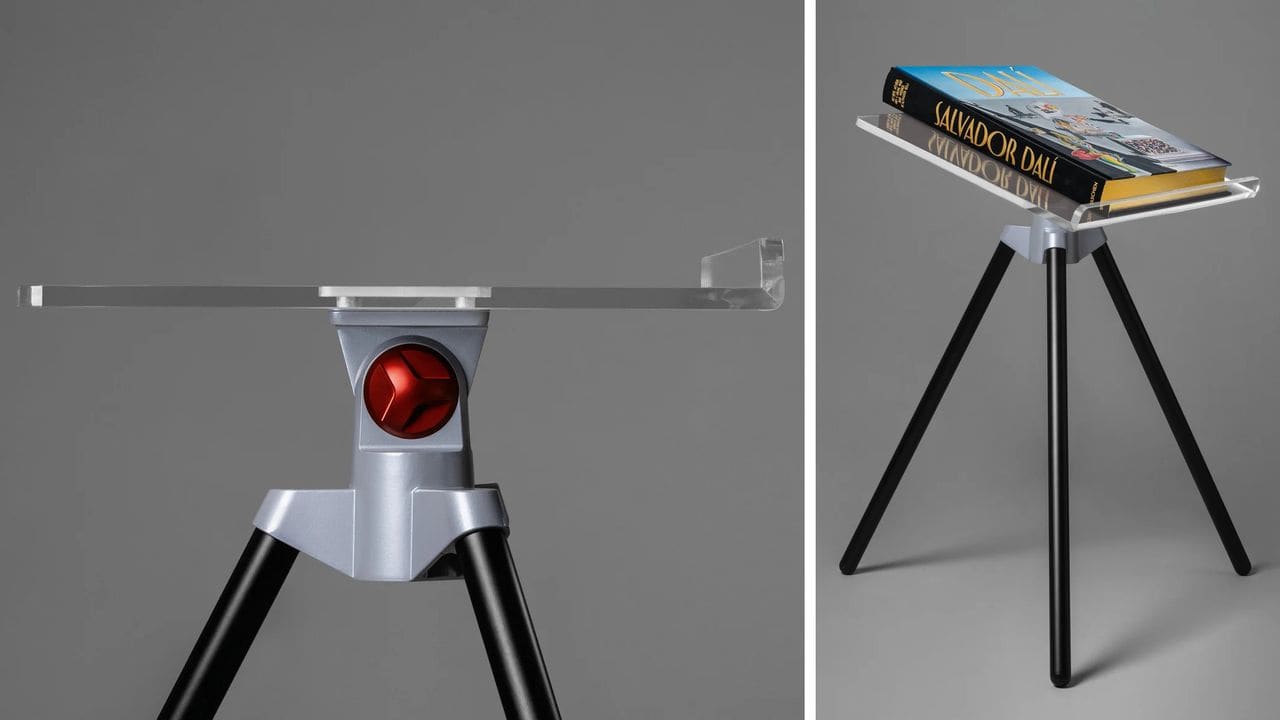
The piece, simply titled Bookstand, was conceived specifically for the portfolio of oversized titles that German publisher Taschen has built its reputation upon. Where most bookstands function as afterthoughts, folding contraptions tucked away when not in use, Newson's version plants itself in space with the confidence of a sculpture. The tripod base, forged from aluminium, establishes a stable footprint. Above it, a thick slab of bent acrylic glass serves as both cradle and display plane, transparent enough to disappear yet substantial enough to support the heft of large-format publishing.
What distinguishes this design from utilitarian alternatives is its acknowledgment that certain books are acquired not merely to be read but to be encountered. A collector's edition Ferrari catalogue raisonné or an XXL America's Cup monograph exists at the intersection of documentation and artifact. The stand Newson has created operates in the same territory, offering a dedicated stage rather than makeshift accommodation.
A Vocabulary of Materials
The material palette is narrow and deliberate: acrylic glass, aluminium, steel. The transparency of the acrylic ensures that the book remains the visual focus, while the metalwork provides the necessary structural logic. A bright red aluminium turner handles adjustability, introducing a single note of color that doubles as a functional cue. The choice recalls Newson's longstanding affinity for legible mechanics, where the means of operation are integrated into the visual language rather than concealed.
The tripod configuration is an efficient solution to the problem of stability without bulk. By distributing weight across three points rather than a broad base, the stand maintains a compact footprint even as it supports volumes that can exceed ten kilograms. The forged aluminium tripod head, topped with the bent acrylic plane, creates a cantilever effect that allows the book to float visually while remaining securely anchored.
This is not ornamental engineering. The stand is designed to hold weight, to resist tipping, to accommodate the awkward dimensions of publications that often measure 50 by 70 centimeters or more. The acrylic bend is calculated to cradle the spine and prevent forward slippage, a detail that becomes critical when dealing with volumes whose production values include embossing, metallic inks and reinforced binding.
A History of Collaboration
Newson's relationship with the publisher stretches back over multiple projects, each one exploring the boundary between packaging and design object. In 2018, he created an aluminium slipcase for a Ferrari catalogue, treating the protective housing as an extension of the book's content. For an America's Cup monograph, he designed both a sailcloth case for the XXL edition and a carbon-fiber stand for a limited run, materials that referenced the subject matter while serving archival functions.
The 2024 release of Newson's own monograph by the same publisher formalized a collaboration that had been unfolding incrementally for years. Earlier still, in 2010, a highly limited Lunar Rock Edition of Norman Mailer's MoonFire included not only a specimen of lunar meteorite but a case designed by Newson that evoked the geometry of a lunar module. Only twelve were produced, and they now circulate exclusively through auction houses and private sales.
These precedents establish a pattern: Newson approaches the problem of housing oversized or precious publications as an industrial design challenge, one that demands structural integrity, material coherence and a clear formal idea. The bookstand extends this logic into the realm of furniture, proposing that the display of certain volumes warrants dedicated infrastructure.
Display as Curatorial Act
At World Archi Design, we have long observed that the line between furniture and equipment can be surprisingly porous. A bookstand of this scale and specificity does not merely hold a book; it frames it, elevates it, and in doing so, transforms the act of display into a curatorial decision. The choice of which volume to place on the stand becomes a statement about value, about what merits this degree of attention within a domestic or studio environment.
This is particularly relevant for the kinds of publications the stand is designed to accommodate: art monographs, architecture surveys, fashion retrospectives, photography collections. These are not reference works to be consulted and returned to the shelf. They are visual documents intended for sustained viewing, often opened to a specific spread and left on display for days or weeks. The stand acknowledges this use pattern, providing a stable platform that can remain in place without monopolizing surface area.
The transparency of the acrylic is key to this function. Unlike opaque stands that create a visual barrier between book and environment, the clear plane allows the publication to remain the primary object of focus. The stand recedes, present but not intrusive, a piece of infrastructure that performs its role without demanding recognition.
Precedent and Context
The tradition of purpose-built book furniture has deep roots, from medieval lecterns to the adjustable reading stands of the Arts and Crafts movement. What has shifted in recent decades is the scale and nature of the publications requiring support. The rise of the luxury monograph, a format that treats the book as a limited-edition object, has created a new category of need. These are volumes produced in runs of a few hundred or a few thousand, often with bespoke materials, hand-binding or integrated elements like fabric samples or photographic prints.
Newson's stand responds to this contemporary condition, but it does so with a formal clarity that avoids historicist reference. There is no evocation of the lectern or the easel; instead, the design draws from the language of industrial equipment, tripods and camera mounts and laboratory stands. The result is a piece that feels native to the 21st century, suited to the aesthetics of the contemporary studio or residence without announcing a specific stylistic allegiance.
Other designers have approached the problem of oversized book display with varying degrees of success. Some solutions prioritize portability, resulting in lightweight stands that sacrifice stability. Others emphasize decorative presence, turning the stand into a sculptural element that competes with the book for attention. Newson's version navigates between these extremes, offering a design that is both substantial and restrained, functional and formally resolved.
The Economics of Display
Priced at £1,500, the bookstand occupies the same market tier as the collector editions it is designed to support. This is not an accessory for casual readers but a piece of equipment for those who have already committed to acquiring publications that can cost several thousand pounds. In this context, the stand functions as part of an ecosystem, a necessary component for those building collections that extend beyond conventional storage and display methods.
The investment also reflects the material and manufacturing realities of producing a piece that must support significant weight while maintaining visual lightness. Forged aluminium tripod heads, precision-bent acrylic and powder-coated steel components require tooling and fabrication processes that do not scale to mass production. The result is a limited-run object that shares more in common with design furniture than with mass-market accessories.
For collectors of Newson's work, the stand represents an accessible entry point relative to his limited-edition designs, which often reach five or six figures at auction. For those focused on the publisher's output, it offers a solution to a practical problem: how to display volumes that are too large for conventional shelving and too valuable to stack horizontally.
A Functional Monument
What Newson has created is less a bookstand than a plinth, a piece of furniture that elevates its subject both literally and conceptually. The decision to make the stand substantial rather than collapsible, permanent rather than portable, signals a particular philosophy about the role of books in physical space. These are not objects to be hidden away but artifacts to be presented, examined and lived with.
The red aluminium turner, the only element of color in an otherwise monochromatic composition, serves as a reminder that this is a tool as much as a display piece. Adjustability is not an afterthought but a central feature, allowing the angle of the book to be modified for optimal viewing or to accommodate volumes of varying thickness. The mechanism is exposed, legible, an honest expression of function that aligns with Newson's broader design ethos.
In an era when digital publishing has made the physical book an increasingly deliberate choice, objects like this stand underscore the enduring appeal of the printed page as material culture. The books that require such infrastructure are not competing with screens; they are occupying a different category entirely, one where tactile presence, production quality and the ritual of display remain central to their value. Newson's bookstand, in its quiet way, is an argument for that persistence.
Credit: Taschen
Save this story. A free account keeps your reading list and the 07:00 email in one place.
CREATE FREE ACCOUNT →SIGN IN