When the Site Writes Half the Brief
There's a particular kind of design constraint that feels less like limitation and more like provocation. In Bratislava's Sihot district, where the Danube branches and the Carpathian foothills begin their climb, a family home sits on land that floods, faces neighbours on two sides, and came with a building permit from 2009 that locked in footprint, height, and placement before anyone had drawn a line.
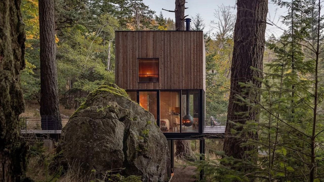
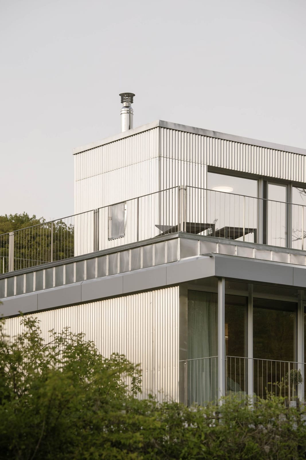
Cechvala Architects took those givens and turned them into a composition of three stacked volumes, each responding to a different set of demands. The base is solid, anchoring the structure above the flood plain. The middle level opens entirely to glass, framing views toward the river. The top volume pulls back, creating a roof terrace that hovers over the landscape. The result is a house that reads as both fortress and pavilion, depending on which side you approach from.
What makes the project compelling isn't just how it negotiates site constraints. It's the way the studio embedded flexibility into the bones of the building, designing a home that can reconfigure itself as lives change, without demolition or major surgery.
A Cladding That Breathes with Light
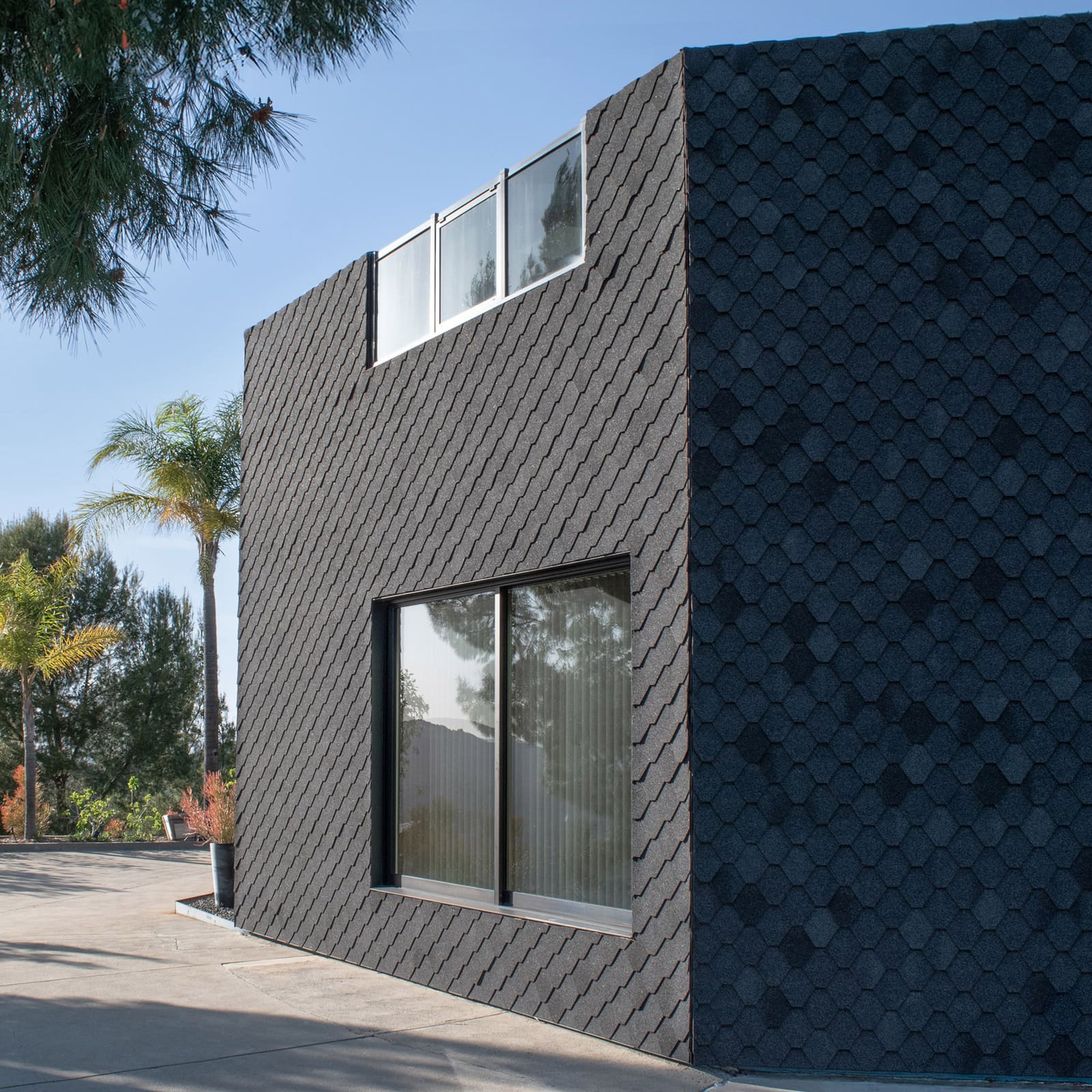
The choice of untreated corrugated aluminium for the facade was driven by pragmatism. Flood zones demand materials that can endure repeated soaking without rot or rust. But the decision also carries aesthetic weight. Raw aluminium doesn't sit inert on a building. It absorbs and reflects the colour temperature of its surroundings, shifting throughout the day as light moves across the Danube and filters through the trees near the horticultural centre next door.
This is a material logic we've seen gain traction in contexts where architects want durability without the maintenance burden of timber or the thermal mass of masonry. Corrugation adds a textural grain that catches shadow, breaking down the mass of the volumes into something more rhythmic. It's a facade that doesn't announce itself loudly but refuses to disappear.
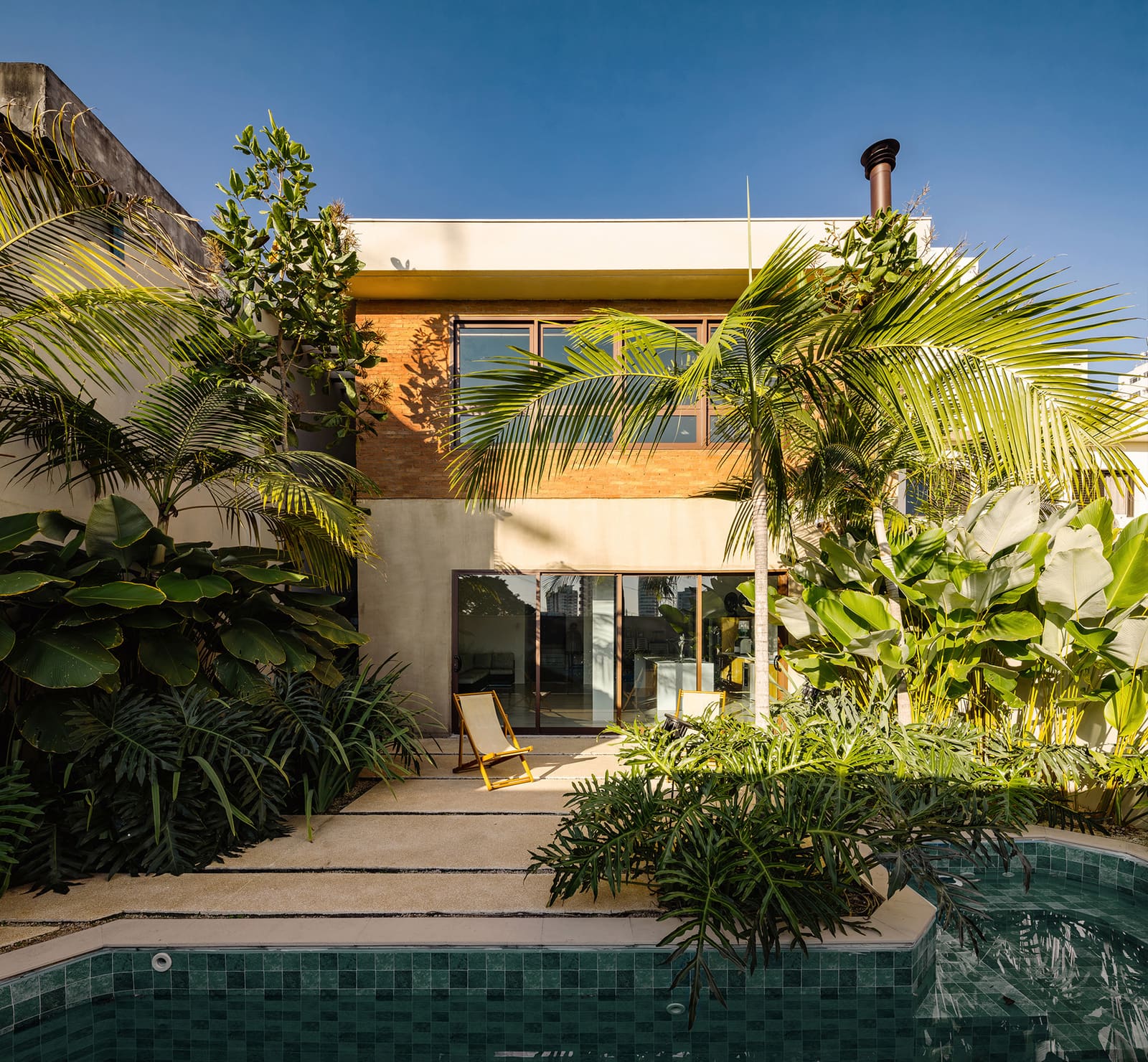
The elevations facing neighbouring properties remain largely opaque, preserving privacy. The river-facing sides, by contrast, open up with floor-to-ceiling glazing, dissolving the boundary between interior and landscape. It's a spatial strategy that privileges outlook over symmetry, orienting the house outward where it can and closing down where it must.
The Staircase as Vertical Anchor
At the centre of the plan, a steel staircase zigzags through a full-height concrete stairwell. It's finished in dark steel, almost black, with thin vertical balustrades that keep sightlines open. A cylindrical woodburner in the same finish sits nearby, echoing the tectonic language of the stair.
The stairwell functions as both circulation spine and light well. A skylight at the top draws daylight down through all three levels, animating the concrete surfaces and casting shifting patterns as the sun moves. This kind of vertical void is a classic move in narrow or stacked-volume houses, but the execution here is unusually restrained. There's no sculptural flourish, no cantilevers for effect. The stair simply does its job, connecting floors while pulling light into the core of the house.
A Grid That Allows the House to Evolve
The internal layout is organised around a modular structural grid. Columns are positioned so that partition walls can be moved without touching the structure. According to Cechvala Architects, this allows occupants to reconfigure rooms over time, adapting the house to different life stages without requiring major interventions.
It's a concept that has precedent in Japanese metabolist thinking and more recently in the work of studios like Lacaton & Vassal, who advocate for generous, indeterminate space that can be subdivided or opened as needed. Here, the approach is less about surplus volume and more about strategic placement of load-bearing elements. The ground floor holds utility spaces, a garage, and a fitness area. The first floor contains open-plan living and a bedroom, with exposed concrete ceilings and pale timber flooring. Built-in furniture pieces anchor certain zones, but the overall plan remains loose enough to accommodate change.
The upper volume, smaller in footprint, opens onto a roof terrace. This is where the house gives back the ground it occupies, creating an outdoor room that overlooks the river and the mountains beyond.
Passive Strategies and Textile Screens
The cantilevered terraces on the first and second floors are designed to provide passive solar shading. In summer, they block high-angle sunlight from overheating the interior. In winter, when the sun sits lower, light penetrates deeper into the rooms, reducing heating demand. It's a calibrated response to orientation and climate, the kind of detail that doesn't announce itself but quietly improves comfort year-round.
Textile screens around the terraces can be lowered when additional shade or privacy is needed. This introduces a layer of adjustability, allowing occupants to fine-tune their relationship to the exterior depending on season, time of day, or mood. It's a low-tech solution that complements the more permanent architectural gestures, acknowledging that buildings are inhabited, not just occupied.
Aging Architecture and Inhabitation
The central argument of the project, as articulated by the studio, is that the house can age together with its occupants. This is more than a metaphor. By designing a structure that accommodates internal reconfiguration without requiring structural overhaul, the architects are proposing a model of residential architecture that resists obsolescence.
We see this approach gaining traction in contexts where housing stock is expected to serve multiple generations, where the nuclear family model no longer dominates, and where environmental concerns make demolition and rebuild increasingly untenable. The RDH house doesn't solve all those challenges, but it engages with them seriously. It treats flexibility not as a marketing slogan but as a spatial and structural reality, embedded in the grid and the plan.
Material Palette and Interior Atmosphere
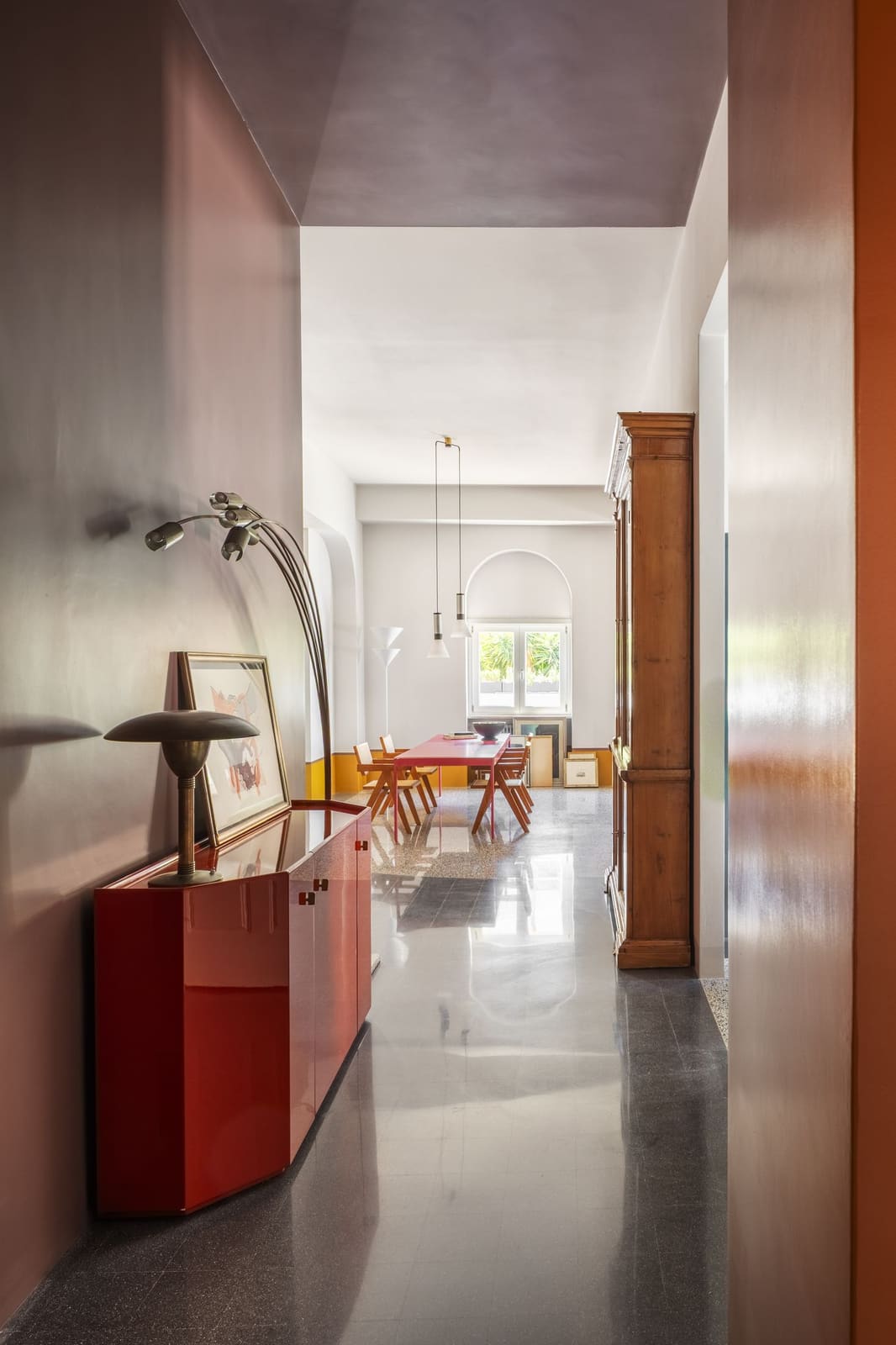
Inside, the material palette is restrained. Exposed concrete ceilings pair with pale timber flooring, creating a neutral backdrop that doesn't compete with the views. Built-in furniture in the same timber adds warmth without clutter. The effect is calm, almost austere, but not cold. The dark steel of the staircase and woodburner provides punctuation, grounding the lighter surfaces.
This kind of restraint is characteristic of a certain strain of Central European residential architecture, where material honesty and spatial clarity are valued over ornament or colour. It's an aesthetic that ages well, partly because it doesn't rely on trends, partly because the materials themselves improve with wear.
A House That Responds, Not Imposes
What distinguishes this project from much contemporary residential work is its attentiveness to context without resorting to mimicry. The aluminium cladding doesn't try to blend into the landscape or reference vernacular forms. The stacked volumes don't defer to neighbouring buildings. Instead, the house establishes its own presence while remaining porous to the conditions around it: the river, the mountains, the flood risk, the need for privacy, the desire for light.
It's a kind of architecture that responds rather than imposes, that builds in the capacity for change without predetermining what that change will look like. In a discipline often preoccupied with fixed form and authorial control, that's a stance worth noting.
Credit: Alex Shoots Buildings
Save this story. A free account keeps your reading list and the 07:00 email in one place.
CREATE FREE ACCOUNT →SIGN IN