The Paradox of the Perennial Non-Trend
Every few seasons, the design press announces the death of the all-white interior. Yet walk through any thoughtfully designed home—from a Copenhagen apartment to a Los Angeles hillside residence—and you'll find white walls anchoring the spatial experience. At World Archi Design, we've been tracking this phenomenon not as cyclical nostalgia, but as evidence of something more fundamental: white functions less as aesthetic choice and more as architectural infrastructure.
The question isn't whether white is "in." It's why, despite decades of maximalist backlash and chromatic experimentation, designers keep returning to it as foundational logic.
Light as Material—Not Metaphor
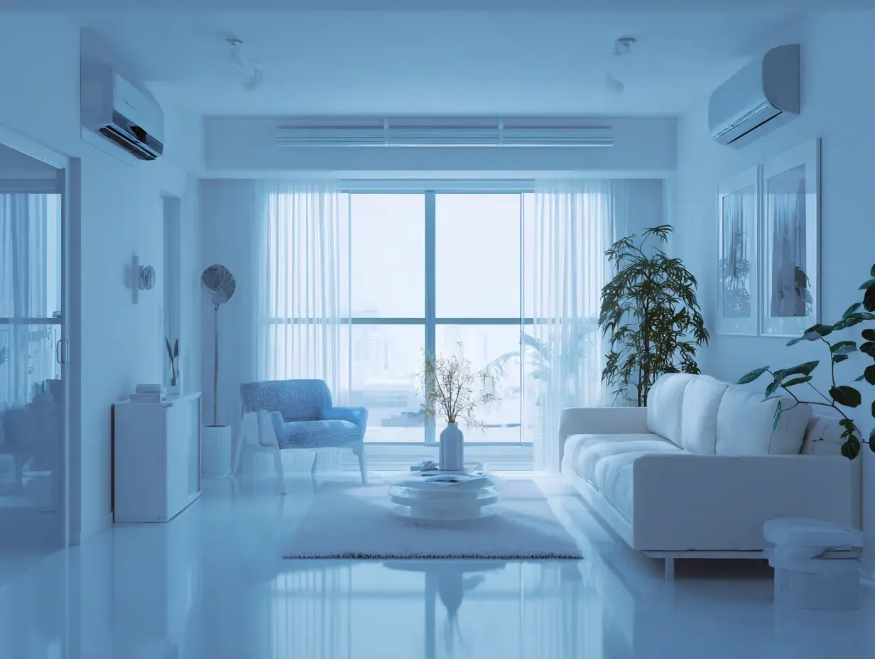
White surfaces operate on the principle of reflectance. Lighter finishes redirect natural light deeper into a volume, effectively amplifying daylight penetration without altering fenestration. This is particularly critical in urban typologies—compact apartments, narrow rowhouses, spaces with limited south-facing exposure. Where architects cannot add windows, they manipulate surface albedo.
The effect is measurable. A room painted in high-LRV (Light Reflectance Value) white can appear 20–30% larger than the same volume in a darker hue, purely through perceived spatial expansion. This isn't subjective preference—it's optical physics applied to domestic architecture.
But the spatial advantage extends beyond luminosity. White walls function as neutral planes, allowing material differentiation and architectural articulation to emerge without chromatic interference. In gallery design, this principle is axiomatic: neutral backdrops foreground the object. The same logic applies to residential interiors, where furniture, art, and tectonic detail become legible against a non-competing field.
Texture as Spatial Depth
The failure mode of white interiors is flatness—what happens when surface is treated as finish rather than field. The most compelling white spaces we've documented rely on material variance to generate depth. Venetian plaster reads differently than matte latex. Linen upholstery absorbs light where glazed ceramic reflects it. Reclaimed oak introduces grain and shadow that wouldn't register in a polychromatic scheme.
This is where contemporary white interiors diverge from mid-century Modernist austerity. Designers like Axel Vervoordt and Vincent Van Duysen—both known for monochromatic palettes—build complexity through material layering: lime-washed walls, raw linen, honed travertine, unfinished timber. The palette is achromatic, but the tactile register is rich.
Without texture, white becomes institutional. With it, the space acquires what architects call "material honesty"—each surface declares its own physical properties rather than hiding behind color.
The Taxonomy of White
There is no universal white. Paint manufacturers catalog dozens of formulations precisely because undertone and LRV shift dramatically under varying light conditions. Benjamin Moore's White Dove leans warm with a slight gray base—ideal for north-facing rooms where cooler daylight dominates. Sherwin-Williams' Pure White skews cleaner and crisper, suited to south-facing volumes with abundant natural light.
The difference is subtle on a two-inch sample but glaring across a 12-foot wall. Designers test multiple shades in situ, observing how each responds to morning versus afternoon light, artificial versus natural sources. This iterative process acknowledges that white is not a single color but a spectrum of neutrals, each with distinct spatial implications.
In practice, many interiors employ multiple whites—one for walls, another for trim, a third for ceilings—to articulate architectural elements through tonal variation rather than chromatic contrast.
White as Restraint Strategy in an Overstimulated Era
The resurgence of white interiors in 2026 aligns with a broader cultural shift toward sensory reduction. After years of maximalist interiors—saturated color, dense pattern, baroque layering—there's a countervailing impulse toward spatial calm. White supports this by minimizing visual noise.
But restraint is not sterility. The most effective white interiors incorporate warmth through:
- Natural wood elements (oak, walnut, teak) that introduce grain and tonal variation
- Vintage furnishings that break the uniformity of contemporary production
- Woven textiles (jute, sisal, linen) that add tactile complexity
- Biophilic elements—potted plants, cut branches—that introduce organic irregularity
- Layered lighting on dimmers, allowing users to modulate ambiance throughout the day
These additions prevent the clinical effect often associated with monochrome schemes. The goal is not to eliminate color entirely but to foreground material and form.
Precedents in Modernist and Vernacular Traditions
The all-white interior has deep roots in both high Modernism and vernacular architecture. Le Corbusier's Villa Savoye (1931) employed white stucco as part of his "Five Points of Architecture," using color absence to emphasize pure geometric form. Meanwhile, Mediterranean and Cycladic vernacular—think Santorini, Mykonos—has relied on whitewashed lime plaster for centuries, both for thermal performance (reflecting solar heat) and cultural continuity.
Contemporary designers synthesize these lineages. John Pawson's minimalist interiors echo Corbusian restraint while incorporating the textural warmth of vernacular lime wash. The result is a hybrid language—Modernist in spatial clarity, vernacular in material humility.
Why White Endures Beyond Trend Cycles
Trends in interior color move in roughly seven-year cycles. Jewel tones surge, then recede. Earth palettes dominate, then fade. Yet white remains constant—not because it's fashionable, but because it's infrastructural. It's the spatial equivalent of a well-designed grid: invisible when done right, but essential to everything built on top of it.
The longevity of white interiors stems from their adaptability. A white-walled room can accommodate shifting furniture, rotating art, evolving taste. The backdrop remains neutral; the foreground is mutable. This flexibility is particularly valuable in an era of rapid stylistic turnover, where homeowners want spatial longevity without aesthetic rigidity.
At World Archi Design, we've observed that the most enduring interiors are rarely those that chase trend—they're the ones that establish a clear spatial framework and allow inhabitation to layer meaning over time. White provides that framework. Not by demanding attention, but by making space for everything else to emerge.
Save this story. A free account keeps your reading list and the 07:00 email in one place.
CREATE FREE ACCOUNT →SIGN IN