The Challenge of Continuity
Across Australia's older suburbs, Federation homes present a recurring question: how do you extend the life of a century-old dwelling without erasing what made it valuable in the first place? Too often, the answer involves surface-level nods to period detail while the interior becomes a series of disconnected rooms. The project we're examining in Mosman takes a different approach, one rooted in material conversation rather than stylistic mimicry.
The original structure, a Federation Arts and Crafts residence overlooking Sydney Harbour, carried the hallmarks of its era: arched entrances, white timber shingles on the verandas, external red brickwork that anchored it to the ground. The brief called for a three-level extension that could accommodate contemporary family life without severing ties to the home's architectural lineage. TKD Architects handled the structural expansion, while Juliette Arent and Sarah-Jane Pyke were brought in to orchestrate layout, finishes, joinery, and furnishings.
Curves as Structural Memory
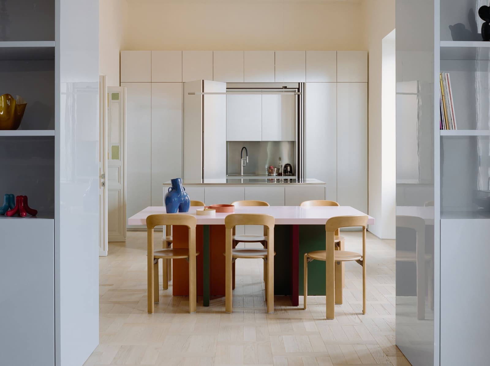
Rather than replicate existing arches, the interior design introduces curves as a recurring motif, one that echoes the home's original geometry without copying it directly. The kitchen island serves as the clearest example: its convex base is carved from Pink and Rose White Tiberio marble, a soft, warm stone that contrasts with the cooler Calacatta Vagili countertop above. A bronze kicker separates the two, catching light and providing visual relief. The form is bold, yet it reads as a natural extension of the home's existing vocabulary.
Elsewhere, arches appear in more subtle forms. In the parents' retreat, they frame a freestanding oval bath. In the dressing room, the curve is inverted and translated into a woven-raffia pattern across wardrobe doors. Underfoot in the powder room, tumbled Carrara mosaic is inlaid with an arched pattern. Each iteration reinforces a formal language without becoming repetitive. The curve becomes a connective thread, linking spaces that might otherwise feel disparate.
A Palette That Breathes
Colour is deployed with precision. The living areas move through a sequence of terracotta, antique rose, light turquoise, and pale sky blue, applied across walls, joinery, and stone surfaces. It's a spectrum that could easily tip into chaos, but the tonal relationships are carefully calibrated. The terracotta of the loggia-like dining terrace directly references the home's external brickwork, blurring the threshold between interior and garden. The turquoise and rose tones, meanwhile, provide coolness and warmth in measured doses, preventing any single hue from dominating.
This approach has precedent in the work of mid-century Italian architects who understood colour as a spatial tool, not just decoration. Carlo Scarpa, whose Monk chairs appear in this home, used pigmented stucco and terrazzo to modulate light and mood. Here, the palette performs a similar function: it softens the transition between old and new, making the extension feel less like an addition and more like a natural evolution.
Texture as Tactile Narrative
The bathrooms demonstrate a commitment to slow-crafted detail. Taking cues from the white timber shingles that clad the original verandas, the design layers texture through finger tiles interspersed with fine brass ribbons, reeded glass set into arched doors, and vertically scribed stone hand-chipped to catch shadow. In the powder room, a Turquoise Green granite pedestal rises from the mosaic floor, its accordion bands softened entirely by hand. This level of detail requires collaboration with artisans who understand how material behavior changes under different finishes.
Hand-chipping stone, for instance, is a labor-intensive process that yields a surface capable of holding light differently than a honed or polished finish. The scribed vertical lines create micro-shadows that shift throughout the day, activating what would otherwise be a static surface. It's a technique more commonly associated with historic restoration than new construction, yet it proves effective here in bridging temporal gaps.
Curation as Spatial Anchor
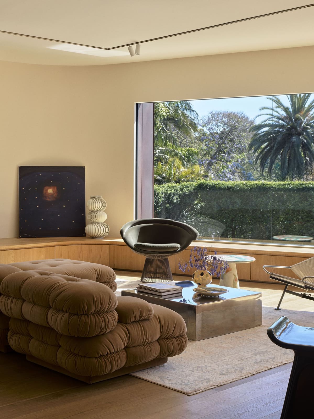
The furnishings are selected not for novelty but for their ability to ground the home's more expressive gestures. Vintage Scarpa Monk chairs sit alongside a Le Corbusier Lampe de Marseille. An Apparatus Cloud pendant hovers above the music room. Mid-century pieces are interspersed with contemporary selections like the Lowell sofa by Hessentia. The mix is eclectic but not arbitrary; each piece is chosen for its formal relationship to the space it occupies.
This approach resists the current trend toward homogenous interiors dominated by a single aesthetic or period. Instead, it reflects a more layered sensibility, one that acknowledges the home as an accumulation of choices made over time. The result feels lived-in rather than staged, a quality that's increasingly rare in high-end residential work.
Material as Mediator
The marble selections deserve closer attention. Pink and Rose White Tiberio, used for the kitchen island's base, is a relatively uncommon choice outside of Europe. Its warm, veined surface introduces a softness that counterbalances the cooler Calacatta Vagili overhead. The juxtaposition of two marbles within a single element is a move borrowed from classical Italian architecture, where contrasting stones were used to articulate hierarchy and structure.
In the powder room, the Turquoise Green granite pedestal represents a different strategy. Rather than relying on veining or pattern, the material's interest comes from its uniform color and the hand-worked accordion banding. It's a sculptural gesture that recalls the work of contemporary Italian designers like Martino Gamper, who treat stone as a moldable medium rather than a precious surface.
Federation Roots, Contemporary Reach
What distinguishes this project from other heritage renovations is its refusal to treat the original structure as either a museum piece or a blank canvas. The Federation elements are neither preserved in aspic nor erased. Instead, they become part of an ongoing conversation. The arches, the shingles, the brickwork, all inform the new work without dictating it. The result is a home that acknowledges its past while remaining firmly rooted in the present.
This balance is difficult to achieve. Too much deference to history produces interiors that feel frozen; too little produces disconnection. The success here lies in the material choices and formal gestures that serve as mediators between old and new. The curves, the palette, the hand-worked textures, all function as translation devices, allowing disparate elements to coexist without friction.
Lessons in Restraint
Perhaps the most instructive aspect of this project is what it doesn't do. It doesn't rely on grand gestures or dramatic contrasts. It doesn't announce its interventions with jarring materials or forms. Instead, it builds quietly, layer by layer, until the cumulative effect becomes undeniable. The home feels generous and calm, qualities that are often at odds in contemporary residential design.
This restraint extends to the spatial planning. The three-level extension provides the necessary functional space without overwhelming the original structure. Rooms flow into one another without forced connections. Natural light is filtered through reeded glass and controlled by the orientation of openings. The result is a home that breathes, that allows for both gathering and retreat.
At World Archi Design, we've been tracking the resurgence of interest in heritage adaptation, particularly in markets like Sydney where land values make demolition and rebuild the default option. Projects like this one demonstrate that there's another path, one that requires more patience and a deeper understanding of material behavior, but that ultimately produces spaces with greater longevity and character. The question isn't whether to preserve or demolish, but how to build continuity across time without resorting to pastiche. This Mosman residence offers one compelling answer.
Photo: Anson Smart / Arent&Pyke
Save this story. A free account keeps your reading list and the 07:00 email in one place.
CREATE FREE ACCOUNT →SIGN IN