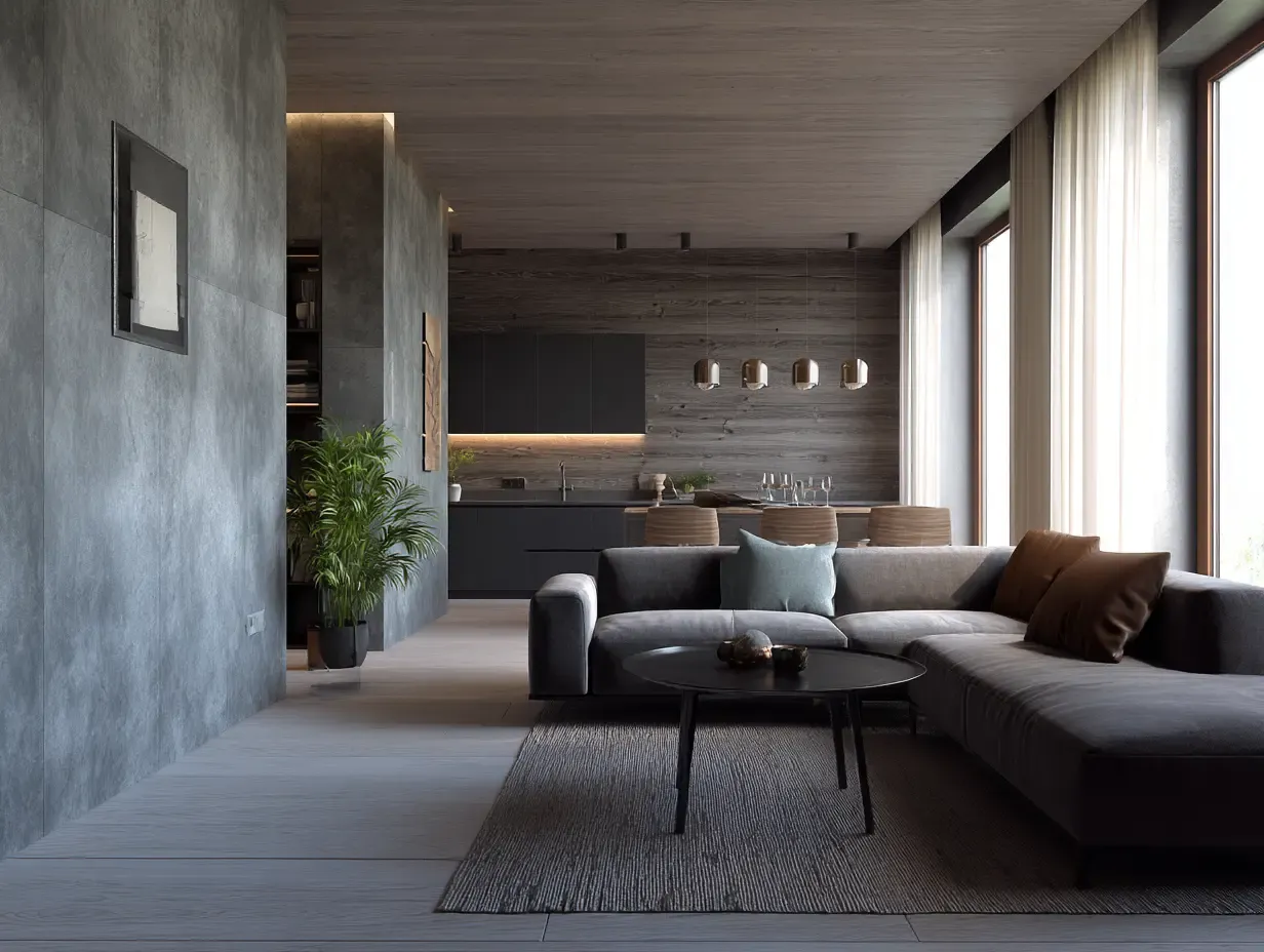
The Problem Isn't What You Own—It's What You Display
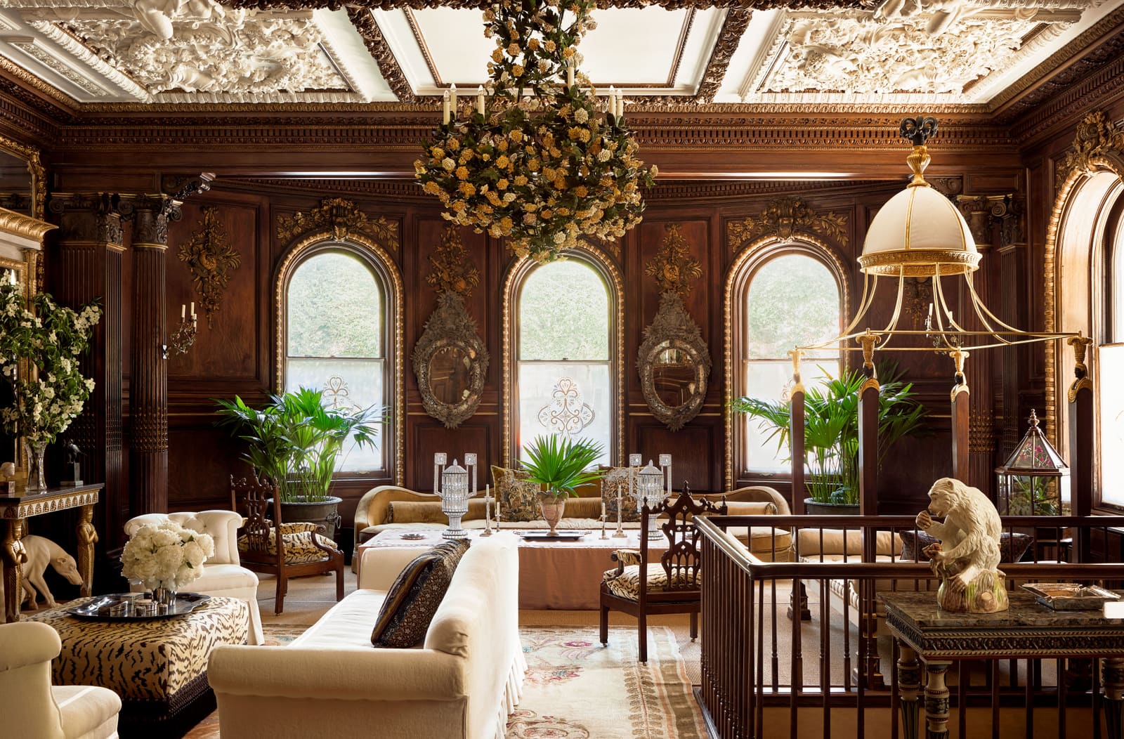
There's a recurring experience in contemporary North American interiors: you walk into a well-appointed living room, note the quality of the furnishings, and still feel a low-grade hum of visual noise. The room is full—not cluttered, exactly, but insistent. By contrast, homes shaped by the soft minimalism movement now prevalent across Belgium, Scandinavia, and parts of Northern Italy produce an opposite effect: the space seems to expand around you. At World Archi Design, we've been tracking this divergence for the past two years, and the gap is widening. The question isn't whether European design has something to teach the rest of the world—it's whether we're willing to unlearn the reflex to fill every surface.
Negative Space as Structural Element
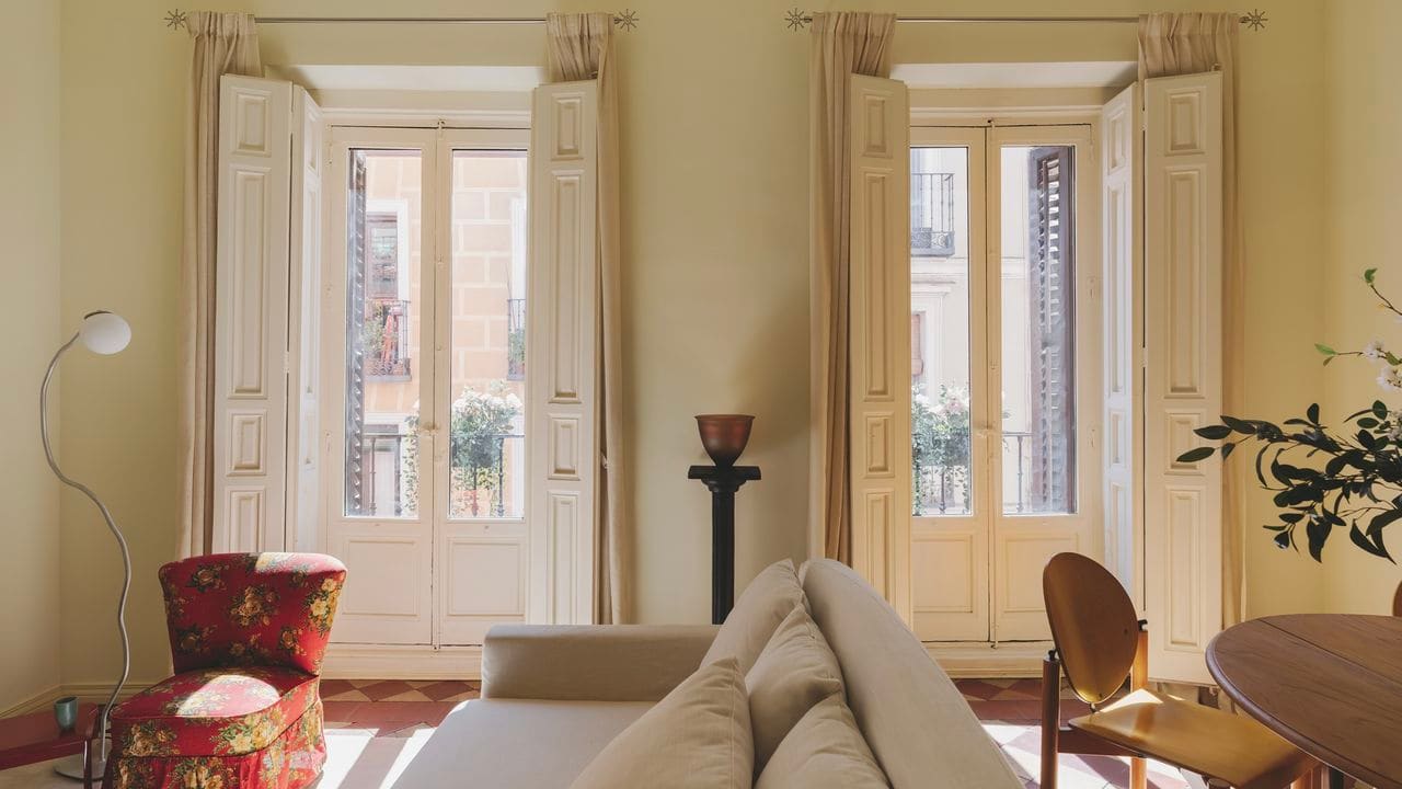
In the Scandinavian and Belgian vernacular, walls are not assumed to require decoration. Shelves are not opportunities for maximal display. This isn't asceticism—it's spatial strategy. Negative space functions as a compositional anchor, allowing the eye to rest and the mind to decompress. The principle borrows from Japanese ma (間), but manifests through a distinctly European material palette: rough plaster, wide-plank oak, matte-finished ceramics.
The practical application: remove approximately one-third of the objects currently occupying your horizontal surfaces. What remains should be repositioned with intentional gaps between items. The emptiness isn't absence—it's breathing room. This editing process mirrors the curatorial rigor seen in studios like Vincent Van Duysen's residential work, where every object earns its place through restraint rather than accumulation.
The Chromatic Shift from Brilliant White to Warm Bone
American modernism has long favored high-reflectance whites—Benjamin Moore's "Chantilly Lace," Farrow & Ball's "All White"—as shorthand for cleanliness and spatial volume. European palettes, particularly in 2020s iterations of soft minimalism, have moved toward what might be called muted earthiness: tones that absorb rather than bounce light. Think Bauwerk Colour's "Calce" or Ressource's "Terre d'Ombre Naturelle"—colors with enough pigment density to feel grounded, even in small rooms.
This isn't a rejection of brightness; it's a recalibration of how brightness is experienced. Warm neutrals—bone, clay, greige—create what lighting designers call a "low-contrast environment," where transitions between surfaces are gradual rather than abrupt. The result is a room that feels optically quieter, especially during months of diminished daylight. If full repainting feels premature, introduce these tones through low-commitment textiles: linen drapery in natural flax, wool throws in undyed oatmeal, lampshades in unbleached parchment.
Atmospheric Layering: The Death of the Overhead Fixture
One of the starkest differences between North American and European residential lighting is the role of the central ceiling fixture. In many U.S. homes, a single overhead source provides the majority of illumination—what designers call "the big light." European practice, by contrast, favors atmospheric layering: three to four independent light sources per room, each operating at lower lux levels but collectively producing a soft, adaptable glow.
This approach is less about aesthetics than circadian alignment. Multiple warm-toned sources (bulbs in the 2700K range, not the institutional 4000K common in North American builder-grade fixtures) mimic the dynamic quality of natural light as it shifts from morning to dusk. The spatial effect is intimacy without dimness—a quality visible in the residential interiors of Belgian architect Hans Verstuyft, where table lamps, wall sconces, and recessed cove lighting work in concert to eliminate harsh shadows.
The immediate fix: add a single warm-spectrum table lamp to the corner of a room currently dominated by overhead glare. The contrast will be immediate.
Tactile Depth Over Visual Statement
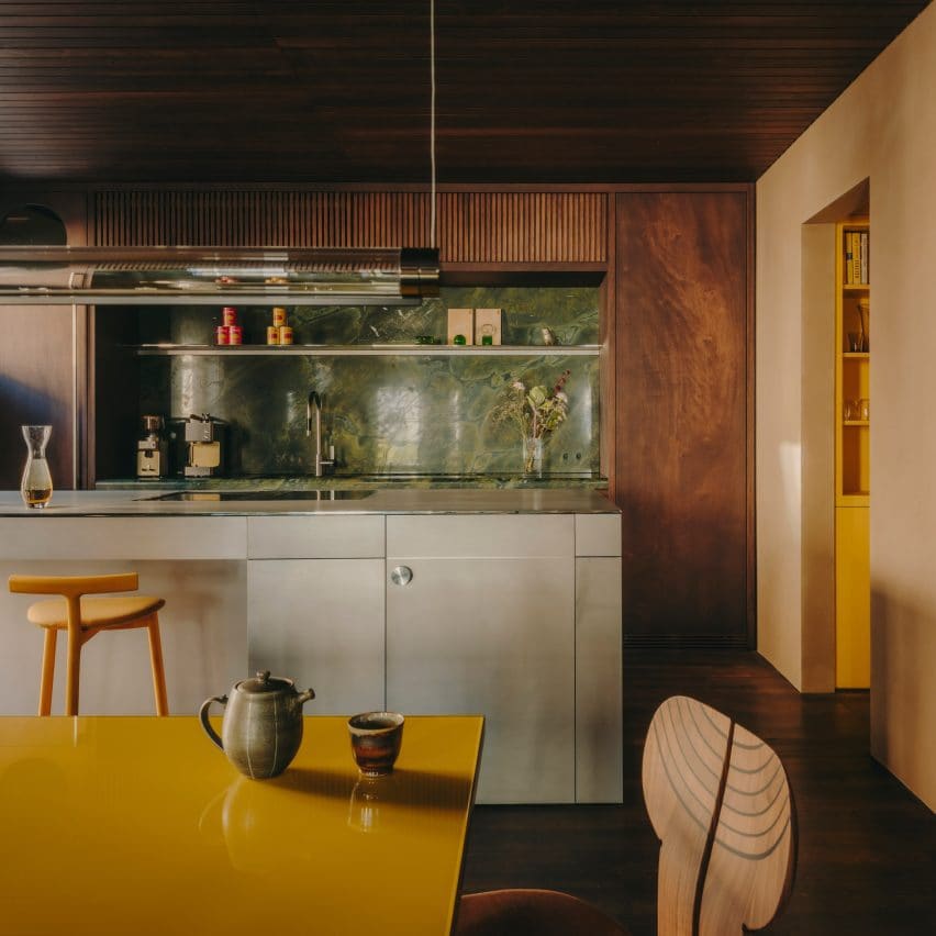
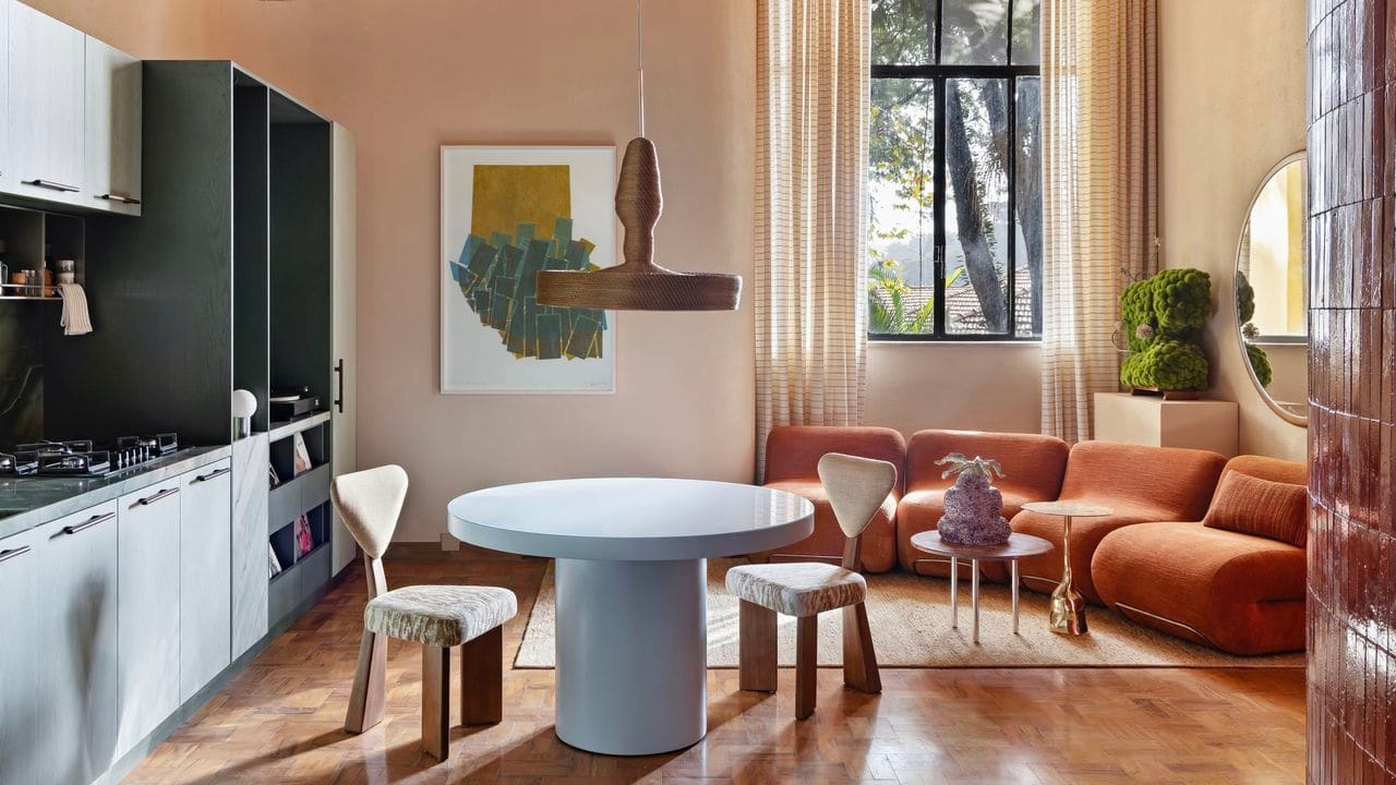
Where some design cultures privilege the "statement piece"—the sculptural chair, the accent wall, the conversation-starting light fixture—European soft minimalism inverts the hierarchy. Priority goes to tactile depth: materials that reward physical interaction rather than Instagram documentation. Unfinished oak with visible grain. Tumbled limestone with irregular edges. Heavy linen with a natural slub. Matte-glazed stoneware that absorbs fingerprints rather than repelling them.
This is biophilic design at the material scale—not through literal plants or water features, but through surfaces that register as organic rather than synthetic. The approach has precedent in the wabi-sabi interiors of Axel Vervoordt, but also in the more restrained work of contemporary Scandinavian studios like Norm Architects, where every finish is chosen for its ability to age visibly and beautifully.
A single substitution can shift the tenor of a room: replace one high-gloss or high-contrast object (a lacquered tray, a polished metal vase) with something materially complex—a rough-hewn wooden bowl, a hand-thrown ceramic vessel with an uneven rim.
The Lived-In Aesthetic as Design Philosophy
Perhaps the most culturally loaded difference is the European tolerance—embrace, even—of the lived-in interior. This is not disorder; it's a rejection of the permanently photo-ready room. A stack of books left on a side table. A chair pulled slightly away from its "correct" position. A blanket draped rather than folded. These micro-imperfections signal that the space is inhabited, not staged.
The philosophy aligns with adaptive reuse principles in architecture: a building that shows its history—exposed brick, patched plaster, layered paint—often feels more emotionally resonant than one that has been over-restored. The domestic equivalent is a room that tolerates evidence of daily life. It's the difference between a showroom and a home.
The practice runs counter to the algorithmic pressure of social media interiors, where every surface must be curated for maximum visual impact. But as we've observed across the European projects we've covered this year, the most psychologically comfortable spaces are often those that resist that pressure. Perfection, it turns out, is exhausting to live with.
The 2026 Mandate: Edit, Soften, Breathe
This movement toward visual quietness isn't a trend in the cyclical sense—it's a corrective response to a decade of sensory overload. Whether you're working within a New York loft or a Copenhagen apartment, the principles remain consistent: reduce surface density, shift the color temperature, layer the light, prioritize material over spectacle, and allow the room to show signs of use. The goal isn't to replicate a specific European aesthetic, but to internalize the spatial logic that makes those interiors feel so restorative. At World Archi Design, we'd argue that the real luxury in 2026 isn't more—it's less, but better. A room that breathes is a room you can actually live in.
Save this story. A free account keeps your reading list and the 07:00 email in one place.
CREATE FREE ACCOUNT →SIGN IN