The Question of Presence Without Mass
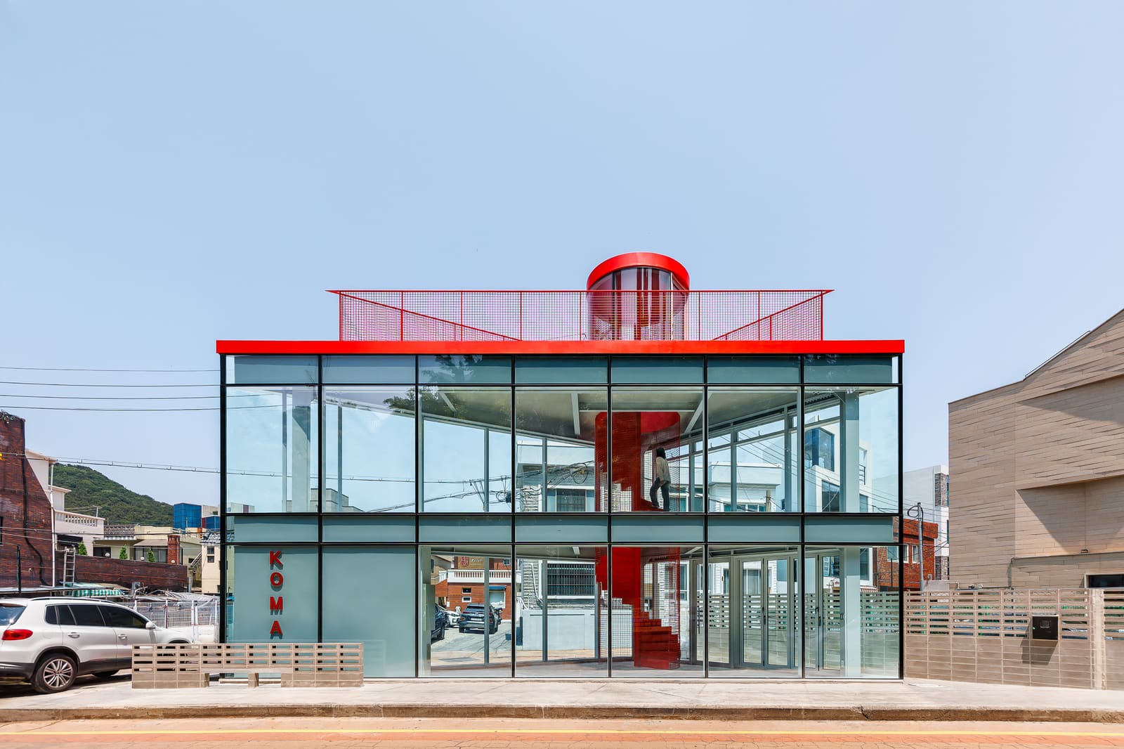
We tend to measure architecture in square meters, floor-to-area ratios, or vertical rise. But what happens when a building occupies barely fifty square meters and sits on a knife-edge plot, hemmed in by renovation culture and neighborhood memory? U.GA Architects' recently completed Koma commercial facility, designed by Dae-woo Yu with Soon-jung Shim and Hyo-kyung Kwon, offers one answer: architecture can assert itself not through bulk, but through precision of stance.
Completed in 2025, Koma stands at an acute-angled intersection in Busan's Haeridan-gil, a former residential quarter that has undergone selective renovation over the past decade. The district is known for adaptive reuse projects that layer contemporary commercial programs into weathered Western-style housing stock. In this environment, the 51-square-meter structure operates less as a standalone object and more as an inflection point, a hinge where two alleys meet and where old masonry rhythms give way to newer, lighter tectonic logics.
Contextual Constraints as Generative Framework
Haeridan-gil's character derives from incremental change rather than master planning. The streetscape is a collage: exposed brick facades, narrow door thresholds, irregular setbacks, and handmade signage. U.GA Architects did not attempt to replicate this vernacular texture. Instead, the studio chose restraint, a move that paradoxically heightens the building's visibility.
The site itself is constrained by geometry. An acute corner lot offers no generous frontage, no symmetrical elevation. The building's footprint is a slice, and its massing responds by compressing vertically and refining horizontally. The facade, clad in aluminum panels supplied by Namsun Aluminum, reads as a taut membrane rather than a load-bearing wall. This choice of cladding, thin and reflective, contrasts sharply with the masonry surrounds and telegraphs a different material logic: one rooted in assembly, modularity, and lightness.
Material Restraint and Tectonic Clarity
The aluminum skin is not decorative. It is a deliberate tectonic statement. In a district where many renovations apply finishes as scenographic gestures, warm plasters, faux timber, reclaimed signboards, Koma's envelope is unapologetically contemporary. The panels are flush-mounted, their joints minimized, creating a monolithic surface that catches ambient light and reflects the changing sky. Photographer Sangin Nam's documentation captures this quality: the facade shifts from matte gray in overcast conditions to a mirror-like sheen in direct sun.
Inside, the spatial program is compact. At 51 square meters total, the interior cannot afford circulation redundancy or decorative excess. The plan is efficient, with service zones tucked against the rear party wall and the primary commercial space oriented toward the street. Fenestration is minimal but strategic, punched openings rather than curtain wall, reinforcing the sense of enclosure and framing views outward with intention.
This restraint extends to detailing. Wiz Construction Co., Ltd., the general contractor, executed the envelope with millimeter-level precision. Joints align, corners are crisp, and the interface between aluminum and adjacent masonry is clean. These are not incidental qualities; they are the means by which a small building claims authority.
Precedent and Divergence
Koma invites comparison to other micro-scale commercial interventions in East Asia: Jun Igarashi's slivers in Sapporo, Schemata Architects' timber insertions in Tokyo, or the infill projects along Seoul's Ikseon-dong alleys. What these share is a commitment to working within the grain of existing urban fabric, accepting spatial limitation as a design prompt rather than a problem to overcome.
Where Koma diverges is in its refusal of warmth. Many micro-retail projects lean on tactile materials, wood, cork, felt, to soften their modesty. U.GA Architects opts instead for cool precision. The aluminum envelope, the minimal fenestration, the compressed massing, all signal a different ethos. This is not architecture that seeks to blend or charm. It asserts itself through contrast, through clarity, through what it chooses not to do.
The Intersection as Threshold
The acute-angled corner is both a physical and conceptual threshold. Physically, it is the point where two pedestrian flows converge. Conceptually, it marks the boundary between Haeridan-gil's layered past and its still-unfolding commercial present. Koma does not resolve this tension; it inhabits it.
The building's orientation maximizes street engagement despite its small footprint. The primary facade addresses the wider of the two alleys, while a secondary elevation, equally restrained, turns toward the narrower passage. This dual address allows the structure to participate in both circulation routes without overextending its formal language. The result is a building that feels larger than its metrics suggest, not through visual trickery, but through spatial intelligence.
Scale, Attitude, and the Future of Incremental Urbanism
Across the projects we've covered this year, a pattern emerges: the most compelling urban interventions are often the smallest. They succeed not by dominating their surroundings, but by engaging them with rigor and specificity. Koma exemplifies this approach. Its 51 square meters are not a limitation; they are a discipline, a forcing function that compels every design decision to justify itself.
At World Archi Design, we've been tracking the rise of what might be called "attitude architecture", projects where formal restraint, material honesty, and contextual attunement substitute for monumental scale. These buildings do not announce themselves through height or ornament. They earn attention through precision, through the quality of their details, and through their refusal to overreach.
U.GA Architects' work in Busan suggests that this approach is not merely aesthetic but urbanistic. In districts like Haeridan-gil, where renovation culture is already reshaping the streetscape, small-scale interventions set the tone for future development. If these projects prioritize craft, materiality, and contextual dialogue, they model a form of incremental urbanism that respects existing fabric while advancing new spatial possibilities.
Koma stands as a case study in how to build at the edge, geographically, programmatically, and conceptually. It occupies a precarious corner, a sliver of urban space where two alleys meet and where old residential patterns give way to new commercial rhythms. In doing so, it reframes the question of architectural presence: not how much space can a building occupy, but how clearly can it articulate its position within the spaces it does not occupy.
Save this story. A free account keeps your reading list and the 07:00 email in one place.
CREATE FREE ACCOUNT →SIGN IN