Often overlooked, transitional spaces - staircases, corridors, and atriums - are no longer treated as neutral passages. In contemporary architecture and interior design, these in-between zones have become powerful spatial tools where color acts as orientation, emotion, and identity. Rather than decorative afterthoughts, color now shapes movement, perception, and memory within buildings.
Why Color Matters in Transitional Spaces
Transitional areas are inherently dynamic. People move through them quickly, repeatedly, and often subconsciously. Thoughtful color strategies can:
+ Guide circulation and improve wayfinding
+ Modulate scale, making narrow corridors feel expansive or tall atriums feel grounded
+ Create rhythm and pause within sequences of movement
+ Express brand or cultural narratives without relying on signage
Unlike static rooms, these spaces benefit from boldness. Color here is experienced in motion, changing with light, angle, and speed.
Staircases: Color as Vertical Narrative
Staircases are among the most sculptural transitional elements, and color enhances their drama.
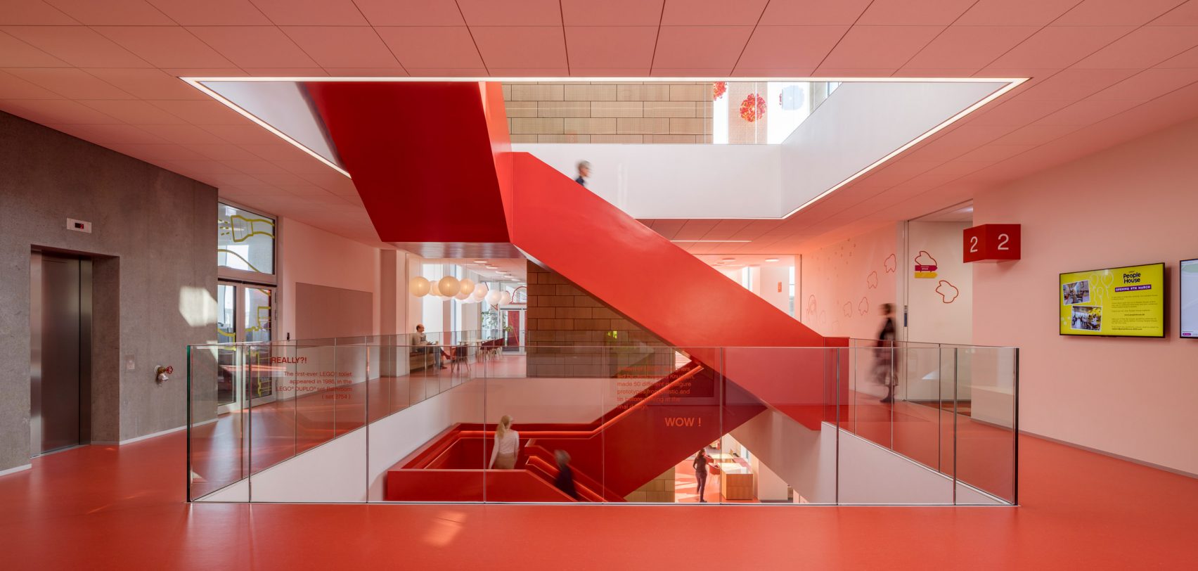
At the LEGO Campus (Denmark), color-rich staircases function as social connectors rather than mere circulation. Bold, saturated hues encourage movement, promote stair use, and echo LEGO’s playful brand DNA, turning vertical transitions into moments of interaction, creativity, and everyday engagement.

Bold, saturated colors animate staircases, turning vertical circulation into a social and brand-driven experience.
Photo Credit: Adam Mork
In cultural buildings like the Zeitz MOCAA (South Africa), muted concrete surfaces are contrasted with controlled color accents, allowing staircases to read as carved voids where light and tone subtly shift as visitors ascend.

Subtle color accents heighten the sculptural power of carved stair voids, guiding movement through monumental concrete forms
Photo Credit: Iwan Baan
Key design insight:
For staircases, color is most effective when it reinforces vertical flow through gradients, repetition, or contrast between risers, handrails, and surrounding walls.
Corridors: From Passage to Experience
Corridors are traditionally long, narrow, and anonymous, making them ideal candidates for chromatic transformation.
Part of a curated set of notable corridor designs, Hotel Indigo Dubai Downtown (UAE) uses rich color and texture in its hallways to create a sense of place and continuity between guest rooms and communal spaces, helping to make circulation both legible and atmospheric.

Layered hues and graphic patterns transform corridors into expressive pathways rooted in local identity
Photo Credit: IHG Hotels & Resorts
At Duke Apartments (Canada), corridors are conceived as shared social space rather than mere access routes. Circulation lines the open-air atrium, where brightly colored doors provide visual rhythm, orientation, and a sense of community, transforming everyday movement into an engaging spatial experience.

Brightly colored doors punctuate open-air corridors, using color as wayfinding and a marker of community
Photo Credit: Michael Elkan Photography
Key design insight:
In corridors, color works best as a spatial equalizer, counteracting length, reinforcing rhythm, and transforming repetition into experience.
Atriums: Color, Light, and Spatial Drama
Atriums are transitional spaces at an urban scale, where movement, gathering, and orientation converge.
The Harpa Concert Hall (Iceland) uses colored glass panels to flood its atrium with ever-changing hues, turning light itself into a moving architectural element.

Colored glass floods the atrium with shifting light, turning circulation into a constantly changing spatial experience
Photo Credit: Nic Lehoux
In Guest House of the Textile Academy NRW’s atrium (Germany), a tall multi-colored art installation extends through the volume, with bright panels in tones ranging from pink and light green to deep orange filling each floor with dynamic, saturated color. This bold chromatic strategy transforms the vertical void into an expressive focal point that energizes circulation and reflects the academy’s creative context.

A multicolored vertical installation activates the atrium, transforming the central void into a vivid landmark of movement
Photo Credit: Andreas Wiese
Key design insight:
In atriums, color should be considered in dialogue with light. Materials, transparency, and reflection often matter as much as pigment.
Emerging Color Strategies in Transitional Design
Across recent projects, several trends stand out:
+ Monochromatic immersion: Entire stairwells or corridors washed in a single hue for strong identity
+ Gradient transitions: Smooth color shifts that mirror movement and time
+ Material-based color: Pigment embedded in plaster, terrazzo, or glass rather than applied finishes
+ Contextual palettes: Colors derived from local culture, landscape, or brand narratives
These approaches recognize that transitional spaces are not pauses between design moments, they are the moments that connect everything else.
Conclusion: Designing the In-between
Color in transitional spaces is no longer about filling gaps. It’s about shaping journeys. Staircases become narratives of ascent, corridors turn into immersive sequences, and atriums transform into luminous social hearts.
When designers treat these spaces with the same intentionality as primary rooms, color becomes a powerful architectural language - one that is felt not when we stop, but when we move.
Save this story. A free account keeps your reading list and the 07:00 email in one place.
CREATE FREE ACCOUNT →SIGN IN