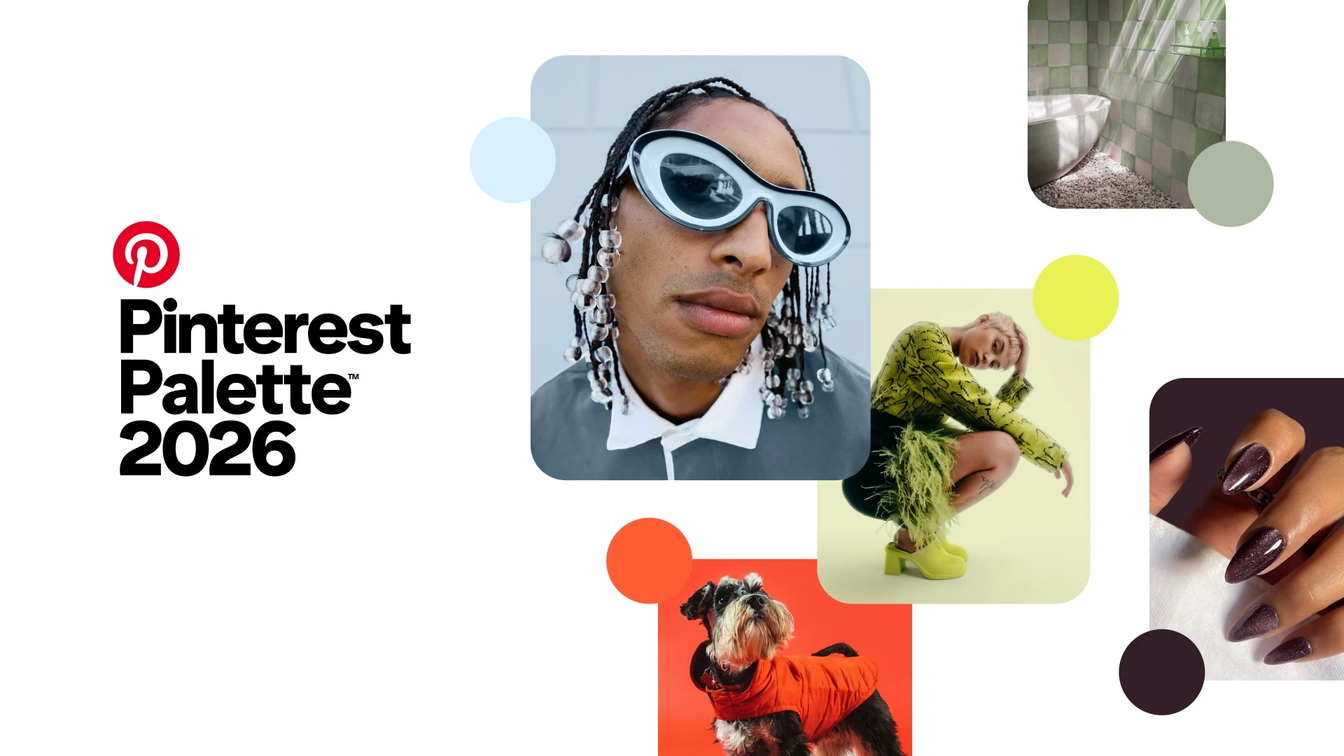
Color is no longer just a finishing touch, it has become a design language that reflects how people want to live, feel, and connect with their spaces. With its Pinterest Palette 2026, Pinterest distills global search behavior into five distinctive colors that capture emerging cultural moods.
The result is a palette that moves fluidly between calm and confidence, restraint and expression - qualities now shaping architecture, interior design, and furniture at every scale.
Meet the Pinterest Palette 2026
The 2026 palette balances softness and vibrancy, nostalgia and modernity. Each color stands alone, yet they work seamlessly together across scales and disciplines.
Cool Blue - Crisp, Airy, and Refreshing
Cool Blue is a clean, breathable shade that evokes clarity and openness. Rooted in sky and water, it reflects a collective desire for calm, focus, and emotional balance in an increasingly complex world.
Design influence:
In architecture, Cool Blue appears in glazed surfaces, shading devices, and reflective materials that visually expand space. In interiors, it brings a sense of quiet to bedrooms, wellness areas, and workspaces. Furniture designers use it for soft upholstery and minimalist forms that feel light and contemporary.


An airy blue that brings clarity and calm, expanding space visually while reinforcing a sense of lightness and focus
Jade - Serene, Mineral, and Enduring
Jade is a tranquil green with mineral depth, inspired by stone, nature, and cultural symbolism. It conveys longevity, harmony, and a connection to the natural world.
Design influence:
Architecturally, Jade integrates seamlessly with landscape-driven projects and sustainable materials. In interiors, it is favored for kitchens, bathrooms, and communal areas where calm and continuity matter. In furniture, Jade enhances solid forms and natural textures, reinforcing a sense of permanence.


A serene green that connects architecture and interiors to nature, evoking balance, longevity, and quiet strength
Plum Noir - Deep, Moody, and Sophisticated
Plum Noir is a dramatic blend of dark purple and near-black tones. Rich and introspective, it introduces mystery and elegance without feeling excessive.
Design influence:
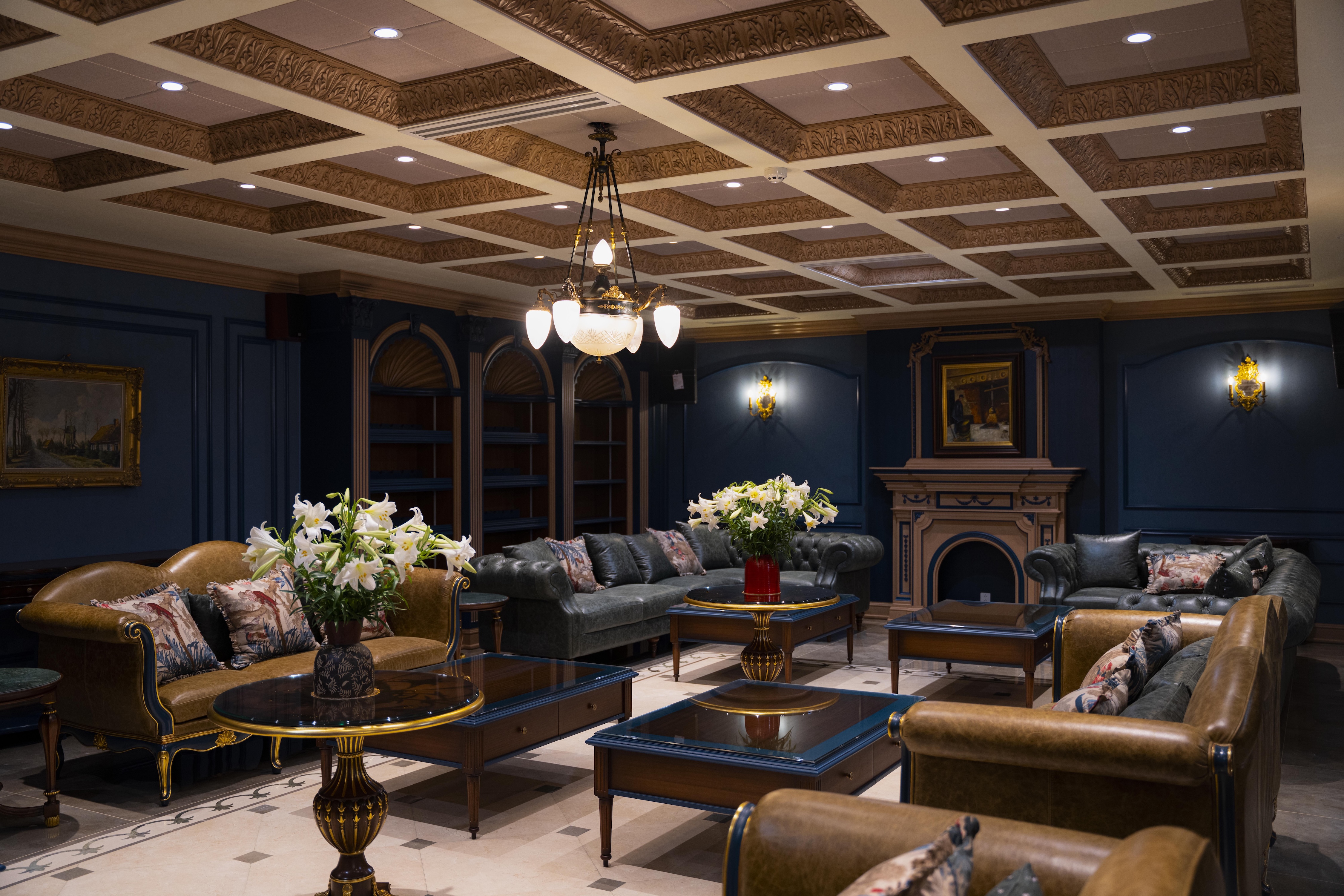
In architecture, Plum Noir is used sparingly to create contrast and depth in façades or structural details. Interior designers apply it in intimate spaces - lounges, libraries, and hospitality settings - to add emotional richness. Furniture pieces in Plum Noir often become focal points, emphasizing sculptural silhouettes and luxurious materials.


A moody hue where richness meets restraint, adding depth, contrast, and understated sophistication
Wasabi - Sharp, Energizing, and Unapologetic
Wasabi is a bold yellow-green that brings an instant charge of energy. Inspired by culinary culture and digital expression, it reflects a growing appetite for playful, unconventional design.
Design influence:
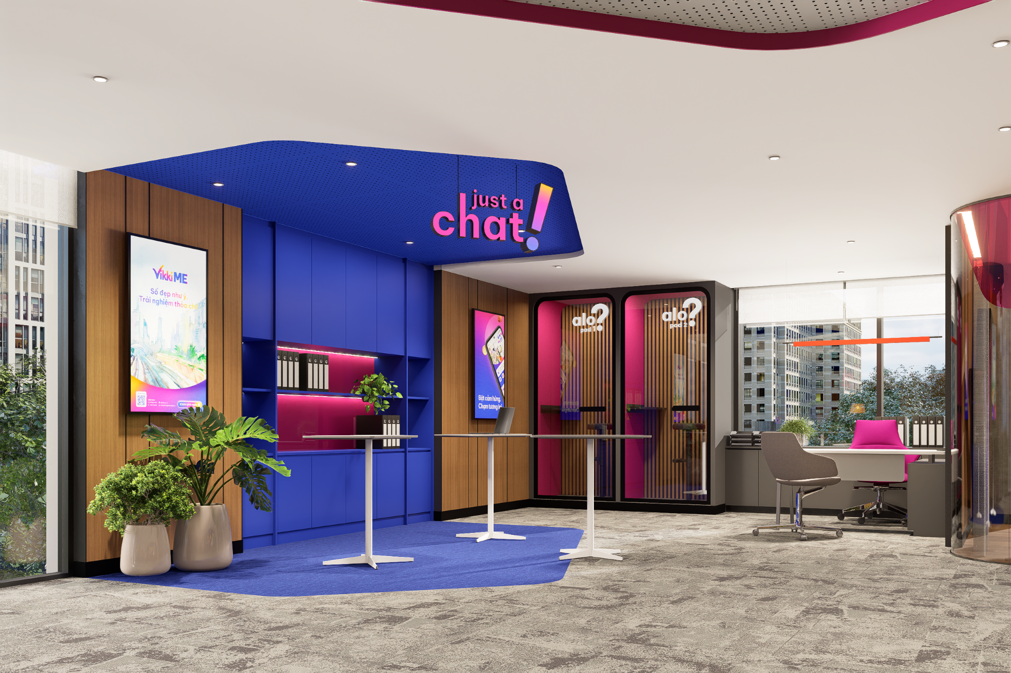
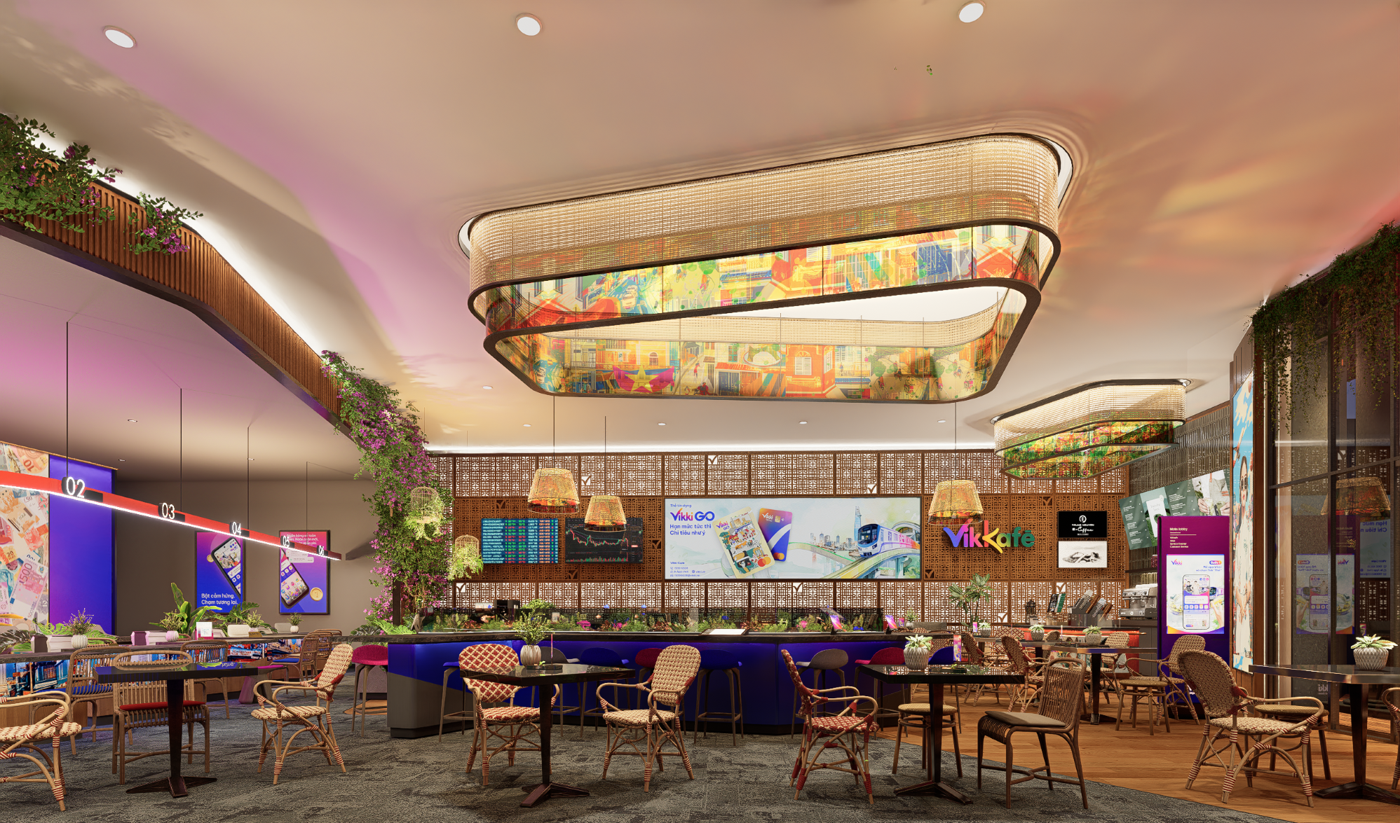
Architects use Wasabi as a high-impact accent to guide movement or highlight circulation zones. In interiors, it enlivens creative studios, retail environments, and social spaces. In furniture design, Wasabi injects character into statement chairs, modular systems, and contemporary accents.


An energetic tone that injects bold character and contemporary edge into modern design
Persimmon - Warm, Vibrant, and Expressive
Persimmon is a rich orange-red that feels sunlit, artisanal, and emotionally grounded. It bridges boldness and warmth, making it both expressive and inviting.
Design influence:
In architecture, Persimmon appears in feature elements, entrances, and cultural buildings where identity matters. Interiors use it to anchor social spaces such as dining rooms and lounges. Furniture designers favor Persimmon for handcrafted pieces and tactile finishes that celebrate materiality.


A joyful hue that anchors spaces with confidence, craftsmanship, and emotional warmth
A Palette That Shapes How We Design and Live
The strength of the Pinterest Palette 2026 lies in its adaptability. These five colors are not trend-driven statements meant to fade quickly, but tools for creating environments that feel intentional and human-centered. Across architecture, interiors, and furniture, they support a shift toward spaces that balance emotional resonance with long-term relevance.
From the clarity of Cool Blue to the warmth of Persimmon, the palette signals a future where color is used thoughtfully, enhancing not just how spaces look, but how they are experienced.
PHOTO CREDIT: Pinterest
Save this story. A free account keeps your reading list and the 07:00 email in one place.
CREATE FREE ACCOUNT →SIGN IN