The Cumulative Weight of Small Changes
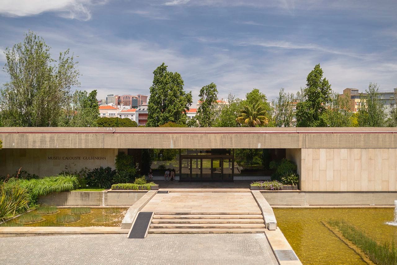
Some buildings lose their way not through dramatic intervention but through the quiet accumulation of pragmatic fixes. The Calouste Gulbenkian Museum in Lisbon, opened in 1969, had suffered precisely this fate. Over nearly six decades, renovations large and small had steadily eroded the spatial logic embedded in its original design by Ruy Jervis d'Athouguia, Pedro Cid, and Alberto Pessoa. None of these alterations were catastrophic on their own, but together they had severed the threads connecting architecture, collection, and landscape into a coherent whole.
The restoration led by Lisbon architect Teresa Nunes da Ponte and French conservation specialist Frédéric Ladonne set out not to expand or reimagine, but to excavate. The goal was to return the museum to its founding principles and amplify what had always distinguished it: an unusually intimate relationship with the eighteen acres of woodland and gardens that surround the building. At World Archi Design, we have observed that the most successful museum restorations are often those that resist the urge to add and instead commit to subtraction, peeling back layers to reveal forgotten clarity.
A Collection That Shaped Its Container
The Gulbenkian collection spans an astonishing chronological and geographic range. Ancient Egyptian and Mesopotamian artifacts share space with Chinese and Japanese works, Islamic art, eighteenth-century French decorative objects, and Impressionist canvases. Unlike many modernist museums conceived as neutral containers awaiting future content, this building was purpose-built around a specific private collection. Every gallery, every sightline, every material choice responded directly to the objects it would eventually hold.
Director Xavier Francesco Solomon emphasizes that this specificity extended to the spatial sequencing. The architects understood that a Mamluk glass vessel from fourteenth-century Syria and a Jean-Antoine Houdon sculpture demand different atmospheric conditions, different scales of enclosure, different thresholds of intimacy. This is tectonic empathy, a quality we have seen in the best collection-specific architecture, from Louis Kahn's Kimbell to Carlo Scarpa's interventions at Castelvecchio.
The Problem of Transparency
One of the museum's most distinctive features has also been its greatest conservation challenge. Floor-to-ceiling glazing throughout much of the building frames views of trees, shrubs, and shifting daylight. In theory, this dissolves the boundary between interior and exterior, allowing visitors to contemplate a Roman cameo or a Rembrandt portrait against a backdrop of living foliage. In practice, the museum's conservation team spent decades wrestling with curtains, shutters, and improvised light-blocking measures to protect fragile works from UV exposure and thermal fluctuations.
The restoration addressed this tension through layered technological intervention rather than retreat. Bronze-tinted glass received UV-filtering film, and micro-perforated fabric screens were installed inside the windows. These screens can be raised when direct sunlight is absent, but even when deployed, they preserve visual connection to the landscape. The perforation density was calibrated to block harmful wavelengths while maintaining transparency, a solution that recalls the sophisticated solar control systems developed for the Louvre Abu Dhabi's perforated dome, though executed here with far greater subtlety.
Nunes da Ponte also implemented a long-term landscape strategy, planting specific tree and shrub species in the museum's two courtyards and around the perimeter. As these mature, they will provide seasonal shading, particularly for galleries housing eighteenth-century paintings. This is adaptive design that acknowledges time as a material, allowing the building's environmental performance to evolve organically rather than relying solely on mechanical systems.
Restoring Spatial Permeability
The original design employed several strategies to create visual and spatial flow between galleries. Partition walls were deliberately kept short of ceilings and adjacent walls, generating gaps that allowed glimpses into neighboring rooms. This prevented the creation of enclosed boxes within the larger envelope and maintained a sense of continuous sequence. Between the Asian and European galleries, a slatted wooden screen permitted partial views, so that visitors examining Chinese porcelain could catch fragmentary impressions of Flemish paintings awaiting them in the next section.
Subsequent renovations had closed many of these apertures. Opaque walls replaced permeable screens, and additional partitions subdivided larger galleries. The restoration removed these later additions and reinstated the original logic. A new slatted screen combining metal and wood now separates Asian and European collections, restoring the rhythm of anticipation and reveal that structured the visitor experience. This approach parallels the sectional permeability Kazuyo Sejima and Ryue Nishizawa achieved at the New Museum in New York, though here applied to a horizontal rather than vertical sequence.
A Material Vocabulary
The palette throughout is disciplined and consistent. Timber, concrete, bronze, stone, leather, and silk appear repeatedly, each deployed according to hierarchies established in the original design. Notably, no walls are painted; color emerges from the materials themselves. This restraint amplifies the richness of individual surfaces and focuses attention on the objects displayed.
One rule governed material juxtapositions: a granite plinth never rests on a granite floor. Instead, granite meets Lioz marble, or the reverse. This principle prevents visual merging and maintains legibility of distinct elements, a technique also employed by Mies van der Rohe in the Barcelona Pavilion, where onyx, travertine, and glass are carefully kept from touching like materials.
In two galleries, including the Lalique room, silk fabric covers walls and even ceilings, creating an enveloping softness that contrasts with the harder surfaces elsewhere. This material transition signals a shift in scale and intimacy, preparing visitors for smaller, more delicate objects.
The Carpet Debate
Perhaps the most contentious decision involved reinstating fitted carpet throughout the European galleries. The original flooring had been removed in 2000 and replaced with polished hardwood. While hardwood conveys a certain contemporary elegance, it also introduced reflections that doubled the visual information in each room, bouncing images of paintings and track lighting back from the floor plane. The acoustics became harder, footsteps more audible.
The new carpet, a lighter greenish beige rather than the original dark green, transforms the spatial character. Solomon describes the effect as a shift from monumental to domestic, appropriate for galleries housing furniture, decorative arts, and smaller-scale paintings. The softness underfoot slows movement and reduces ambient noise, qualities increasingly rare in major museums. This recalls the carpeted galleries at the Frick Collection in New York, where the domestic scale and acoustic dampening encourage prolonged looking.
Light as a Return
French lighting design agency ACL undertook a comprehensive upgrade of the museum's illumination. The goal was not innovation but recovery: to recreate the warm golden glow that characterized the galleries at their 1969 opening. Fixtures were integrated into ceiling rails and cutouts to provide soft, even illumination of walls and individual works without visible hardware. Display cases received anti-reflective glass, eliminating the glare that had previously interrupted sightlines.
This attention to light quality reflects an understanding that atmosphere is not decorative but structural. The specific color temperature and distribution of light shapes how we perceive form, texture, and color in the objects we encounter. By returning to the original lighting character, the restoration reasserts the architects' intention that art be experienced under conditions approximating natural daylight, filtered and softened but still alive.
A Quiet Achievement
Major museum projects tend toward expansion and spectacle. Renzo Piano's Whitney extension, Herzog & de Meuron's Tate Modern transformation, and Frank Gehry's Guggenheim Bilbao all assert their presence through bold formal gestures. The Gulbenkian restoration moves in the opposite direction, withdrawing rather than advancing, clarifying rather than complicating.
This restraint is not timidity but confidence. Nunes da Ponte and Ladonne trusted that the original design possessed sufficient strength to carry the collection if only the accumulated obstructions were removed. The result is a museum that feels both more modern and more humane than it did before the intervention. Visitors move through spaces that breathe, where light and shadow shift with the time of day, where interior and exterior remain in constant dialogue.
In an era when institutional architecture often prioritizes iconicity over experience, the Gulbenkian restoration offers a different model: one that honors specificity, embraces restraint, and recognizes that great buildings sometimes need not reinvention but rediscovery.
Credit: Gulbenkian Museum
Save this story. A free account keeps your reading list and the 07:00 email in one place.
CREATE FREE ACCOUNT →SIGN IN