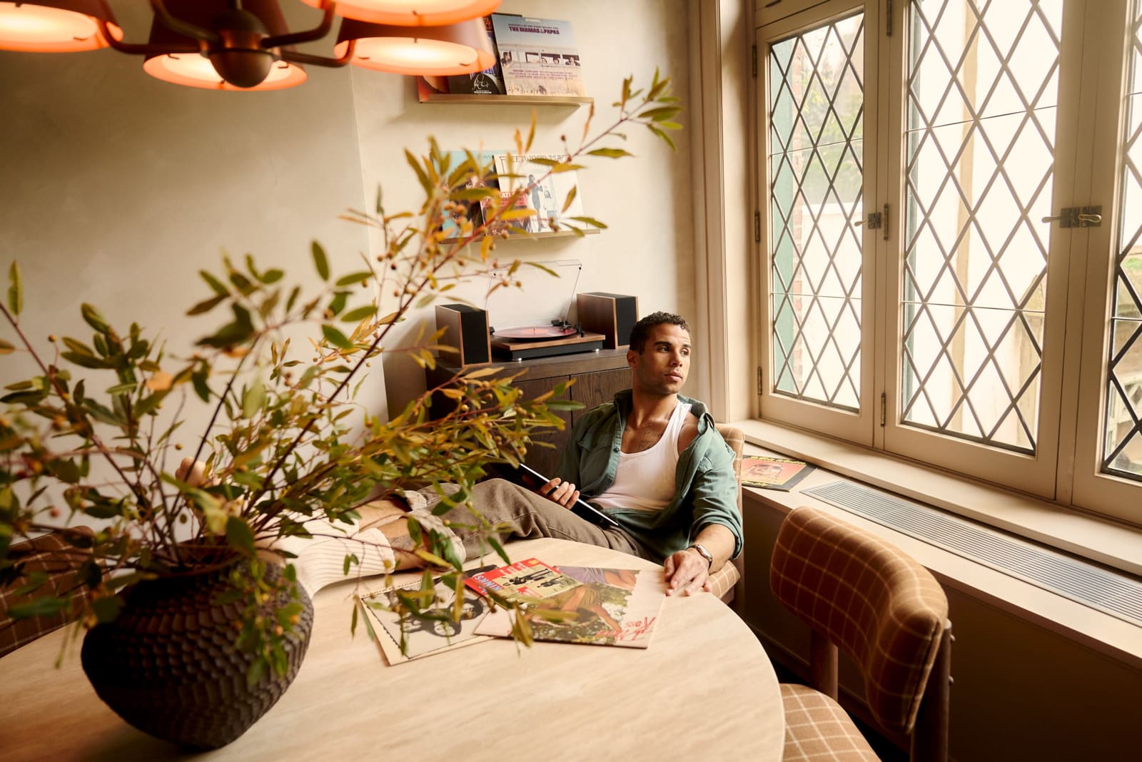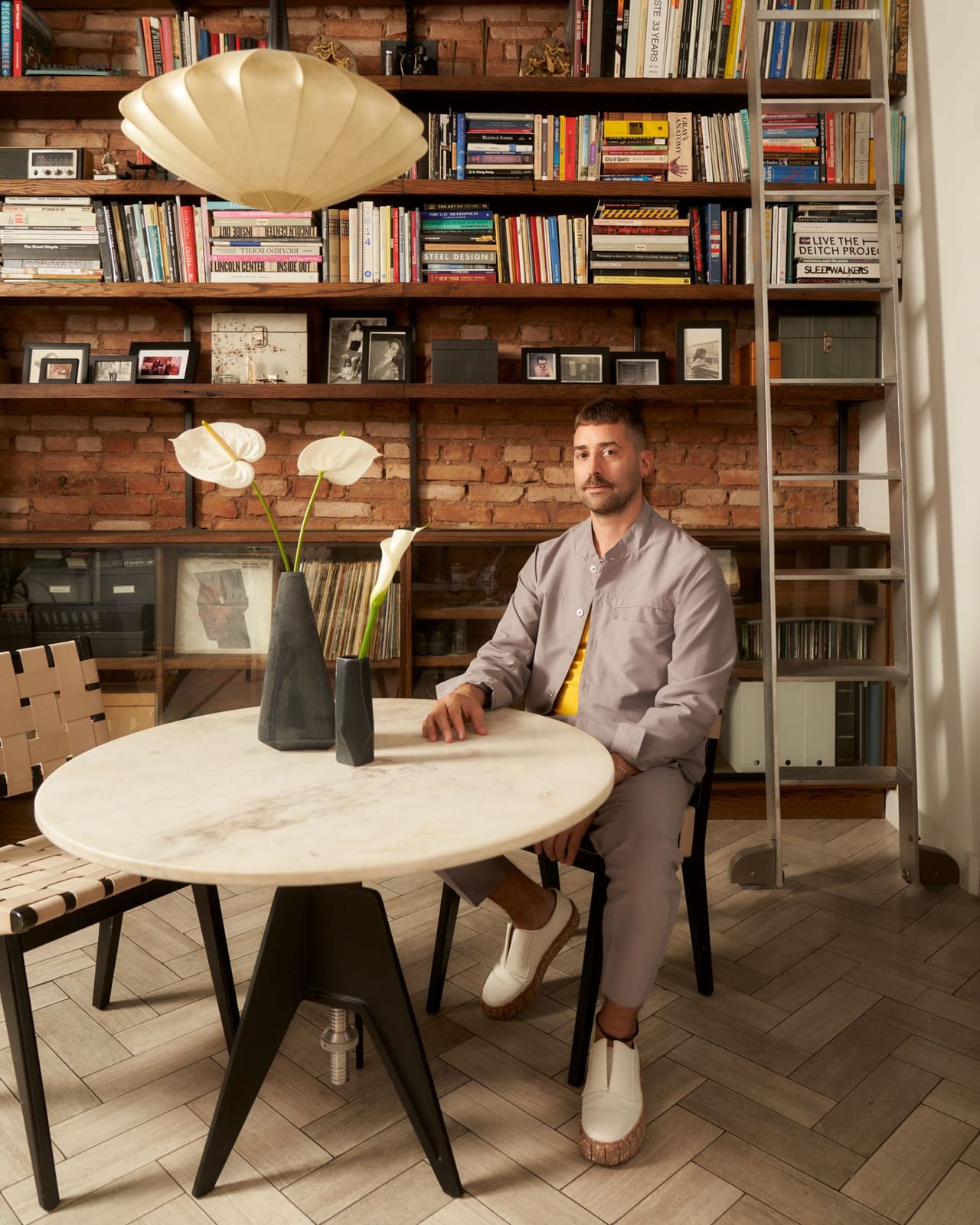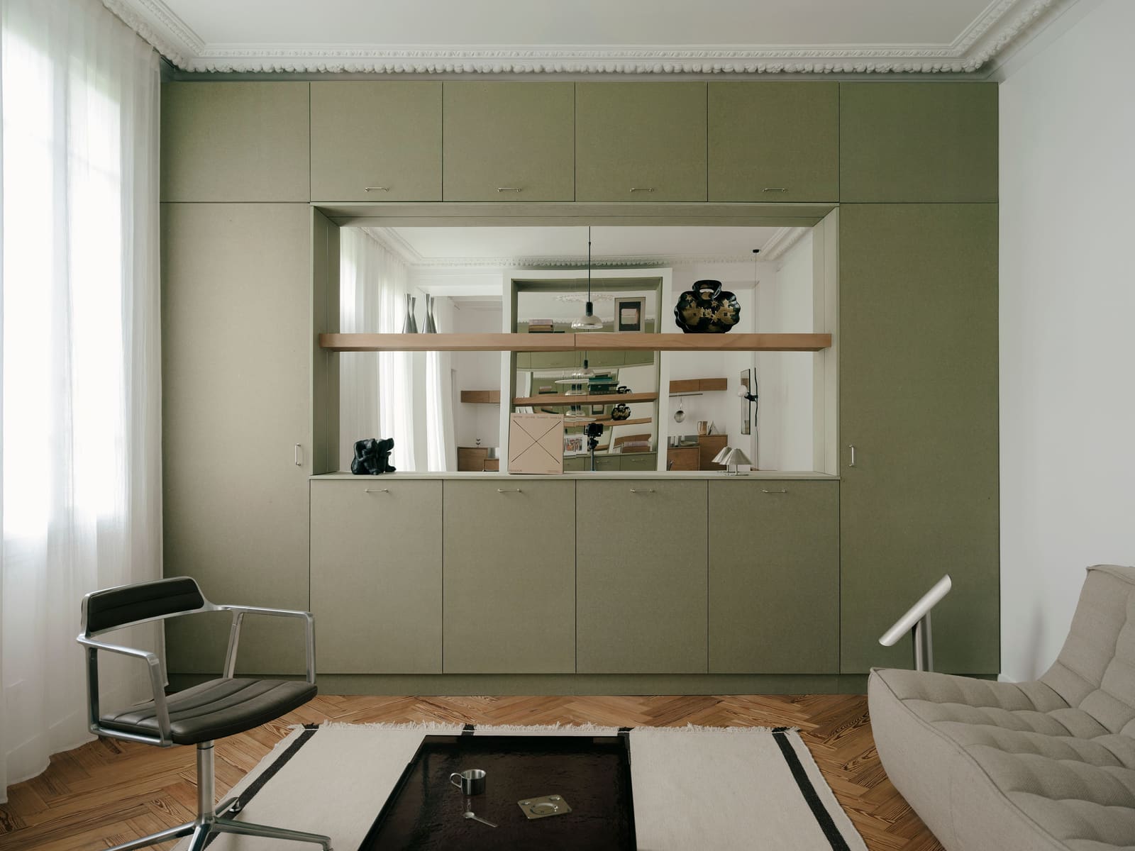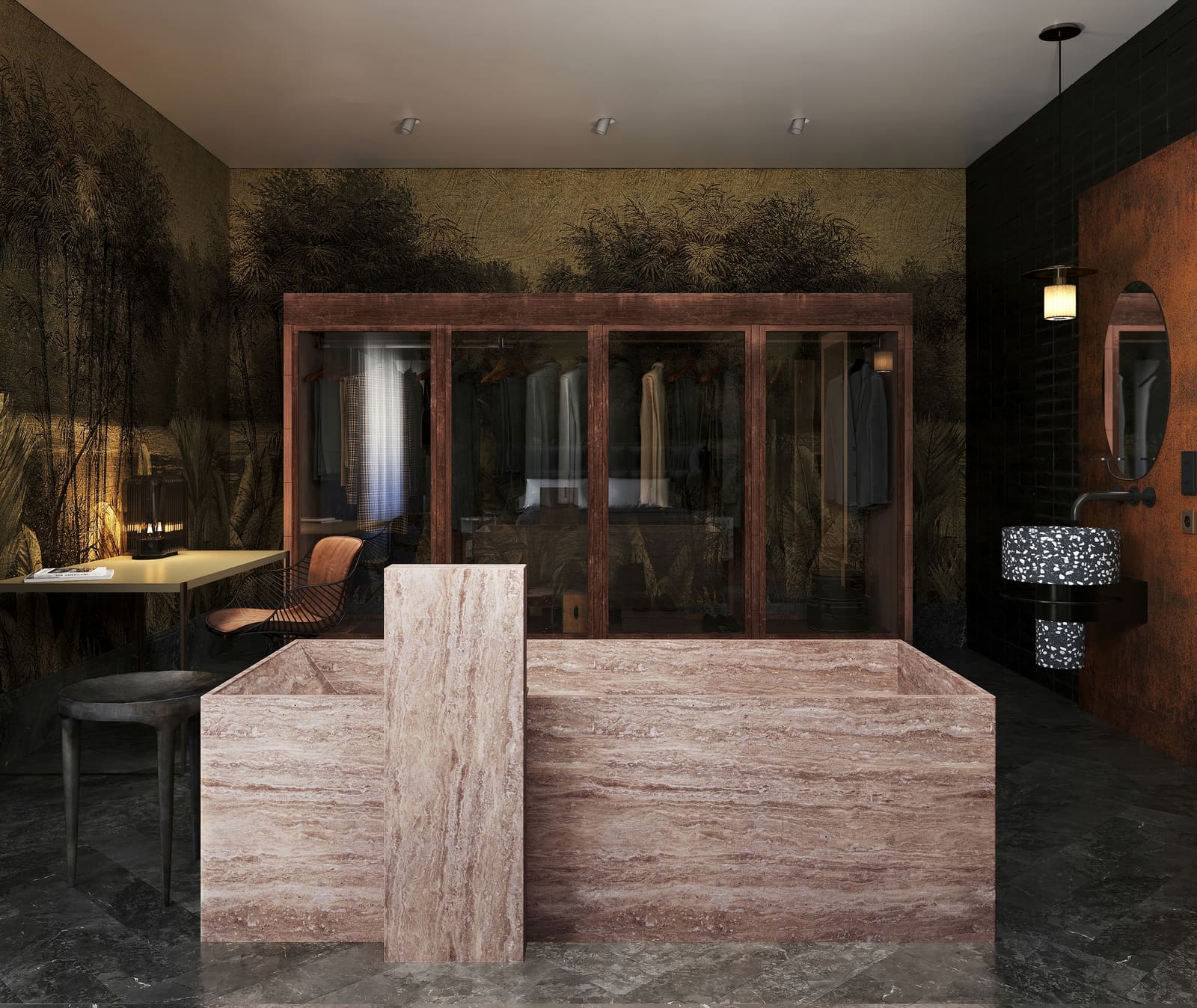
The Inherited Rulebook
The conventional wisdom surrounding compact residential interiors has calcified into near-dogma over the past few decades: paint everything white to reflect maximum light, avoid pattern that might visually crowd, and furnish with pieces proportionally miniature enough to preserve circulation. These directives appear in rental staging guides, real-estate listicles, and the mental blueprints of countless apartment dwellers navigating urban density. Yet a growing number of architects and interior designers now regard this orthodoxy as not merely outdated but fundamentally counterproductive.
At World Archi Design, we've been tracking a shift in how spatial practitioners approach the sub-400-square-foot typology, particularly in high-density markets where compact footprints dominate the housing stock. The emerging consensus challenges the premise that small spaces require visual timidity. Instead, designers advocate for environments that embrace their limitations and transform constraint into atmospheric richness. The question is no longer how to make a room appear larger through optical sleight-of-hand, but how to make it feel more intentional, more inhabitable, and more emotionally resonant within its actual dimensions.
Chromatic Saturation Over Reflective Neutrality
The white-wall mandate rests on a simple spatial logic: pale surfaces bounce light, and brighter rooms read as more expansive. Architect Sarah Jacoby, whose practice centers on urban residential projects in New York, disputes the underlying assumption. White, she notes, doesn't alter physical dimension; it simply renders surfaces neutral. Depending on undertone, particularly cooler whites with blue bases, the effect can flatten a space and strip it of warmth. Her approach tilts toward saturated, warm-spectrum hues that prioritize comfort over the illusion of square footage.
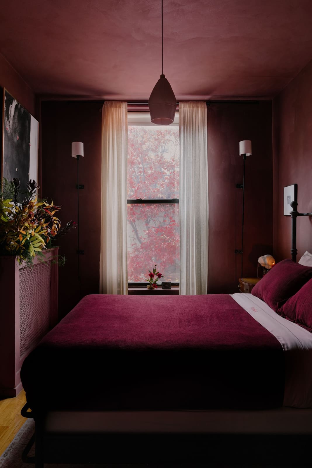
Emily Frank, principal of Frank & Co. Home, draws a critical distinction between brightness and perceived spaciousness. In an all-white interior, she observes, every corner and boundary line becomes sharply legible. The eye registers edges with clarity, which paradoxically reinforces the room's perimeter rather than dissolving it. Her preferred technique involves chromatic envelopment: wrapping walls, millwork, and ceilings in a single saturated tone so that spatial boundaries become ambiguous. The eye stops hunting for edges and instead reads the room as a continuous atmospheric field.
This approach finds precedent in Harris Reed's London residence, where deep navy walls and coral accents create a cohesive color narrative that cocoons rather than constricts. Similarly, a Vermont schoolhouse conversion employed Farrow & Ball's Eating Room Red in a powder room, a move that amplified the sense of enclosure in a way that felt luxurious rather than cramped. A Manhattan loft kitchen countered cold granite with all-pink cabinetry, softening the material palette and introducing warmth without sacrificing visual coherence.
Alissa Friedman of Bright Design Lab refers to this strategy as color capping. In low-light conditions common to compact urban apartments, she argues, white reads as flat gray anyway. A rich, moody hue wrapping the entire envelope creates what she describes as a seamless embrace. Christene Barberich, who documents her own Brooklyn apartment in granular detail, tested the hypothesis in two ultra-compact bedrooms, each painted in one of Farrow & Ball's darkest grays. The result, she notes, was dimensionality that activated the space emotionally, drawing occupants into an atmospheric experience rather than fixating on physical limits.
Pattern as Rhythmic Flow, Not Visual Noise
The second orthodoxy under scrutiny is the prohibition against pattern in tight quarters. The assumption holds that graphic wallpaper, bold textiles, or intricate tile will visually overwhelm a small room, fragmenting the space and making it feel cluttered. Frank challenges this directly. In her work, repeatable patterns introduce rhythmic flow that guides the eye across surfaces rather than pinning it to edges. Graphic tile, in particular, creates a sense of movement that counteracts the static quality of small, enclosed volumes.
Friedman goes further, arguing that narrative-driven wallpaper functions as a power move in compact interiors. A bold floral or ambitious print shifts attention from spatial boundaries to the story embedded in the pattern itself. The walls, in effect, disappear as the eye engages with detail and composition. She cites a Federal-style kitchen in Denver, where patterned wallpaper paired with vintage sconces and custom hardware transformed a modest footprint into what she calls a jewel box: a space that derives drama from its intimacy rather than apologizing for its scale.
The caveat, Friedman notes, is visual weight. There exists a threshold between curated richness and claustrophobia. Her guideline is to keep the floor as clear as possible, allowing pattern and color to occupy vertical surfaces while preserving openness at ground level. A Brooklyn townhouse exemplifies this balance, layering English textiles and saturated color while paring back on decorative objects. The rug, upholstery, and wall art deliver impact; the shelving and surfaces remain relatively spare.
Substantial Furniture Over Miniaturization
The third tenet facing revision is the directive to furnish small spaces with proportionally small pieces. The logic seems intuitive: smaller furniture leaves more open floor area, which should make the room feel less congested. Friedman describes the outcome as the Dollhouse Effect. A collection of underscaled chairs, narrow side tables, and diminutive case goods creates visual fragmentation because the eye must process a higher number of discrete objects. The result is busyness, not openness.
Her alternative is fewer pieces with stronger presence. A single substantial mirror, a well-proportioned chair, or a generously scaled sofa anchors the composition and reads as intentional. Frank echoes this, noting that appropriately scaled furnishings establish what she terms design confidence. Larger pieces convey permanence and psychological grounding; the eye registers the composition as a whole rather than tallying individual items and inferring spatial constraint from their miniaturization.
A 345-square-foot Manhattan apartment designed by Josh Greene demonstrates the principle. The space comfortably accommodates a queen-size bed, a two-person sofa, and a dining table that seats three. The coffee table, often sacrificed in compact layouts, remains. The key is selectivity: each piece earns its footprint through function and proportion, and nothing feels apologetic.
Jacoby, who works almost exclusively in New York City apartments, observes that showroom sofas often exceed the square footage of her entire project sites. Her preference is for built-in seating and storage that integrates with the architecture, carving out niches and hiding necessities. For clients with tighter budgets, she recommends dual-function pieces: dining benches with interior storage, side tables that open, nightstands with concealed compartments. The goal is efficiency without visual clutter. She also notes that our cultural assumptions about required space are often inflated. A galley kitchen or elevator can hold a surprising number of people; residential interiors need less breathing room than we've been conditioned to expect.
Precedent and Psychological Dimension
The chromatic and material strategies employed in these compact interiors have roots in mid-century Scandinavian design, where small urban apartments were treated as complete environments rather than provisional spaces. Architect Alvar Aalto's work in Helsinki, for instance, often employed rich wood tones and built-in furniture to maximize usability without sacrificing warmth. Similarly, Japanese residential design has long embraced the concept of ma, or negative space, where boundaries are softened through material continuity and restrained palettes.
What distinguishes the current moment is the willingness to layer saturation and pattern in ways that earlier precedents avoided. The influence of maximalist interiors, particularly those emerging from London and Paris over the past decade, has permeated compact residential design. Designers are borrowing techniques from hospitality and retail, where small, high-impact spaces are designed to feel immersive rather than expansive.
There is also a psychological component at play. Frank notes that undersized furniture can communicate uncertainty, as if the occupant is hedging against the space rather than committing to it. Larger, confidently scaled pieces signal that the designer or resident has made peace with the room's dimensions and chosen to optimize for livability rather than optical tricks. This shift in mindset reframes the compact apartment not as a problem to be solved but as a distinct spatial typology with its own aesthetic potential.
Material Choices and Spatial Perception
Material selection plays a supporting role in these strategies. Matte finishes, for example, absorb light and reduce glare, which can make saturated colors feel softer and more enveloping. Glossy or reflective surfaces, by contrast, create highlights and shadows that delineate boundaries more sharply. Friedman often specifies matte paints and low-sheen wallpapers to maintain atmospheric cohesion.
Textile weight also matters. Heavier fabrics in upholstery and window treatments add acoustic dampening, which enhances the sense of enclosure in a positive way. In tight quarters, sound can bounce off hard surfaces and create a sense of harshness; layering textiles mitigates this and contributes to the "hug" effect Friedman describes. A mohair rug or velvet upholstery introduces tactile richness that complements saturated color and reinforces the jewel-box atmosphere.
Flooring choices tend toward continuity. Where possible, designers extend a single material throughout the apartment to avoid visual breaks that emphasize room-to-room transitions. Wide-plank wood, polished concrete, or large-format tile minimizes grout lines and joints, allowing the floor to read as a unified plane. This continuity supports the color-capping strategy by reducing the number of distinct surfaces the eye must parse.
The Role of Lighting in Compact Environments
Lighting emerges as a critical variable in compact interiors, particularly when saturated color is involved. Warm-spectrum LED sources enhance reds, oranges, and earth tones, while cooler bulbs can deaden them. Friedman and Frank both specify 2700K to 3000K color temperatures to support their chromatic palettes. Layered lighting, combining ambient, task, and accent sources, prevents flat illumination that can make saturated walls feel oppressive.
Vintage sconces and custom fixtures serve a dual function: they provide necessary light and act as sculptural elements that draw the eye upward, expanding the perceived vertical dimension. In a room where floor space is limited, vertical emphasis becomes a valuable tool. Jacoby often integrates lighting into built-in millwork, concealing sources behind coves or within shelving to create a soft, indirect glow that enhances the sense of envelopment.
Natural light, when available, is treated as a collaborator rather than the primary illumination source. Sheer curtains or light-filtering shades modulate daylight without blocking it entirely, softening the transition between interior and exterior. In north-facing rooms or basement apartments where natural light is minimal, designers embrace the dimness and design for artificial light from the outset, treating the space as inherently nocturnal.
The Compact Apartment as a Distinct Typology
What these designers share is a refusal to treat compact apartments as compromised versions of larger homes. Instead, they approach them as a distinct typology with specific opportunities. The intimacy of a small room, when embraced rather than apologized for, can create a sense of refuge that larger, more open plans often lack. The challenge is to design with intention, making every decision, from paint color to furniture scale, a deliberate contribution to the spatial narrative.
The emerging design language for compact interiors prioritizes atmosphere over illusion, confidence over caution, and emotional resonance over square-footage anxiety. It acknowledges that most urban dwellers will spend significant portions of their lives in spaces well under 500 square feet and that those spaces deserve to be treated as complete, coherent environments rather than provisional shelters. The white-walled, sparsely furnished, optically expanded apartment may still have its adherents, but a growing cohort of practitioners is building a persuasive case for the opposite approach: saturation, pattern, substance, and commitment.
Photo: Miguel Flores-Vianna
Save this story. A free account keeps your reading list and the 07:00 email in one place.
CREATE FREE ACCOUNT →SIGN IN