The Paradox of Restraint
For decades, the design world has equated sophistication with restraint. Neutral palettes, minimal gestures, the careful erasure of anything that might betray personality. Yet a growing number of studios are asking whether elegance must always speak in a whisper. In Madrid, PUNTOFILIPINO's recently completed residential project poses that question through an unexpected pairing: classical architectural grammar rendered in a palette that refuses to apologize.
The apartment, finished in 2023 under the direction of Gema Gutiérrez, operates at the intersection of two seemingly opposed impulses. One seeks the order and proportion that have anchored Western interiors since the Renaissance. The other embraces saturation, eclecticism, and the kind of visual boldness that typically lives outside the vocabulary of "refined" design. What emerges is neither pastiche nor irony, but a genuine investigation into whether tradition can absorb intensity without collapsing into chaos.
Chromatic Confidence Within Tectonic Order
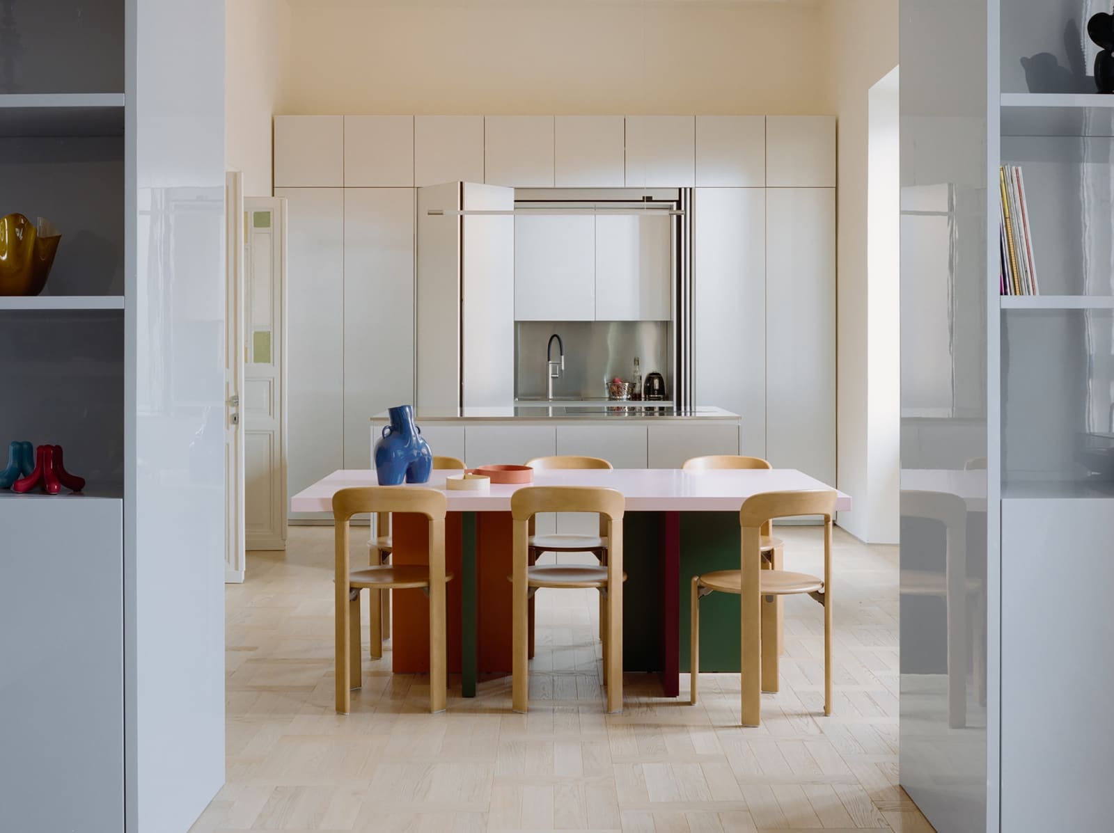
The spatial envelope maintains classical bones. Ceiling heights, door proportions, and wall articulation follow conventions that would feel at home in a nineteenth-century Madrid building. Yet within that framework, color becomes the primary material. Rather than applying hue as accent or afterthought, the design treats it as structural. Walls saturated in jewel tones define zones without physical partitions. A deep emerald or saturated coral does the work that a change in floor level or a dropped soffit might accomplish elsewhere.
This approach recalls the chromatic experiments of early modernists like Bruno Taut or the Viennese Secession, who understood that color could organize space as effectively as form. But where those precedents often deployed hue within a utopian or symbolic program, PUNTOFILIPINO's palette feels more instinctive, less burdened by ideology. The result is a domestic interior that reads as both composed and spontaneous, a difficult balance that many projects attempt but few achieve.
Material Eclecticism as Curatorial Practice
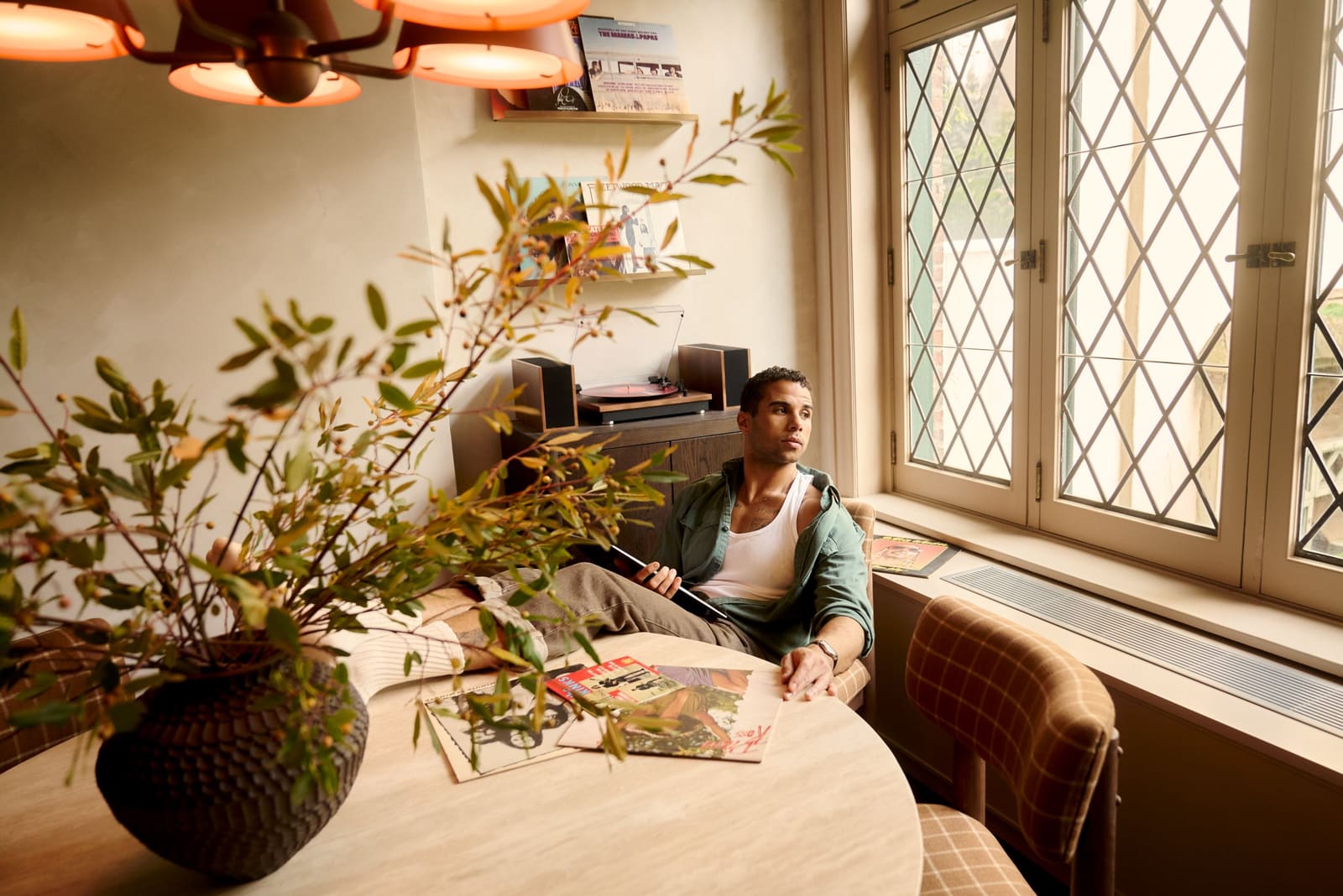
Furnishings and fixtures span eras and origins, united less by style than by a shared commitment to craft and presence. Danish midcentury pieces sit alongside contemporary European lighting, each object selected for its ability to hold its own within the saturated field. The studio sourced elements from Menu, Normann Copenhagen, and DCW Éditions, among others, treating the interior less as a blank canvas and more as a curated exhibition where each element contributes to a larger dialogue.
This method borrows from the editorial eye of collectors and gallerists, who understand that coherence need not mean uniformity. In the hands of a less assured designer, such eclecticism risks reading as clutter or visual noise. Here, the classical armature provides enough structure to anchor the variety. The proportions of the rooms, the rhythm of openings, and the consistent ceiling plane all act as stabilizing forces, allowing the furnishings to assert individuality without fragmenting the whole.
Beyond Fashion, Toward Identity
At World Archi Design, we have tracked a gradual shift in how residential interiors engage with identity. For much of the past two decades, high-end design favored the anonymous, the gallery-like, spaces that could belong to anyone and therefore to no one. More recently, a counter-movement has emerged, one that treats the home as a site of self-expression rather than self-effacement. PUNTOFILIPINO's work participates in that shift, but with a crucial distinction: it does not collapse into mere personalization or lifestyle branding.
The apartment resists the easy narratives of "bold" or "daring" that trade publications often apply to colorful interiors. Instead, it asks what happens when classical spatial logic is freed from its historically narrow palette. The answer, at least in this instance, is a kind of expanded classicism, one that retains the discipline of proportion and detail while admitting a broader emotional and sensory range.
Precedents and Departures
Comparisons to postmodern interiors from the 1980s are inevitable, given the shared appetite for color and eclecticism. Yet the work differs in key ways. Where postmodernism often deployed historical references ironically, treating ornament as quotation or pastiche, this project engages tradition more earnestly. The classical elements are not jokes or knowing winks; they function as intended, providing order and hierarchy. The radicalism lies not in subverting those conventions but in proving they can coexist with a contemporary sensibility that values intensity and individuality.
In that sense, the apartment has more in common with the colorist interiors of certain Milanese designers from the 1970s, who understood that modernism's rejection of ornament need not extend to a rejection of sensory richness. Studios like Sottsass Associati demonstrated that a space could be intellectually rigorous and visually exuberant at once. PUNTOFILIPINO's Madrid project extends that lineage into the present, adapting it to a context where clients increasingly seek environments that reflect personal identity without sacrificing architectural coherence.
The Domestic Interior as Cultural Statement
What the project ultimately suggests is that the domestic interior remains a site of genuine cultural negotiation. In an era when so much design defaults to algorithmic neutrality or trend-driven gestures, a residential space that commits to a clear point of view becomes a form of resistance. Not resistance in a political sense, but in its refusal to disappear into the background, to serve as mere backdrop for curated lifestyle content.
The apartment does not ask to be universally liked. Its saturated palette and eclectic furnishings will alienate as many viewers as they attract. But that specificity is precisely its strength. By embracing a distinct aesthetic position, the project carves out space for clients who understand sophistication as something other than restraint, who see elegance not as the absence of intensity but as its disciplined expression.
As residential design continues to diversify, moving away from the monolithic taste cultures that once defined luxury interiors, projects like this offer a useful model. They demonstrate that tradition and experimentation need not be opposed, that historical reference and contemporary sensibility can inform one another rather than cancel each other out. The classical and the radical, it turns out, may have more to say to each other than we assumed.
Credit: Polina Parcevskya and Julie Smorodkina
Save this story. A free account keeps your reading list and the 07:00 email in one place.
CREATE FREE ACCOUNT →SIGN IN