The Case for the Minimal Canvas
There is a peculiar freedom in designing a room no one lingers in. The powder room, tucked beneath staircases or wedged into transitional corridors, demands nothing of daily routine. It does not require the ergonomic choreography of a kitchen or the restful neutrality of a bedroom. Instead, it invites a different question: What happens when function is secure and the only remaining task is delight?
At World Archi Design, we have been tracking a shift in how designers approach these compact spaces. Rather than treating the half-bath as an afterthought, a growing cohort views it as a laboratory for material experimentation, saturated color, and gestures that might overwhelm larger rooms. The projects that follow, drawn from recent residential work across North America, illustrate this emerging ethos: when square footage contracts, creative license expands.
Jewel Box Logic and the Staircase Nook
Courtnay Tartt Elias faced an awkward inheritance: a cramped alcove beneath the stairs in a 1923 Spanish Craftsman home in Houston's Montrose neighborhood. The architectural constraint was clear. The spatial answer was not. Tartt Elias, principal of Creative Tonic Design, opted for immersion over minimalism. She carved a custom sink from Italian black marble, anchored it with brass wall-mount faucets, and wrapped the walls in geometric Osborne & Little wallpaper. Farrow & Ball's Black Blue, a near-navy with undertones of charcoal, defines the millwork.
The strategy here is layering. Multiple mirrors, framed in gold and brass, fragment and multiply the reflection, creating the illusion of aperture where no window exists. The result reads less like a bathroom and more like a compressed cabinet of curiosities, where every surface carries visual weight. It is a deliberate inversion of the open-plan aesthetic that dominates contemporary residential design: instead of dematerialization, Tartt Elias offers density.
Lighting as Spatial Correction
Annie Downing confronted a different problem in a new-build home in Austin's Barton Creek area. The powder room had no natural light. Harsh overhead fixtures would flatten the space and punish anyone who glanced at the mirror. Downing, a local designer with a reputation for textural synthesis, installed a pair of alabaster sconces from Arteriors flanking a steel mirror. The translucency of alabaster diffuses the glow, softening shadows without sacrificing visibility.
She layered in Kelly Wearstler's Graffito 2 grasscloth wallpaper for Lee Jofa, an abstract graphic that introduces movement without chromatic intensity. The sink is a floating integrated stone volume, paired with Watermark's Brooklyn faucet fitted with an onyx handle. The material palette spans stone, metal, and fiber, but the unifying principle is restraint in finish. No surface competes for dominance. Instead, each element modulates the next, producing a space that feels both cohesive and alert.
Pattern as Envelope
Kate Figler's client requested blue and white for a guest bath in Nashville. Figler, working on a large-scale residential project from the ground up, responded by enveloping the room in Quadrille's Bali Hai wallpaper, a pattern dense enough to read as textile rather than print. The millwork was painted a soft coordinating hue, creating continuity between wall plane and architectural trim.
The risk here is saturation. In a larger room, allover pattern can collapse spatial boundaries and induce visual fatigue. In the powder room, the same strategy becomes legible as intentionality. Figler balanced the graphic intensity with unlacquered brass plumbing fixtures, which she values for their capacity to patina over time. The console sink departs from the standard vanity typology, introducing a note of glamour that registers as deliberate rather than gratuitous. The result is a space that contrasts sharply with the muted tones elsewhere in the house, yet feels architecturally grounded.
Velvet Darkness and the Windowless Room
Mead Quin embraced the absence of natural light in a Lake Tahoe retreat for a Bay Area family. The powder room, one of the few interior spaces without a view, became an opportunity to explore mood rather than transparency. Quin specified hand-plastered walls custom tinted a velvety gray, a finish that absorbs rather than reflects light. The effect is enveloping, almost tactile.
The vanity is crafted from Pyrolave lava stone, a volcanic material with a matte, porous surface. Quin designed a custom base, fabricated by Rocky Mountain Hardware, that supports the stone volume without competing with it. Above, a Gregorius Pineo mirror finished in hammered metal flanks dark pewter sconces from Remains Lighting. The combination of movement and texture transforms a spatial liability into an asset. The room feels aged, romantic, and deliberately removed from the brightness of the surrounding interiors.
Fashion Sensibility Meets Parisian Restraint
Britt Zunino of Studio DB worked with a family whose prewar apartment overlooks Central Park in New York. The powder room sits adjacent to a bar and dining area, a high-traffic zone where guests pause between courses. The client, who works in fashion, requested something bold but not brash. Zunino selected Gucci's Heron wallpaper, a vibrant print that introduces narrative without tipping into kitsch.
The material palette layers colorful marble, unlacquered Waterworks brass fittings, and playful concrete tile from Popham Designs. Zunino describes the aesthetic as Parisian, a mix of traditional architectural detail and contemporary furnishing. The powder room extends this logic in miniature, combining refined finishes with a sense of humor. It reads as polished but not precious, a space that invites engagement rather than reverence.
Emerald Quartz and Psychological Depth
Maya Williams confronted a bright-white modern residence in Beverly Hills' Trousdale Estates and saw an opportunity for chromatic inversion. The powder room became a vessel for emerald quartz, a naturally reflective stone that Williams applied to both the sink and the surrounding walls. The material choice introduces an illusion of depth, amplifying the spatial volume through reflection rather than transparency.
Williams describes the dark, rich palette as psychologically calibrated for relaxation and intimacy. She layered in a custom Area Environments wall covering, a Made Goods gold mirror, and Jiun Ho sconces. Above the vanity, a black-and-white photograph by Ellen von Unwerth depicting Naomi Campbell introduces a note of levity, grounding the material intensity with human presence. The result is a space that feels both luxurious and unguarded, a rare combination in high-end residential work.
Marbled Wallpaper and the Lesson in Mixing
Killy Scheer of Austin-based Scheer & Co. inherited a beige powder room during a local remodel. The transformation hinged on a single material decision: marbled peach-and-wine wallpaper from Cat Alexander Design Studio. Scheer used the wallpaper as the foundation for the room's palette, building outward from its chromatic range. Chocolate-hued Ann Sacks tile introduces a secondary pattern, scaled to contrast with the wallpaper's larger motif.
The bespoke vanity references wooded cabinetry found elsewhere in the residence, creating continuity across the project. Marble on the sink meets hardwood floors, a deliberate collision of materials that Scheer describes as a lesson in mixing. Above, a Paul Ferrante mirror anchors the composition. The space reads as layered rather than busy, a testament to careful calibration of scale, color, and texture.
Ceppo di Gré and the Organic Edge
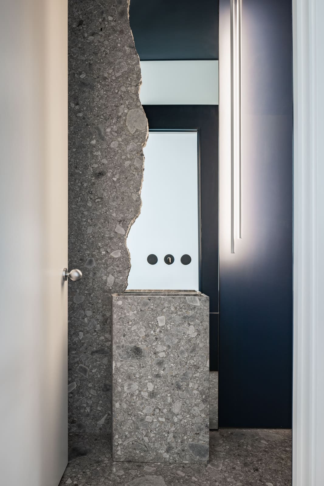
Alessandra Travaini of Altra Studio worked with clients in a Tribeca triplex who appreciated marble but found many options too polished or visually dominant. Travaini proposed Ceppo di Gré, an Italian stone characterized by organic texture and natural variation. Sleek, jagged slabs from ABC Stone clad the wall, cascading down the sink and onto the floor in a continuous gesture.
The material reads as edgy but approachable, a balance achieved through the stone's inherent warmth. Flos lighting and House of Rohl fixtures temper the boldness, introducing restraint without diluting the impact. The powder room becomes a study in how a single material, deployed with confidence, can define an entire spatial experience.
Charcoal Zellige and the Relocated Room
Amanda Hickam of Harper Harris relocated a powder room in a Birmingham, Alabama, residence from its original position just past the front door to a new corridor off the transformed entry. The move granted privacy and intentionality, allowing Hickam to treat the room as a destination rather than an afterthought. She swathed the space in charcoal gray Clé Zellige tiles, a handmade Moroccan product whose textural variation keeps the dark color from reading as flat or severe.
A floating Calacatta viola marble vanity introduces chromatic contrast, its veining echoing the irregularity of the tile. Hickam layered in a vintage brass bowl, a Pindler black linen café curtain, and Kelly Wearstler's antique-burnished brass and etched crystal sconces for Visual Comfort. The room catches visitors off guard, a deliberate departure from the light, airy palette that defines the rest of the house. It is a reminder that contrast, when carefully orchestrated, produces spatial legibility.
The Argument for Constraint
What unites these nine projects is not a shared aesthetic but a shared approach: the recognition that spatial constraint can license material ambition. The powder room, precisely because it is small and functionally straightforward, becomes a site for ideas that would overwhelm a kitchen or bedroom. Pattern can saturate. Color can deepen. Texture can accumulate. The risk is manageable because the stakes are low.
This is not to suggest that powder rooms are trivial. On the contrary, they offer a glimpse into how designers think when liberated from the demands of program and daily use. They reveal priorities, preferences, and a willingness to test ideas at full scale. In an era when residential design often defaults to safe neutrality, the powder room remains one of the last spaces where boldness is not only permitted but expected.
The lesson extends beyond the half-bath. As architects and designers navigate tightening budgets and conservative clients, the powder room model offers a useful precedent: find the room where risk is tolerable, and use it to push the envelope. The results may surprise you.
Photography courtesy Harper Harris
Save this story. A free account keeps your reading list and the 07:00 email in one place.
CREATE FREE ACCOUNT →SIGN IN