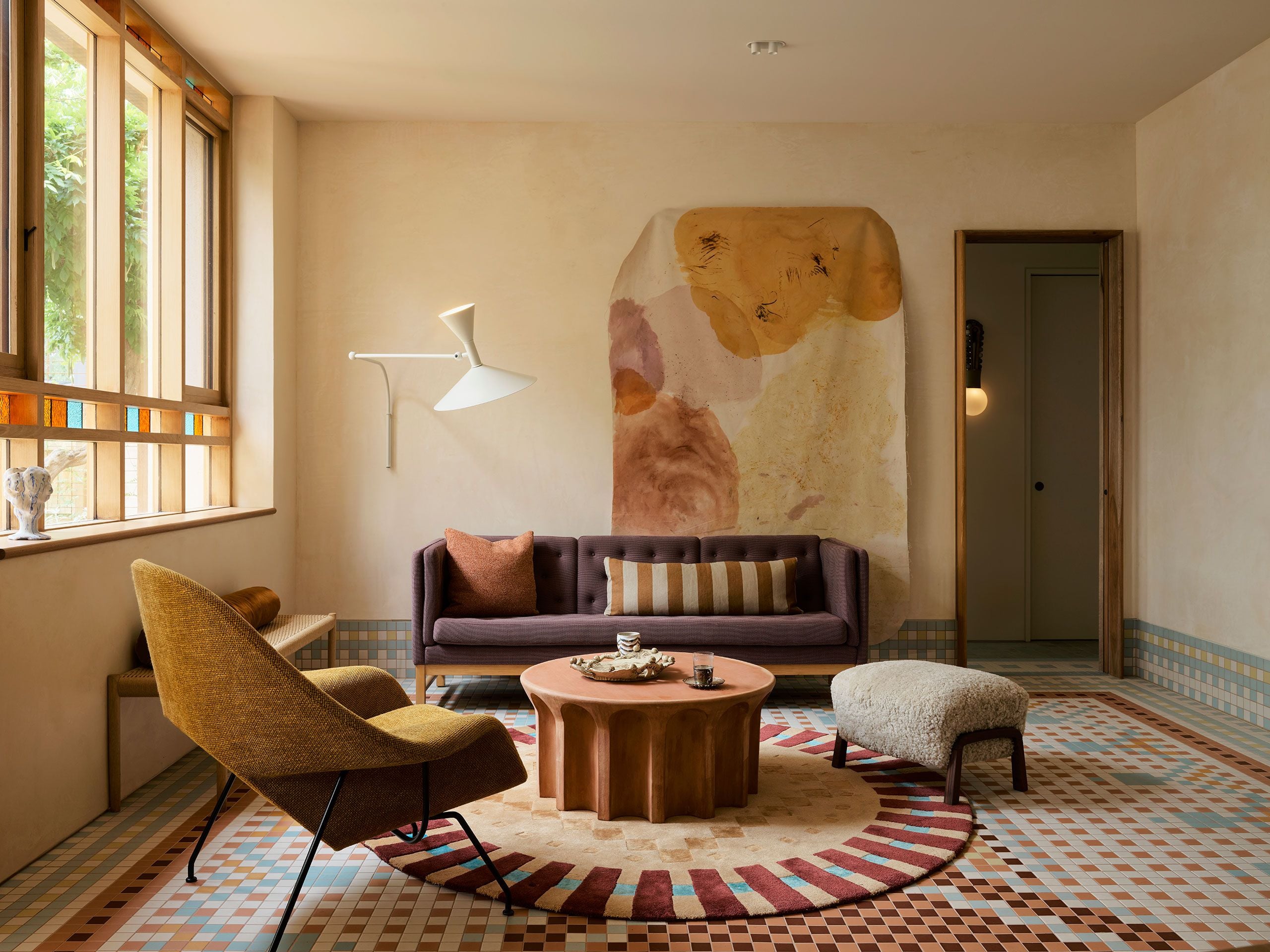
Vibrant color in interior design does more than decorate, it defines mood, guides movement, and transforms architecture into lived art. In contemporary residential projects around the world, bold palettes, unexpected hues, and daring applications of color have reshaped how space feels and functions. From playful maximalism to refined color blocking, these nine homes demonstrate how color can elevate spatial experience.
1. Toronto Residence by Cynthia Ferguson
A full home renovation in Toronto by designer Cynthia Ferguson uses rich, saturated hues to individualize spaces throughout the residence. A hot-pink home office injects confidence and creative energy, while a lilac-clad primary bathroom softens daily rituals with a dreamlike quality. Elsewhere, deep green tiles and navy cabinetry ground the palette, preventing excess. Color here becomes a spatial language - each room carrying its own emotional frequency while contributing to a cohesive, character-rich domestic narrative.


Saturated tones distinguish work, rest, and retreat, allowing color to define mood and function across the home
Lauren Miller
2. San Francisco Queen Anne Home by Studio Munroe
In this historic Queen Anne residence, Studio Munroe reinterprets Victorian architecture through contemporary color saturation. Painted ceilings in blues, blushes, and olive greens redefine room proportions, drawing the eye upward and reshaping spatial perception. Rather than overpowering original details, color enhances them, creating a dialogue between past and present. The result is an interior where chromatic boldness revitalizes heritage spaces without compromising their architectural integrity.


Painted surfaces reframe Victorian volumes, with layered hues enhancing ceiling height, light, and historic detail
Studio Munroe
3. Berlin Penthouse by Studio Bosko
This Berlin penthouse uses primary colors as spatial dividers rather than walls. Yellow defines the kitchen, red energizes the dining area, and green anchors the living space, creating clear functional zones within an open plan. Large windows amplify these hues with natural light, allowing color to shift throughout the day. The design demonstrates how bold palettes can organize space while preserving visual continuity and urban openness.


Bold primary colors structure the open plan, visually separating daily rituals without interrupting flow
Giulia Maretti Studio
4. Mondrian-inspired Beijing Penthouse by Shangceng Design
This Beijing penthouse draws from De Stijl principles, translating Mondrian’s iconic palette into spatial choreography. Blocks of red, blue, yellow, black, and white articulate thresholds, circulation paths, and functional zones. Rather than decoration, color becomes structure, guiding movement and framing views. The interior feels rhythmic and precise, proving that disciplined color application can generate both visual excitement and architectural clarity.


Graphic planes of red, blue, and yellow choreograph movement, turning circulation into an abstract composition
Xueman Hu
5. Mo Jacobsen by YSG Studio
YSG Studio’s Mo Jacobsen residence in Melbourne is a vivid study in color as architectural expression, where rich hues, pattern, and texture shape every corner of the home. A deep peach corridor and terracotta tiles lead into a light-filled extension defined by pixelated porcelain mosaics inspired by Persian rugs that visually demarcate living zones. Gem-toned leadlight glass, garnet-red accents, apple-green cabinetry, and pastel tiles balance warm Mediterranean exuberance with Scandinavian restraint, creating a dynamic, playful interior narrative.


Saturated hues, patterned surfaces, and jewel-like leadlight shape a tactile, light-responsive interior
Anson Smart
6. Naples Apartment by Carmine Abate
The Naples apartment by architect Carmine Abate is a retro-inspired, color-driven home that celebrates vibrant expression and joyful living. Bold accents - like a Cartier-red wardrobe that anchors the living area and a staircase of dichroic glass that shifts color with light - animate the open plan. Each of the four bathrooms is defined by a distinct hue, from turmeric yellow to imperial blue, while a muted kitchen offers contrast. Rich materials and playful color accents shape a lively, optimistic interior.


Expressive accents punctuate a restrained backdrop, bringing rhythm and optimism to retro-inspired spaces
Carlo Oriente
7. Chelsea Barracks London Penthouse by Studio Atkinson
This penthouse blends refined craftsmanship with expressive color narratives that enliven each room. Nature-inspired green walls wrap formal living spaces, while silk moiré wall fabrics and patterned prints inject warmth and visual interest into dining and sitting areas. Deep red paint heightens the central stairwell’s drama, balanced by eclectic upholstered pieces and botanical accents that connect interior and terrace. Rich hues and material contrasts shape a dynamic yet sophisticated residential experience.


Deep greens, reds, and textured finishes enrich formal rooms with warmth and crafted elegance
Studio Atkinson
8. Pigalle Apartment by Atelier HA
Atelier HA’s Pigalle apartment in Paris turns limited light and compact dimensions into a dramatic, color-rich interior that channels its vibrant neighborhood. High-gloss lacquered cabinetry in bold red and yellow frames a striking kitchen, while playful CE.SI. tiles in peach, mint green, and maroon create graphic rhythm. Mirrored walls amplify depth and reflect light, making the space feel expansive. Against crisp white floors and walls, richly hued vintage furniture, bold accents, and shimmering surfaces shape an immersive, theatrical home full of personality and joie de vivre.


Glossy finishes, mirrored surfaces, and vivid hues amplify light and drama within a compact Parisian layout
Yannick Labrousse
9. Nantucket House by Meg Braff
At Nantucket, interior designer Meg Braff transformed a classic shingle-style home with a lively, color-infused interior that balances coastal tradition with bold palettes. Rich hues - navy in the dramatic dining room, radiant yellow in the breakfast nook, and saturated botanical wallpapers in the bedrooms - animate each space, while playful stripes and graphic prints add visual rhythm. Against a backdrop of crisp whites and classic materials, these vibrant colors shape distinct zones and energize the home with a joyful, seaside-inspired narrative.


Classic architecture is enlivened through confident color pairings and playful graphic contrasts
Annie Schlechter
Across these projects, color emerges as an active architectural force rather than a decorative afterthought. Saturated palettes shape movement, influence mood, and define identity within the home. In embracing bold hues and expressive combinations, these interiors challenge convention and invite emotion, proving that color-driven design can transform domestic spaces into immersive, memorable experiences.
Save this story. A free account keeps your reading list and the 07:00 email in one place.
CREATE FREE ACCOUNT →SIGN IN