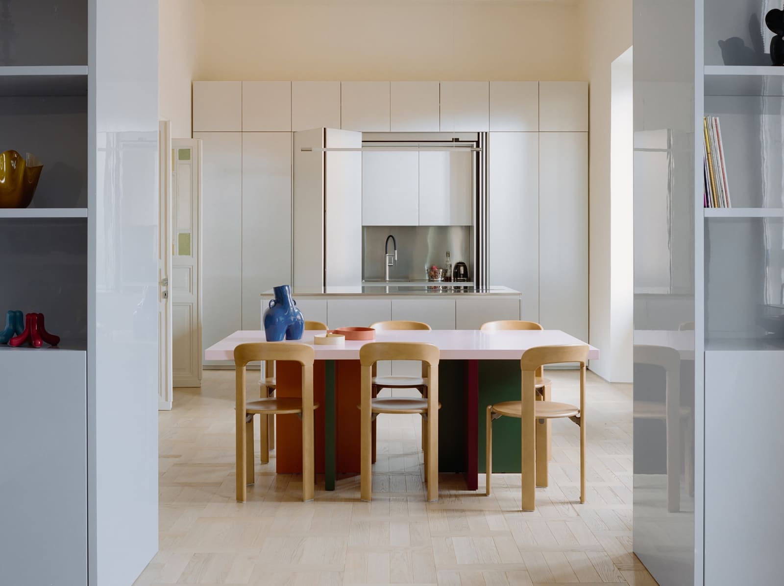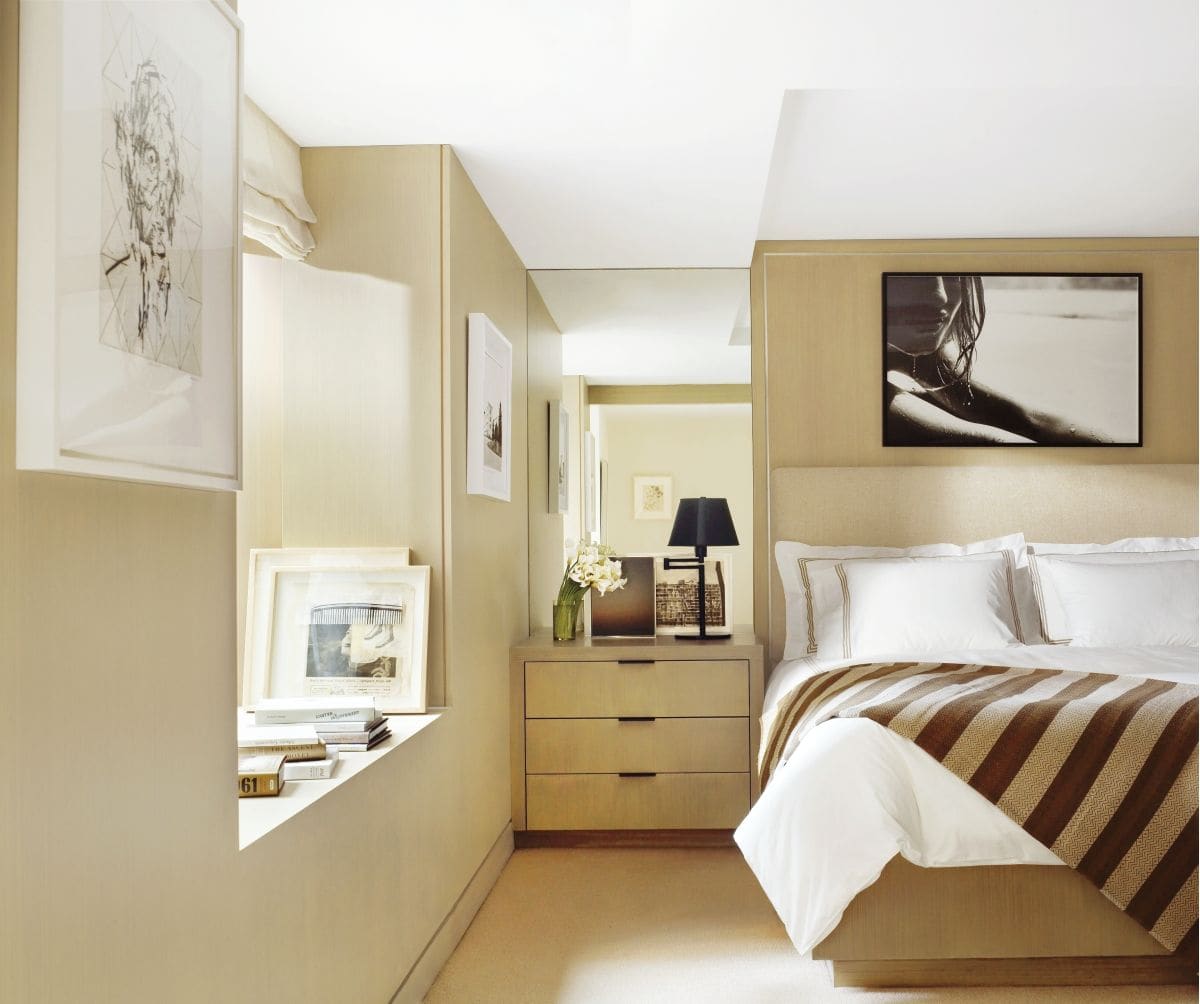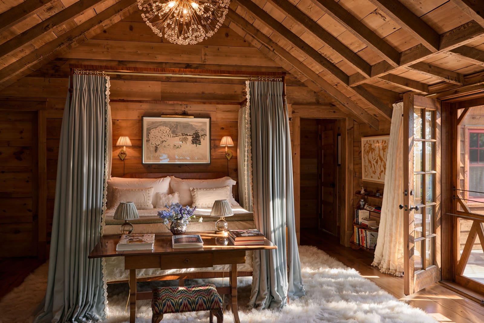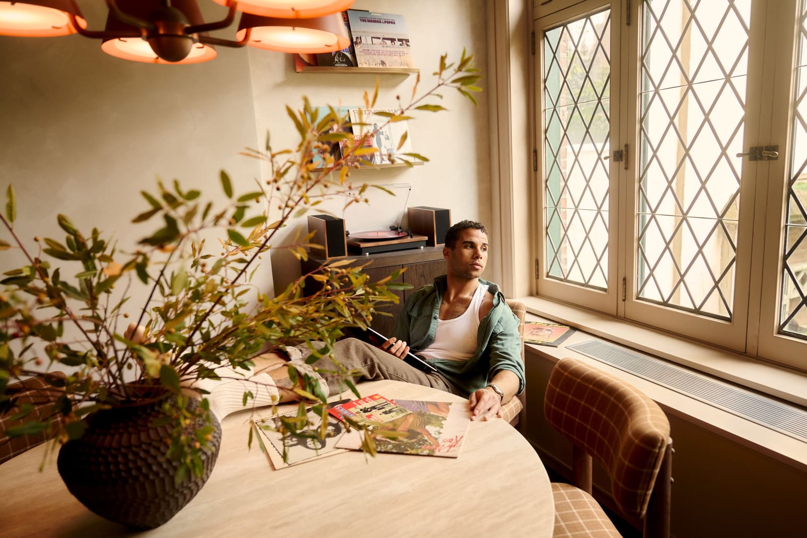
The Quiet Part Said Out Loud
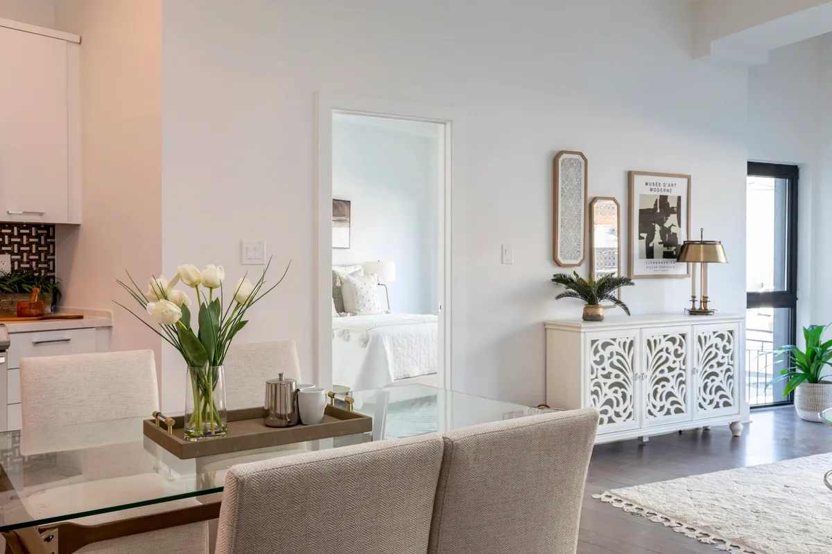
When Pantone names an off-white as Color of the Year, it's worth asking what the industry is trying to say without saying it. PANTONE 11-4201 "Cloud Dancer"—a warm, light-reflecting neutral described by Pantone as "lofty"—isn't just a palette cleanser after years of saturated hues. It's a signal that interiors are being asked to do less visual work, and that the fatigue with pattern, contrast, and chromatic intensity has reached the point where even the annual color announcement has become an exercise in restraint.
At World Archi Design, we've been tracking the gradual shift from high-contrast interiors (the deep greens, terracottas, and navy moments of 2021–2023) toward what we're now seeing in 2026: rooms that prioritize ambient calm over focal drama. Cloud Dancer fits neatly into that trajectory—not as a trend, but as a tool.
Why Off-White Is Harder to Deploy Than Pure White
White is easy. It's declarative. Off-white, by contrast, requires context. Cloud Dancer sits in that tricky zone where it reads as white under certain lighting but reveals warmth under incandescent or warm LED. That duality makes it useful in residential interiors where pure white (Farrow & Ball's All White, Benjamin Moore's Chantilly Lace) can feel sterile or institutional.
The challenge: off-whites demand tonal layering. A single off-white pillow on a white sofa reads as a mistake. Three off-white objects with varied textures—matte ceramic, brushed linen, waffle-weave cotton—read as intentional. This is where Cloud Dancer becomes a design argument rather than a decorative flourish: it works best when multiplied and modulated, not isolated.
Six Low-Intervention Applications (No Paint Required)
Textile Swaps: The Pillow as Spatial Anchor
The fastest entry point is textile replacement—specifically, pillow covers in tonal pairs. A smooth off-white linen paired with a nubby bouclé or chunky knit in the same color family creates enough micro-contrast to register as designed, not default. On darker upholstery (charcoal, walnut-toned leather, deep linen), this move brightens the plane without requiring new furniture.
One tactical addition: a single accent pillow in warm clay, cocoa, or muted terracotta keeps the palette from drifting into the coldness that plagued Scandinavian minimalism in its Instagram era.
Throws as Textural Proxies
A waffle-weave or chunky-knit throw in an off-white tone does double duty: it adds warmth (literally and visually) and it photographs well in the diffused natural light that Cloud Dancer is designed to enhance. The rule here is simple—if the color is neutral, the texture must be legible. Smooth off-white fleece reads as generic; a thick cotton or wool weave reads as considered.
Draping matters. Over one arm of a sofa or across the foot of a bed, casually, not styled to death. The goal is to look lived-in, not catalog-ready.
Lampshade Replacement: The Cheapest Lighting Upgrade
Replacing a lampshade costs less than replacing the lamp, and the impact is disproportionate. A warm off-white shade (linen or cotton, not paper) softens the quality of light in a room, especially when paired with warm-temperature bulbs (2700K, not the blue-white LEDs that dominated early-2010s interiors).
This is a move borrowed from hospitality design—boutique hotels have been using warm-toned shades to create ambient glow for years. It's one of the few strategies that translates cleanly to residential without requiring a contractor.
Tone-on-Tone Vignettes: The Shelf as Micro-Gallery
Grouping three to five objects in the same tonal family—ceramic vessels, matte candles, a light-covered book, a small bowl—creates what designers call a "quiet moment." This is the inverse of the maximalist shelfie: instead of color contrast, you're working with subtle shifts in finish (matte vs. gloss) and form (organic vs. geometric).
One metallic accent—a small chrome tray, a brushed-brass candle snuffer—keeps it from reading as monastic. The metal acts as a visual comma, breaking up the softness without disrupting the palette.
Oversized Prints with Negative Space
A large-format print with significant negative space (minimal line art, abstract photography, pale landscapes) introduces the Cloud Dancer sensibility without requiring wall paint. The key is scale: a small print in a large room disappears. An oversized piece (30" × 40" or larger) anchors the wall and makes the room read brighter from across the space.
This is a tactic lifted from gallery design, where negative space is used to direct attention. In residential interiors, it has the added benefit of making ceilings feel higher and rooms feel less cluttered—two qualities that align with the broader 2026 shift toward visual simplification.
Ceramics as Functional Softness
Matte off-white ceramics—mugs, bowls, vases, catchall trays—are the easiest way to introduce Cloud Dancer into daily use. Unlike paint or upholstery, ceramics are modular: you can add one piece at a time, and the cumulative effect builds gradually.
This approach has precedent in mid-century Scandinavian design (Arabia's Teema line, Iittala's matte glazes) and in contemporary Japanese tableware (Hasami, Tokoname). The logic is the same: matte off-white reads as warm and tactile, not clinical.
What Cloud Dancer Pairs With (and What It Doesn't)
Pantone positions Cloud Dancer as a foundation color, which means its success depends on what it's layered with. Warm wood tones (white oak, walnut) create a soft, grounded contrast. Chrome or stainless steel adds crispness without harshness. Stone tones—sand, putty, light gray—build a tonal landscape that feels cohesive rather than flat.
What it doesn't pair well with: high-gloss finishes, stark black, or anything that pulls the palette into cold territory. Cloud Dancer is warm-leaning, and it needs warm or neutral companions to perform correctly.
The Larger Shift: Neutrals as Active Agents
The selection of an off-white as Color of the Year is less about the color itself and more about what it represents: a recalibration of how color functions in interiors. After years of bold accent walls and saturated textiles, the pendulum has swung toward palettes that don't demand constant visual processing.
This isn't minimalism in the austere sense—it's minimalism as a form of cognitive relief. Cloud Dancer works because it doesn't compete. It's a color that makes everything around it look cleaner, more intentional, and more expensive. That's not a trend. That's a strategy.
Save this story. A free account keeps your reading list and the 07:00 email in one place.
CREATE FREE ACCOUNT →SIGN IN