The Compression Paradox
At what scale does a space stop being a container for experience and become the experience itself? The question hovers over many micro-hospitality interventions in European city centers, where rising rents and zoning constraints have made the sub-50-square-meter café a typological necessity. Yet size alone doesn't determine whether such spaces feel claustrophobic or charged. The difference lies in how designers handle compression—whether they fight it or weaponize it.
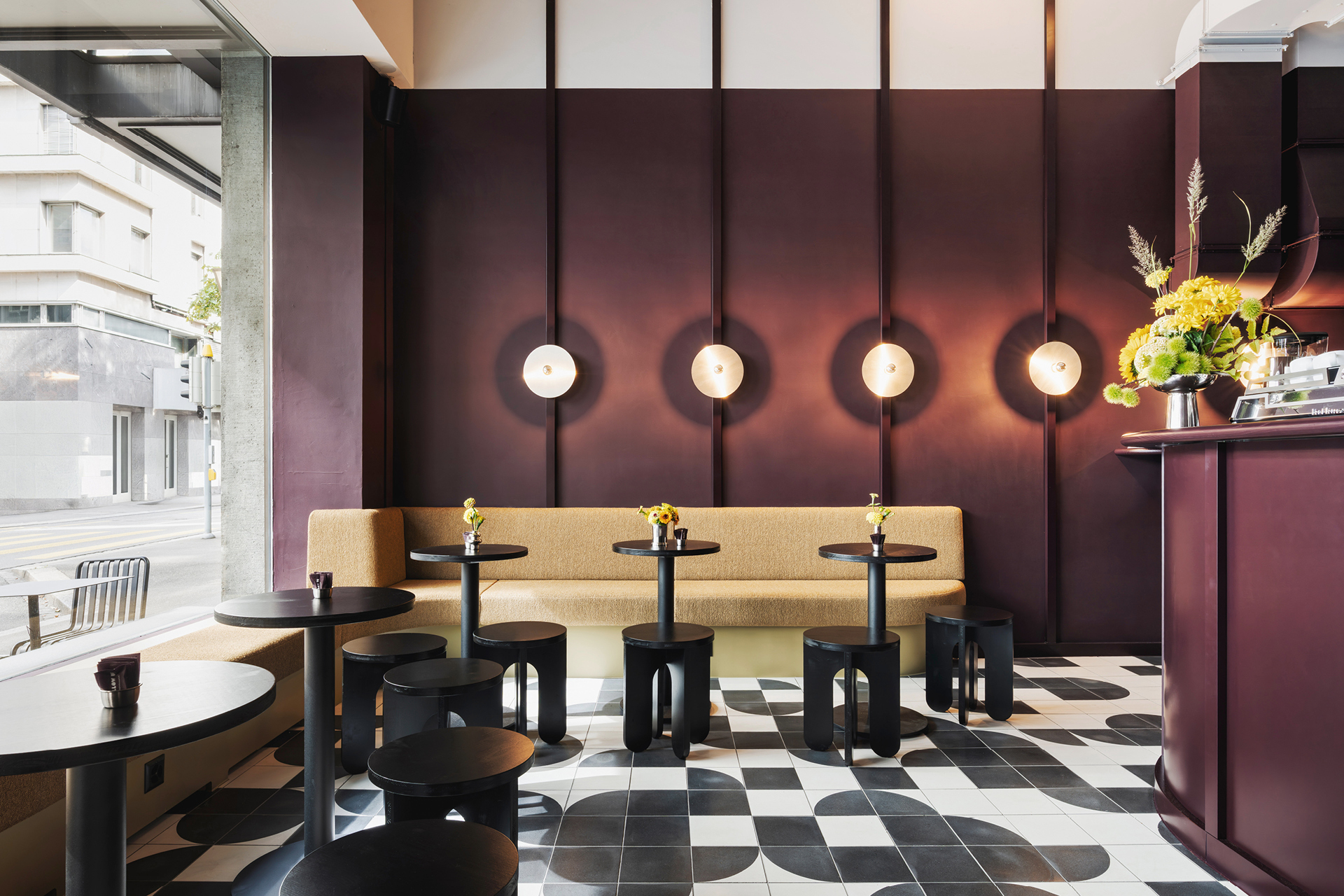
La Piada, a 35-square-meter bar and café in Zurich's Kreis 1 district, falls into the latter camp. Completed in 2025 by pfeffermint AG under lead architect Nicole Imhof, the project attempts to collapse the geographic and cultural distance between Zurich and Italy's Emilia-Romagna region—the birthplace of piadina, the flatbread that gives the café its name and raison d'être. The interior doesn't mimic a trattoria or deploy nostalgic signifiers. Instead, it treats compression as a formal strategy, using material density and spatial layering to create what might be called atmospheric intensity: the sense that a small space can hold more cultural charge per square meter than a larger one.
Spatial Strategy: Layering Over Expansion
The parti is simple: rather than open the space with mirrors or light wells—common tactics in micro-retail—pfeffermint AG chose to layer it. The interior is organized as a sequence of material zones that overlap rather than divide. A timber-clad service counter anchors the center, but its edges blur into adjacent surfaces—plaster walls that curve slightly to soften corners, terrazzo flooring that runs uninterrupted from threshold to back wall, steel-framed glass partitions that separate without enclosing.
This layering has a spatial effect. Because no single material dominates, the eye doesn't settle on a single plane. Instead, it tracks the seams—where timber meets plaster, where terrazzo abuts steel, where light grazes a curved edge. The result is a kind of perceptual expansion: the space feels larger than its footprint because it contains multiple readings. Stand at the entrance and it reads as a bar; move two meters forward and it reorganizes as a seating niche; shift laterally and it becomes a display surface.
The strategy recalls the work of Zurich-based studio Diener & Diener, whose small-scale interventions—particularly their 1990s Kunsthaus Zurich café—demonstrated that spatial richness doesn't require square footage. It requires adjacency, overlap, and material friction. Pfeffermint AG's approach is less austere than Diener & Diener's, more willing to embrace warmth and tactility, but the underlying logic is shared: compression can generate complexity.
Material Palette: Authenticity Without Pastiche
The materiality avoids the trap of Italian simulacra—no exposed brick, no Chianti bottles, no faux-rustic signage. Instead, pfeffermint AG selected materials that nod to Emilia-Romagna's vernacular without quoting it directly. The terrazzo flooring, for instance, references the region's historic use of cementitious aggregates, but its palette is muted—grays and off-whites rather than the saturated reds and ochres of traditional Italian terrazzo. The timber cladding is unstained European oak, left to patinate naturally rather than forced into a Mediterranean hue.
The steel-framed partitions introduce a contemporary note, a reminder that this is a Zurich café in 2025, not a time capsule. But their proportions—slender frames, generous glass panels—recall the metal-and-glass shopfronts of postwar Italian modernism, the kind Gio Ponti and BBPR deployed in Milan and Turin. The gesture is subtle enough that it doesn't announce itself, but legible enough that it registers as more than decorative.
Lighting reinforces the material strategy. Rather than uniform overhead illumination, the space uses a combination of linear LED strips tucked into ceiling coves and low-voltage pendants over the counter. The effect is to create zones of brightness and shadow, which further fragment the space perceptually. A customer waiting at the counter experiences a different luminous environment than someone seated three meters away.
Branding as Spatial Gesture
Pfeffermint AG handled both interior design and branding for La Piada, a dual mandate that allowed the visual identity to function as a spatial element rather than an overlay. The café's graphic system—a geometric sans-serif wordmark, a limited palette of black, white, and terracotta—extends onto wall surfaces, menu boards, and even the terrazzo floor, where a subtle inlay marks the threshold.
This integration of branding and architecture isn't new—studios like Snøhetta and Norm Architects have long treated graphic design as part of the spatial toolkit—but it's rarely executed with this level of restraint. The typography doesn't compete with the materials; it modulates them. A wall-mounted menu becomes a compositional anchor, balancing the visual weight of the timber counter. A terracotta stripe along the baseboard ties the floor to the ceiling without overwhelming either.
The danger in such integration is over-determination—the sense that every surface has been designed to the point of exhaustion. La Piada avoids this by leaving gaps. There are stretches of blank plaster, moments where the timber cladding stops short of a corner, zones where the terrazzo is allowed to simply be a floor. These voids give the space room to breathe, to accommodate the unpredictable choreography of café life.
Cultural Context: The Micro-Hospitality Moment
La Piada arrives at a moment when European cities are rethinking the relationship between hospitality and urban density. Zurich, like Copenhagen, Amsterdam, and Vienna, has seen a proliferation of sub-50-square-meter food-and-beverage concepts in the past decade—not as pop-ups or kiosks, but as permanent, design-forward destinations. The trend is partly economic (lower rents, lower fit-out costs) and partly cultural (a desire for intimacy and specificity over scale and genericism).
But the typology carries risks. Small spaces can feel precious or overly curated, more interested in Instagram legibility than lived experience. Pfeffermint AG's design sidesteps this by prioritizing use over image. The counter is sized for efficient service, not photogenic drama. The seating is minimal but functional. The materials are durable—terrazzo and oak will age well, unlike the plywood and exposed OSB that dominate much micro-retail.
The project also raises questions about cultural translation. Can a 35-square-meter space in Zurich authentically convey the spirit of Emilia-Romagna? Or is it always, inevitably, a simulacrum—a compressed, aestheticized version of something that exists elsewhere, at a different scale, under different conditions? Pfeffermint AG's answer seems to be: both. The space doesn't pretend to be Italy; it evokes it through material resonance and spatial intensity. Whether that's enough depends on what you expect from a café—and from architecture.
A Test Case for Intensity Over Area
What La Piada demonstrates, ultimately, is that small-scale hospitality design can be more than a branding exercise. When handled with rigor, compression becomes a generative constraint—forcing designers to think in terms of material adjacency, perceptual layering, and atmospheric density rather than square footage. Pfeffermint AG's interior won't redefine the café typology, but it offers a credible model for how to work within its constraints without resorting to gimmickry or pastiche.
The question now is whether the approach scales—not in size, but in replication. If the logic of material layering and spatial compression can produce richness at 35 square meters, can it do the same at 50? At 100? Or does it depend on the intimacy of the very small, the kind of space where every surface is within arm's reach? At World Archi Design, we've been tracking the proliferation of micro-hospitality interventions across European cities, and the most successful ones—like La Piada—seem to understand that smallness isn't a liability. It's a medium.
Save this story. A free account keeps your reading list and the 07:00 email in one place.
CREATE FREE ACCOUNT →SIGN IN