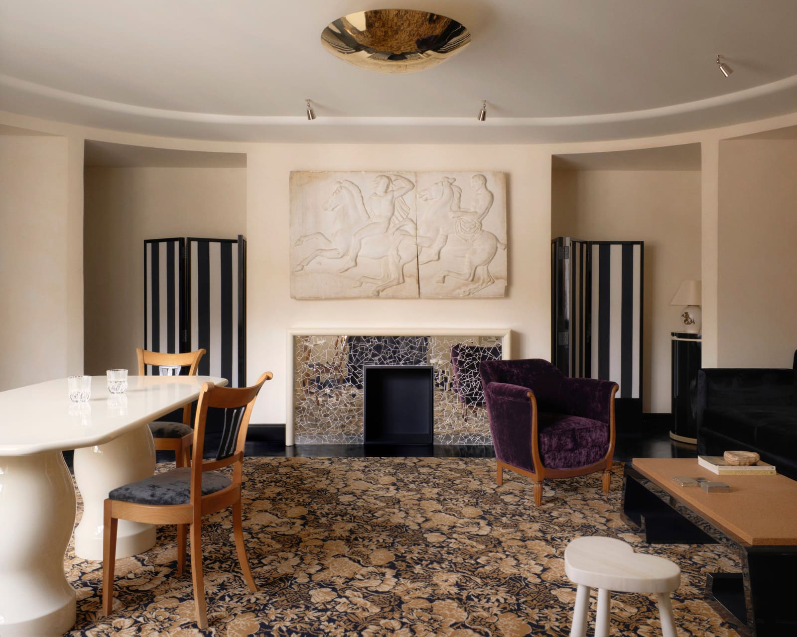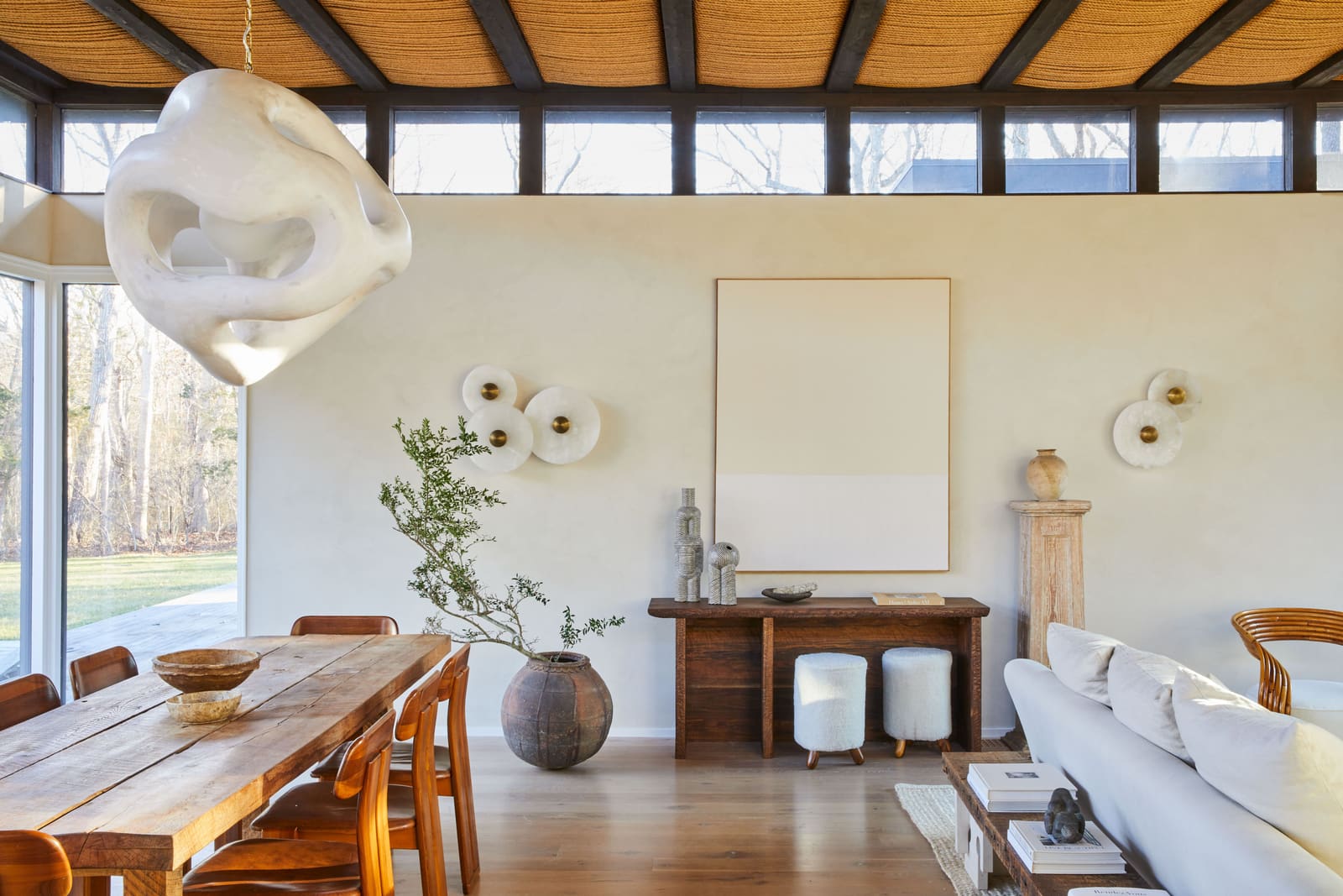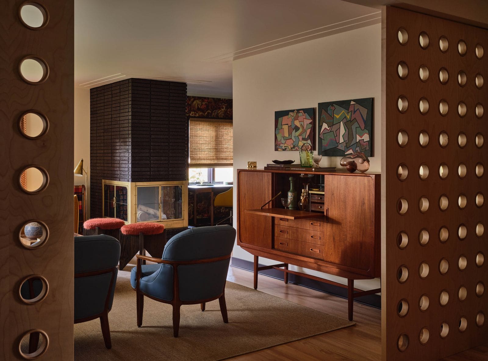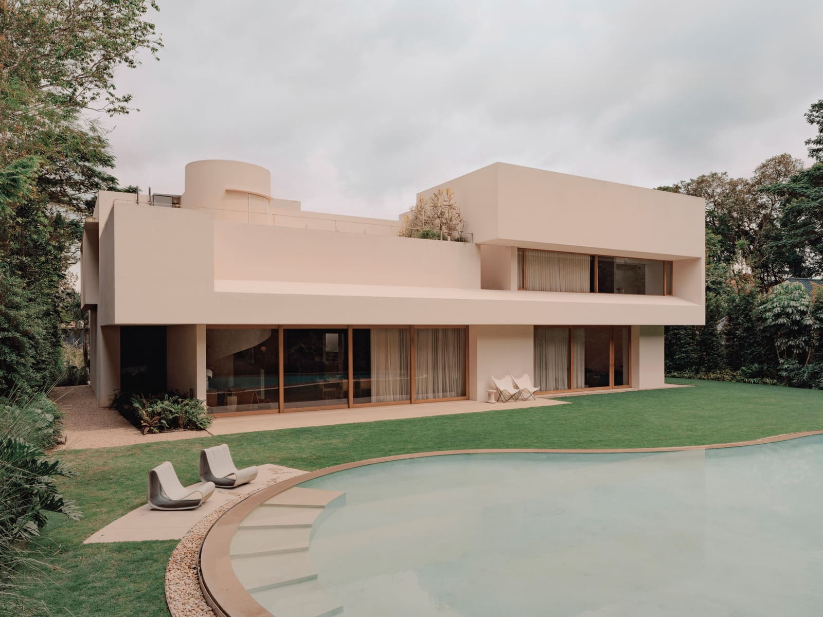
The Difference Between Correct and Compelling
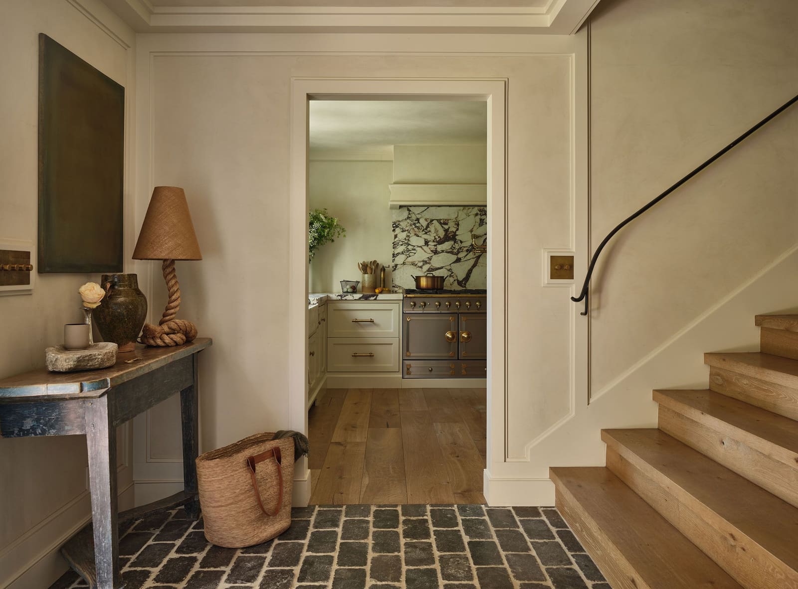
Walk into a well-designed room and you'll likely notice the furniture arrangement first, perhaps the palette or the lighting. But the feeling that lingers - the sense that a space has soul rather than just style - rarely comes from the obvious choices. It lives in the radius of a cabinet corner, the deliberate mismatch of a trim color, or the way a single object refuses to line up with everything else. These micro-decisions accumulate into something larger: the difference between a room that photographs well and one that holds your attention in person.
At World Archi Design, we've been tracking a shift in how practitioners approach detailing. The past decade's emphasis on statement pieces and hero materials has given way to something more nuanced - a recognition that character often emerges from restraint, from choices so subtle they register as intuition rather than design. The best work today operates at this threshold: visible enough to create tension, invisible enough to avoid distraction.
Millwork as Behavioral Architecture
Custom cabinetry has long been a marker of high-end residential work, but the most thoughtful examples now extend beyond aesthetics into choreography. Linette Dai, whose Los Angeles practice specializes in layered residential interiors, designs millwork around what she calls "life rituals" - the small, repeated actions that structure daily experience. A sofa she recently completed includes integrated side tables with concealed drawers, positioned to hold remotes and other ephemera within arm's reach. The gesture is practical, but its real value lies in how it anticipates behavior, embedding function so seamlessly that the user forgets it was designed at all.
Leah Ring takes a different approach, using decorative flourishes and radius corners to soften the industrial precision that millwork can sometimes convey. These moves - a curved edge here, a recessed detail there - shift cabinetry from backdrop to tactile presence. The difference is small but legible: sharp corners suggest efficiency, while rounded ones invite touch. Both communicate, but they speak different languages.
The best millwork today does double duty: it organizes space while encoding a particular quality of life. It's architecture at domestic scale, responsive not just to dimensions but to how a household actually moves.
Hardware as Disappearance
Light switches and outlet plates are among the most frequently touched surfaces in any home, yet they're often treated as afterthoughts. Sarah Solis, whose Malibu-based practice emphasizes material longevity, sees them as opportunities for quiet refinement. She favors unlacquered brass and bronze finishes that patina over time, aging visibly rather than degrading. The choice signals a different relationship to maintenance - one that values change over stasis.
Daniella Gohari pushes the idea further. In a recent kitchen project, her New York firm integrated stovetop controls directly into the surrounding millwork, eliminating the visual clutter of freestanding knobs. The result is a composition that foregrounds materiality - the grain and finish of the wood - rather than the mechanics of cooking. It's a move borrowed from yacht design and high-end automotive interiors, where every surface is considered part of a continuous whole.
This approach requires coordination between multiple trades and a willingness to complicate installation, but the payoff is a space that feels less assembled and more inevitable. Hardware doesn't disappear because it's hidden; it disappears because it's absorbed into a larger formal logic.
Color as Spatial Modulation
Bold color contrasts have their place, but the most layered interiors often rely on subtler gradations. Ring frequently specifies trim in a slightly different hue than the walls - sometimes just a shade lighter or darker - to sharpen architectural lines without announcing them. The technique creates visual interest through modulation rather than opposition, a kind of tonal breathing that keeps the eye engaged.
Sydney Jackson uses this principle in her Connecticut kitchen projects, where she treats islands as opportunities for chromatic shift. Rather than matching cabinetry throughout, she introduces a more saturated or unexpected hue on the island, creating a focal point that doesn't dominate. The strategy borrows from traditional color theory - complementary or analogous pairings - but applies it with restraint, trusting small doses to do the work of larger statements.
The logic here is architectural: color becomes a tool for defining zones and guiding circulation, not just for aesthetic expression. A well-chosen trim color can make a ceiling feel higher or a hallway less narrow, adjustments that operate below the threshold of conscious perception but shape how a space is experienced.
Tailoring Upholstery Beyond the Obvious
Custom upholstery is standard in high-end residential work, but the degree of customization varies widely. Ring often specifies contrasting fabric welt - a narrow strip of piping along seams - as a way to introduce color or texture without overwhelming a piece. The detail is borrowed from mid-century tailoring, where welt added structure and visual punctuation. In contemporary interiors, it serves a similar function: sharpening edges, creating definition, and signaling that a piece was considered rather than catalog-ordered.
Jackson favors blind tufting on custom cushions, a technique that suggests the presence of buttons without the hardware. The result is a subtle topography, a play of light and shadow that adds dimension to what would otherwise be a flat surface. It's a move that rewards proximity - something you notice only when you sit down, a private detail in an otherwise public room.
These techniques recall the craft traditions of bespoke tailoring, where the quality of finish often matters more than the choice of fabric. In interiors, they perform a similar role: they signal care, precision, and a willingness to invest in details that won't show up in photographs but will register in daily use.
Asymmetry as Compositional Strategy
Perfectly balanced compositions can feel inert, as if all the decisions have already been made. Heidi Caillier, whose Pacific Northwest practice is known for its layered, lived-in quality, often introduces asymmetry to disrupt that sense of resolution. An off-center lamp, a painting hung slightly higher than expected - these moves create tension, forcing the eye to recalibrate rather than glide. The effect is subtle but significant: the room feels less like a finished product and more like an ongoing conversation.
Nina Freudenberger takes a structural approach, designing built-in bookcases with staggered shelves that refuse conventional symmetry. In a Montauk project, she varied shelf heights and depths across a single wall, creating a rhythm that feels improvised even though it was carefully planned. The result is a kind of controlled irregularity, a formal strategy that mimics the accumulation of objects over time.
This use of asymmetry has precedents in Japanese spatial composition, where balance is achieved through distribution rather than mirroring. It's a different kind of order - one that accommodates change, allows for visual breathing room, and resists the static perfection that can make a space feel untouchable.
The Accumulation of Small Moves
What unites these approaches is an understanding that interiors are experienced sequentially, not all at once. A room reveals itself through a series of small encounters: the way a drawer opens, the grain of a switch plate, the unexpected hue of a baseboard. These details don't demand attention, but they accumulate into an atmosphere, a quality of presence that separates memorable spaces from merely competent ones.
The challenge for designers is knowing when to stop - when the layering becomes clutter, when the detail becomes distraction. The best work today operates at that edge, trusting restraint and resisting the impulse to over-articulate. It's a kind of confidence that comes from experience, from understanding that the most powerful gestures are often the quietest.
In an era dominated by image-making and instant legibility, these practitioners are betting on something slower: the idea that a room's real value emerges over time, through use and familiarity, in moments too small to photograph but too significant to ignore.
Credit: Michael Clifford
Save this story. A free account keeps your reading list and the 07:00 email in one place.
CREATE FREE ACCOUNT →SIGN IN