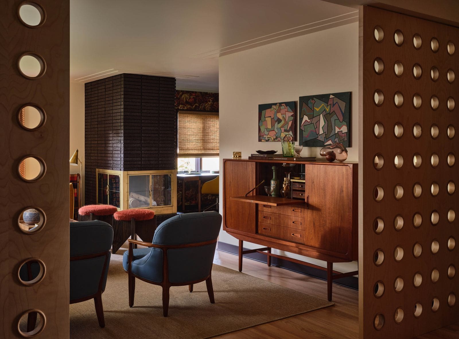
From Wallflower to Statement Piece
There's a quiet revolution happening along underutilized walls. The sideboard, that long-neglected storage workhorse traditionally banished to dining rooms, has undergone a transformation that speaks to broader shifts in how we think about furniture as architecture. What was once a purely functional repository for linens and dishware now commands attention through sculptural form, material experimentation, and a willingness to occupy space with confidence rather than apologize for it.
At World Archi Design, we've been tracking this evolution across residential projects, and the pattern is clear: designers are no longer treating these cabinets as background elements. Instead, they're deploying them as focal points that introduce proportion, rhythm, and tactile richness into rooms that might otherwise read as flat. The contemporary sideboard borrows equally from midcentury discipline and maximalist theatricality, resulting in pieces that feel both grounded and expressive.
Material Honesty and Surface Play
The material palette has expanded dramatically. Mango wood brings warmth and grain variation that machine-cut veneers can't replicate. Rattan, once coded as purely coastal, now appears in urban contexts where its woven texture provides visual relief against hard surfaces. Teak maintains its midcentury pedigree, particularly in vintage pieces that surface in estate sales and designer renovations.
But it's the treatment of these materials that reveals intent. Fluted fronts create shadow lines that shift throughout the day. Scalloped door profiles soften rectilinear rooms. Burl wood veneers, finished to a high gloss, transform storage into something closer to sculpture. These aren't decorative flourishes; they're deliberate strategies to modulate light, introduce rhythm, and create moments of visual pause.
Consider the architectural language at work in pieces with grid-cut relief facades. The compartmentalization recalls apothecary cabinets and card catalogs, systems of storage that made organization visible rather than hidden. When translated to residential scale, this approach invites a different relationship with the object. You're not just using it; you're reading it.
Proportion and the Problem of Scale
One challenge the sideboard poses is its horizontal emphasis. At six to seven feet long but rarely more than three feet tall, it occupies a transitional zone in a room's elevation, neither anchoring the floor plane like seating nor engaging the upper wall like art or shelving. The best examples solve this through leg design and profile articulation.
Tubular legs, for instance, create a datum line that lifts the mass and allows visual (and literal) passage beneath. This strategy has roots in Scandinavian design, where furniture was conceived as inhabiting space rather than claiming it. Angled legs, by contrast, introduce dynamic tension. They suggest movement and make the piece feel less grounded, which can be useful in rooms where too much horizontal weight would feel oppressive.
Curved silhouettes represent another approach to the scale problem. By introducing convex or concave profiles, designers disrupt the relentless linearity that plagues many interiors. The curve doesn't just soften; it redirects the eye and creates spatial flow. In plan, a curved sideboard can help transition between zones or guide circulation in open layouts.
Function Meets Formalism
Despite all this formal experimentation, these pieces still need to work. Adjustable shelving is standard but often poorly executed. The best configurations use metal shelf pins rather than plastic, and provide enough vertical options to accommodate everything from oversized serving platters to vinyl records. Soft-close hinges prevent the cabinet doors from slamming, a small detail that dramatically affects the perceived quality of the piece.
Modular systems deserve mention here. While a single sideboard can anchor a dining room, some manufacturers offer configurations that allow multiple units to combine into longer runs or L-shaped arrangements. This flexibility makes them viable for media walls or even as room dividers in loft spaces. The challenge is maintaining visual coherence when units are ganged together; the best systems use consistent joinery and finish details to read as a unified composition rather than a series of boxes.
Cord management, often an afterthought, becomes critical when the sideboard doubles as a media console. Integrated grommets or rear cutouts keep cables organized and prevent the tangle that undermines even the most considered design. Some pieces include interior outlets, which future-proofs the unit for evolving electronics.
The Return to Craft
What's striking about the current moment is how many of these pieces foreground craft. Hand-woven rattan, solid hardwood construction, brass hardware that's forged rather than stamped. This isn't nostalgia; it's a response to decades of particleboard mediocrity and the recognition that furniture operating at this scale needs substance.
Black acacia, for example, offers both structural integrity and a finish that resists the visual noise of heavy grain. When precision-cut and seamlessly joined, it can create surfaces so smooth that door seams nearly disappear, an effect that borders on trompe-l'oeil. The restraint required to achieve this level of refinement stands in sharp contrast to more expressive approaches, yet both strategies share a commitment to material authenticity.
Vintage teak pieces, particularly those from the 1960s and 70s, continue to influence new designs. The joinery techniques used in that era - dovetails, mortise-and-tenon, finger joints - represent a level of craft that's expensive to replicate but worth studying. When contemporary manufacturers reference these precedents, the best results come from understanding the underlying principles rather than simply copying forms.
Color as Spatial Tool
The chromatic range has also expanded. Moss green, a hue that might have felt too bold a decade ago, now appears on credenzas in both traditional and modern interiors. The color works because it occupies a middle value that neither recedes nor dominates, allowing the form itself to remain the focus.
Black furniture, having cycled in and out of favor for decades, has returned with new context. In bedrooms it can feel heavy, but in living and dining spaces it provides graphic punch and helps other elements in the room cohere. The key is pairing it with enough contrast - light walls, pale floors - to prevent the space from feeling cave-like.
Natural oak, particularly when wire-brushed or lightly whitewashed, offers a neutral baseline that works across design registers. It's accommodating without being bland, and its warm undertones prevent the coldness that can afflict gray-heavy palettes.
Installation and Context
Placement matters more than many realize. A sideboard floating on a wall, with space on either side, reads differently than one wedged between architectural features. The former emphasizes the object; the latter integrates it into the room's fabric. Both are valid, but the choice should be deliberate.
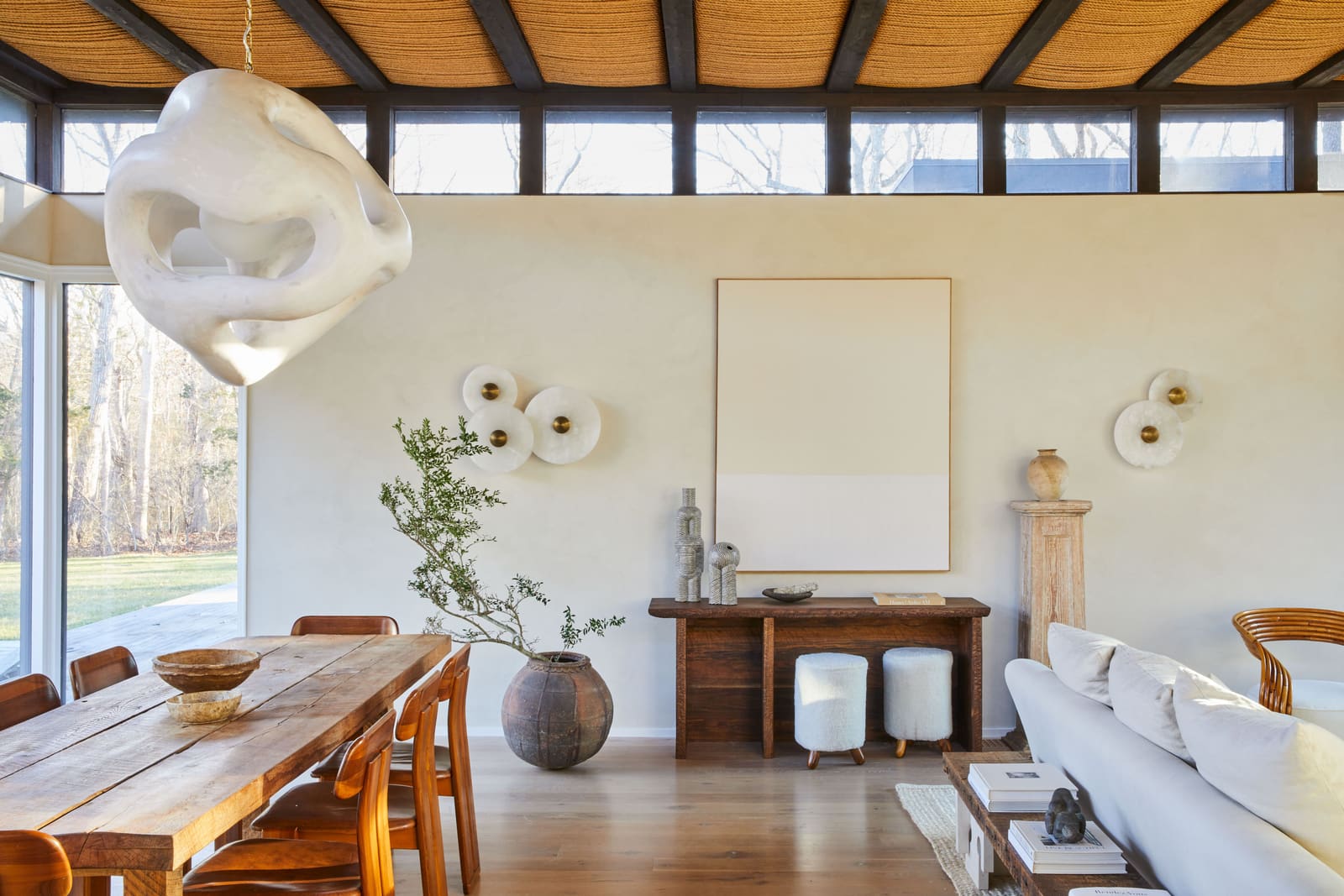
In dining rooms, the traditional location, the sideboard often sits opposite the table, creating a visual terminus and providing staging area for serving. But we're seeing more adventurous placements: behind a sofa to define a seating zone, in an entry to establish arrival sequence, or along a hallway to activate circulation space.
The relationship to adjacent elements also warrants attention. A sideboard beneath a large mirror or piece of art creates a composed vignette, but the proportions need to align. Generally, artwork should be no wider than the cabinet and centered on the wall above, with 6 to 12 inches of clearance between the cabinet top and the art's lower edge.
What This Shift Reveals
The sideboard's renaissance tells us something about how domestic space is evolving. As homes become more flexible and multifunctional, furniture needs to work harder while maintaining aesthetic coherence. The sideboard, with its generous storage capacity and horizontal emphasis, fits this brief perfectly. It can house a media system, a bar setup, a book collection, or simply provide a surface for display.
But beyond utility, these pieces reflect a renewed appetite for furniture that engages seriously with design history while remaining legible in contemporary contexts. They're not ironic and they're not minimal to the point of disappearance. Instead, they occupy a middle ground where craft, material quality, and formal invention can coexist without any single element overwhelming the others.
This balance - between presence and restraint, between function and form - is difficult to achieve. When it works, the sideboard becomes exactly what good furniture should be: a thoughtful response to spatial and programmatic needs that also manages to elevate the everyday act of storage into something worth looking at.
Credit: Michael Clifford
Save this story. A free account keeps your reading list and the 07:00 email in one place.
CREATE FREE ACCOUNT →SIGN IN