A Question of Partnership, Not Dominance
How should a new building relate to a beloved original? This question has plagued architects and institutions for decades, often yielding additions that either mimic their predecessors too timidly or shout for attention too loudly. At the New Museum in New York, OMA has charted a third path - one rooted in balance, restraint, and a kind of architectural intimacy that feels less like construction and more like collaboration.
The expanded museum now spans 11,148 square metres, effectively doubling its footprint. Yet OMA's intervention does not read as a separate entity. Instead, it functions as a counterpart to the 2007 SANAA building, engaging in a spatial dialogue that enhances both structures. Shohei Shigematsu, a New York-based partner at OMA, framed the endeavor as designing "a pair" rather than an extension - a subtle but profound shift in thinking that permeates every decision.
The Original Context: SANAA's Stacked Icon
SANAA's original building arrived on the Bowery at a pivotal moment. Its stacked, off-kilter volumes clad in expanded aluminum mesh made an immediate impression, becoming one of Lower Manhattan's most recognizable silhouettes. The structure seemed to embody the neighborhood's transformation from historic grit to contemporary polish, and it anchored a wave of development that brought condominiums, boutiques, and hotels to the area.
But success brought its own pressures. Within a decade, the museum found itself constrained by its own popularity. Attendance surged, programming diversified, and the galleries began to feel undersized. Circulation became a bottleneck, with visitors navigating tight corridors and congested stairwells. The museum needed more space - but not at the expense of its architectural identity.
Massing and Gesture: How OMA Reveals SANAA
OMA's addition is shorter and deeper than its neighbor, a proportional shift that allows the SANAA building to retain visual primacy from certain angles. The most telling gesture occurs at street level, where a triangular cutaway in the facade creates a small plaza aligned with Prince Street. This move does more than provide public space - it exposes a previously hidden elevation of the SANAA structure, one that had been obscured by an adjacent commercial building.
At the roofline, the massing steps back to form a series of triangular terraces. This recession reveals the cantilevered crown of the original building, ensuring that SANAA's signature overhang remains legible in the skyline. These are not merely deferential gestures; they are acts of architectural generosity that prioritize the composition as a whole over individual assertion.
The Staircase as Civic Infrastructure
If OMA's facade exercises restraint, the interior asserts a clear identity. A grand staircase spirals through the front portion of the building, rising through multiple floors and capturing shifting views of the city. This element addresses the museum's former circulation problems while creating what Shigematsu describes as "a kind of collision space" - a zone where visitors, staff, and the public can linger, meet, and move fluidly between exhibitions.
The staircase atrium currently hosts Shelter, a four-storey installation by artist Klára Hosnedlová composed of flax-based textiles that cascade down the central void. The work amplifies the spatial drama of the staircase, turning circulation into spectacle. But even without the installation, the staircase functions as a social and spatial anchor, a piece of infrastructure that feels as much civic as institutional.
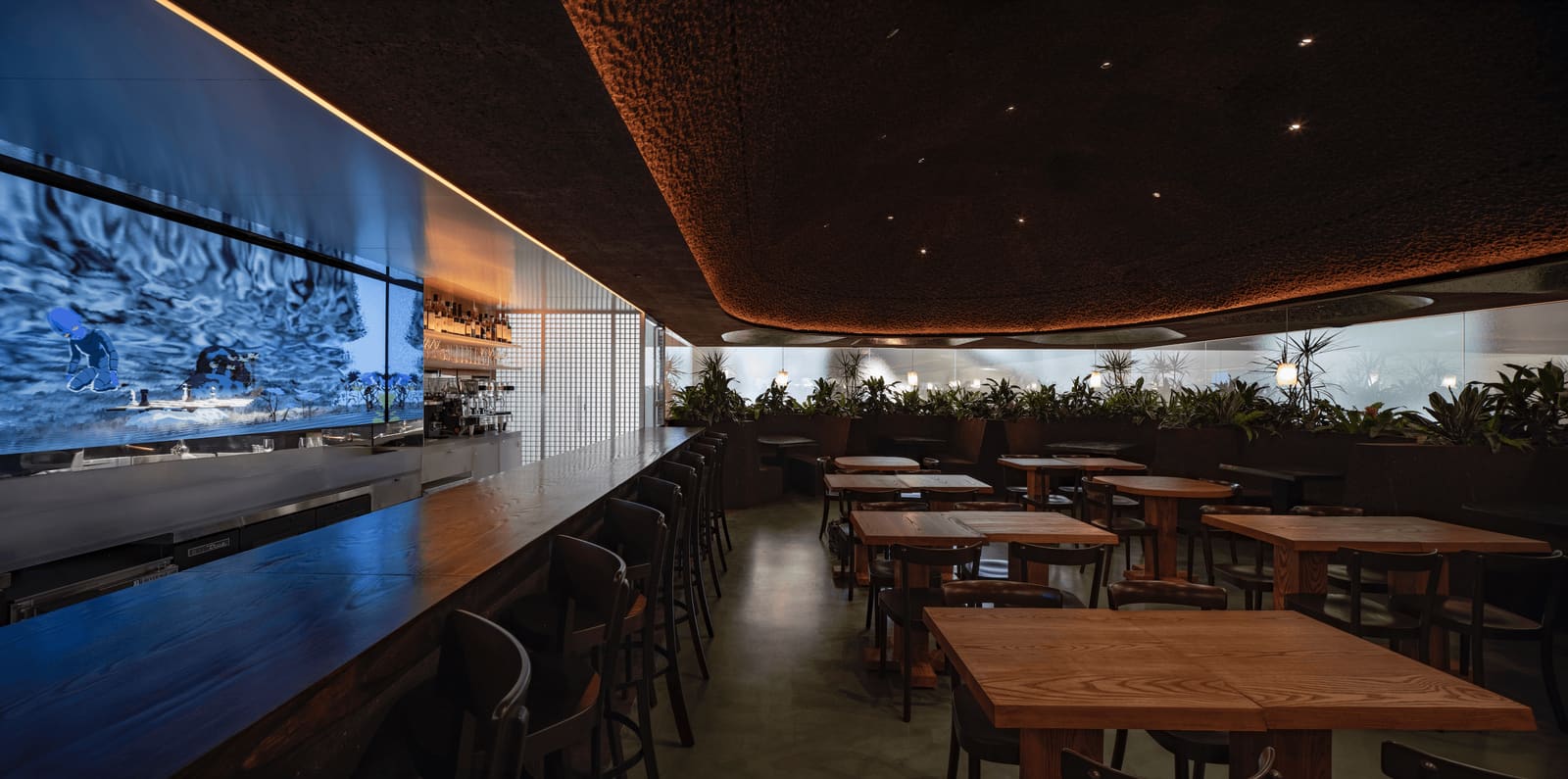
Across the interior, new and old floors connect with minimal visual friction. The transition between OMA and SANAA spaces is so seamless that visitors might lose track of which building they occupy - a testament to careful coordination of floor heights, material palettes, and spatial proportions.
A Facade That Shifts With Light
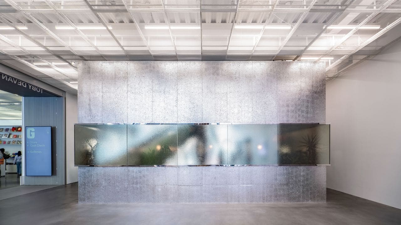
OMA clad the addition in glass laminated with metal mesh, a material choice that responds to the SANAA building's expanded aluminum skin while introducing a dynamic quality. During daylight hours, the facade reads as opaque and highly metallic, its surface reflecting the urban surroundings. At night, transparency emerges as interior light permeates the glass, revealing the building's inner workings and activity.
This diurnal transformation gives the facade a temporal dimension, one that shifts with use and atmosphere. It is a subtle nod to the original building's shimmering mesh, but it operates on different principles - glass rather than metal, transparency rather than opacity, changeability rather than constancy.
The Precedent of Paired Additions
OMA's approach recalls a small but significant lineage of museum expansions that prioritize dialogue over dominance. Frank Gehry's addition to the Art Gallery of Ontario, completed in 2008, wove new galleries into the existing structure while maintaining the identity of both. More recently, David Chipperfield's extension of the Kunsthaus Zürich - opened in 2020 - created a distinct volume that nonetheless defers to the original 1910 building through material restraint and proportional sensitivity.
Yet the New Museum expansion distinguishes itself through its emphasis on revelation. Where other additions create new frontages or reorient entries, OMA's design works to make the SANAA building more visible, more legible, more itself. The new structure does not compete for attention; it redistributes it.
Rough Edges and Ongoing Refinement
The project has not been without challenges. Construction refinements continue after an apparent rush to open, with certain finishes and details still awaiting resolution. These rough edges are not unusual for large-scale institutional projects, but they underscore the complexity of executing a design premised on seamlessness and precision. As these issues are addressed, the full coherence of OMA's vision will likely become more apparent.
What the Expansion Suggests for Institutional Growth
At a moment when museums worldwide grapple with the question of how to expand - whether to build anew, renovate, or remain static - the New Museum offers a compelling case study. The project demonstrates that additions need not erase or overshadow; they can clarify, support, and enhance.
This approach requires humility, a quality not always abundant in contemporary architecture. It demands that architects study the original structure deeply, understand its strengths and limitations, and design in response rather than in isolation. It also requires clients willing to value long-term coherence over short-term spectacle.
The expanded New Museum suggests that the best additions function less like trophies and more like partners - distinct in identity, but united in purpose. In an era of architectural ego and institutional ambition, that might be the most radical proposition of all.
Photo: Jason Keen
Save this story. A free account keeps your reading list and the 07:00 email in one place.
CREATE FREE ACCOUNT →SIGN IN