The Studio Above the Tracks
Tucked above a tangle of rail lines in Kings Cross, a nondescript building houses what amounts to a laboratory for rethinking consumer electronics. The space contains prototyping equipment, colour samples that could fill a small archive, and a collection of vintage devices that serve as both inspiration and cautionary tale. Over the past eighteen months, the team inside has been engaged in a particular kind of recalibration: figuring out how much colour is the right amount, and what transparency actually means when the circuit board beneath the glass is as much theatre as engineering.
We've been tracking the ways studios navigate the tension between honesty and spectacle, and few occupy that space as deliberately as the designers working here. Their recent output - a cascade of phones, earbuds, and over-ear headphones - charts a visible shift from hard-edged Cyberpunk aesthetics toward something softer, more polychromatic, yet still grounded in the material vocabulary of exposed mechanics.
Colour as Architecture
Lucy Birley, who oversees colour, material, and finish decisions, describes her role as determining "the appropriate amount of colour" for each release. It sounds straightforward until you consider the variables: how a shade reads under different lighting conditions, how it translates from screen to physical object, how it holds up when sprayed versus printed, and whether it creates visual harmony across a product line that now spans multiple categories.
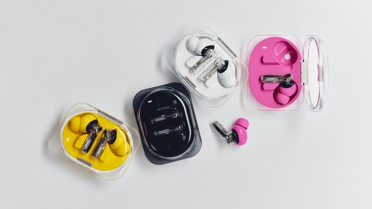
The introduction of pink caused what Birley describes as "some consternation" internally. The shade emerged by desaturating an existing red, a tonal shift subtle enough to feel like evolution rather than disruption. Yellow has undergone similar refinement - the version used on recent earbuds is fresher, slightly less vibrant than its predecessor. When applied to headphone ear pads, the original yellow made the product read too much like industrial hearing protection. The adjustment was minor in spectrum terms but decisive in perception.
This magpie approach to colour sourcing - a Prada mascara spotted in Selfridges, a deck of cards, a lipstick - has built up a substantial reference library. Surface finish affects perception as profoundly as hue itself. A colour that works on matte polycarbonate may fail entirely when applied to glossy metal. Lighting, form, and adjacent colours all exert influence. The work is less about chasing trends than about filtering the world of colour through a consistent brand lens.
Transparency and Its Discontents
Frank Lin, the lead industrial designer, points to transparency as a defining characteristic of the studio's output. It began as a way to communicate care - "God can see it," goes the studio saying - and evolved into a storytelling device. The transparent backs on recent phones don't actually reveal the full interior architecture; they approximate it in a stylised manner, balancing honesty with abstraction.
This is a calculated form of rawness. You see into the device, but what you see has been curated. Components are arranged not just for function but for visual coherence. Light leaks must be mitigated, glue bubbles managed, ventilation integrated without disrupting the composition. The challenge multiplies when colour enters the equation: are transparent parts painted? How does pigment interact with backlighting? What happens to colour consistency across sprayed prototypes, 3D-printed components, and final manufacturing runs?
The studio routinely produces fifty to one hundred prototypes for products as seemingly simple as earbuds. These are laid out on tables for extended appraisal, sometimes alongside the objects that inspired specific colour choices. The process is democratic - Lin insists that "everyone's opinion is valid" - but it's also iterative to the point of exhaustion. The team will 3D print over-scaled versions of a product to explore every seam and radius.
The Return of the Physical
Last year's over-ear headphones reintroduced physical controls in a market increasingly dominated by touch-sensitive haptics. The decision reflects a broader philosophy about context and tactility. Touch interfaces work well in certain environments, less so in others. Physical buttons offer a different kind of feedback loop, one that doesn't require looking at the device or waiting for a vibration confirmation.
"Freedom is what we love and what we want," Lin says. "We just hope the rest of the world agrees." It's a modest statement for a design stance that runs counter to much of the industry's trajectory. The move toward physical controls, like the embrace of colour variety, represents a bet that users want agency and expressiveness over streamlined minimalism.
Digital First, Material Second
Most consumers encounter a product digitally before holding it. This reality shapes every colour decision. A shade must read consistently whether viewed on an OLED screen, an LCD monitor, or under fluorescent retail lighting. Birley notes that "people are often drawn to colours without realising it," which means the work involves both conscious appeal and subconscious alignment.
The studio nods toward product design from the 1970s and 1980s, but the recent wave of colour owes as much to the optimism of late 1990s and early 2000s industrial design - the lime green era of Apple and its imitators, the exuberance of Memphis and the disciplined palette experiments of the Bauhaus. These references aren't about pastiche; they're about recovering a sense of possibility that the last decade of matte black rectangles seemed to foreclose.
Manufacturing Constraint as Creative Filter
Bringing colour to a tightly packaged, thermally managed device involves navigating a thicket of technical constraints. Heat transfer affects pigment stability. Ventilation grilles interrupt colour fields. Adhesives must remain invisible. The gap between what works on a 3D-printed prototype and what survives mass production can be vast.
This is where the eighteen-month timeline for palette expansion makes sense. It's not just about choosing colours; it's about proving they can survive the journey from concept to consumer at scale. The studio's approach - undersell and over-deliver, as Lin puts it - depends on ensuring that the colour you see in a product render matches the colour you unbox six months later.
Retention Through Expression
Colour creates a bond that extends product life. Birley argues that consumers want to see variety even if they don't always choose the most expressive option themselves. The act of offering a pink earbud or a yellow ear pad signals that the brand values individuality, which in turn encourages retention and reduces the churn toward the next device.
"What do you want from your consumer technology?" Birley asks. It's a question that cuts through the usual discourse about specs and benchmarks. The answer her team is building toward involves tactility, visual identity, and a form of transparency that's as much about values as it is about materials.
Zoomed Out
Lin emphasises the importance of maintaining a "zoomed-out approach to colour, geometry and materiality." It's a reminder that design decisions don't exist in isolation. A colour choice for an earbud ripples through the entire product ecosystem. A shift in transparency language affects how users perceive the brand's relationship to honesty. A return to physical controls reframes expectations around interaction.
At World Archi Design, we've documented how studios balance expression with constraint, and how material choices carry meaning beyond aesthetics. The work happening above the Kings Cross rail lines represents a particular strain of this practice - one that treats colour as architecture, transparency as narrative, and manufacturing limitation as a generative force rather than a compromise. Whether the rest of the world agrees, as Lin hopes, remains to be seen. But the prototypes piling up on those studio tables suggest a team willing to iterate until the question is answered.
Save this story. A free account keeps your reading list and the 07:00 email in one place.
CREATE FREE ACCOUNT →SIGN IN